Visual hierarchy in email templates is the placing of different graphic elements around the textual content. It plays a vital role in determining reader experience and how your subscribers will interpret your message. If you want your audience to focus on the right element, it is necessary to place the right elements where your readers expect them. Talking specifically about today’s situation where your message should render across multiple device types, inbox providers, and operating systems; the use of responsive HTML emails templates is fast becoming a necessity. In this article, I am going to discuss the importance of visual hierarchy in emails and how you can follow a few simple steps to build stellar emails that communicate effectively through their visual appeal. Read the blog ahead to know more.
The Need Of Visual Hierarchy In Emails
The human brain is designed to process visual information 60,000 times faster than text. This means that your emails will impact your reader visually much before they read your copy. The hierarchy principles are based on data construction preferences and compulsions of the human brain. To achieve a perfect visual hierarchy in your emails, the elements should naturally complement each other and align themselves to a core outline. In the below sections, I am sharing a few rules of placing the elements in an email which you can instantly utilize in your future campaigns.
Leverage F And Z Patterns
Both F and Z patterns are time-tested methods of placing content elements. Initially, they were used in newspapers and other print media. Even on digital platforms, they help marketers place content elements in a consumer-friendly manner. Here in the below image, you can see the heat map.
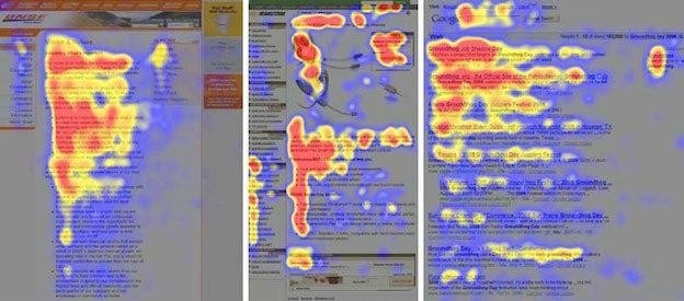
In the same way, you can also place the content elements in a Z pattern as people tend to look at the corners with a diagonal joining the upper right portion with the lower-left portion of the email. Follow these tips to get the best visual hierarchy for your content blocks:
- Place important information on the left side and extreme right for the top portion.
- Place the information on the right side for the lower portion.
- Make use of short numbered and bulleted points.
- Bolden the headlines and important words.
- Place CTAs in the corners of the Z pattern.
Use Text Size And Spacing Consciously
Keep the size of your headlines significantly bigger than the main body. Having bigger headlines signals the importance of particular sections in your email copy as we are wired to pay more attention to bigger entities naturally. I also find that email templates should effectively utilize space to differentiate various elements and create perceptual relations between them. Giving more spacing between elements allows users to focus better on the presented content. Using both of these attributes helps to define the relative relationships between elements and streamline reader attention.
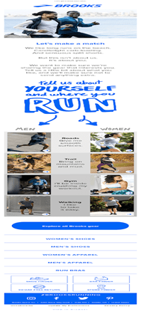
Capitalize On Hero Image
The hero images pivot the reader’s attention around the central topic of your email. It is the large visual element on the top part of the email template. It could be an image as well as an embedded video, GIFs, or even cinemagraphs. They also contain supporting text. You should use high-quality visuals that communicate the purpose of sending the email. It is necessary to complement the CTAs through hero images to create a logical flow while selecting the theme, and sure that your hero image illustrates the features or advantages of your product.
(Source)
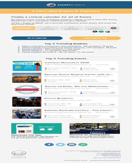
Use Color And Proximity Smartly
If you want to highlight specific portions of your email, you can use brighter colors for those areas. I also suggest using color psychology to your advantage as using pale colors drives the user’s attention away while on the other hand, the brighter colors help your users find essential information faster. Contrasting also helps in establishing a visual hierarchy to drive engagement. Proximity is another search attribute which allows us to understand how various elements are related to each other. Placing images beside bulleted text allows readers to understand that the subject of the information is explained in short points beside it. You can also use proximity to divide the elements and shift the reader’s attention towards new blocks.
(Source)
Highlight Information Through Typeface Weight And Pairing
Selecting the right email typefaces is equally important as they project the formal and casual tones. For instance, lightweight and longer typefaces are great for luxury brands as they resemble the humanly aesthetics associated with good looks. By pairing different typefaces, you can channelize the reader’s attention towards different parts of your copy. This is also so widely used when marketers who want to highlight multiple pieces of information without overwhelming the reader.
Summing Up
Developing good emails requires one to follow multiple principles of design and establish a logical flow. The visual hierarchy consists of not only images or the format of your email copy, but it takes into account various relationships establishing qualities of your design. Coming towards the end, I would like to tell my readers that you should avoid using all of these visual hierarchy principles at once. Each design has its own set of requirements, and despite compromising on certain principles, you can get very beautiful email designs. I hope you find this article on creating visual hierarchy insightful.
Author Bio
Kevin George is the Head of Marketing at Email Uplers, one of the largest Email Templates production company which specializes in converting PSD to email templates. He loves gadgets, bikes, jazz, and breathes ‘email marketing’. He is a brand magician who loves to engage and share insights with fellow marketers.
About the Author

Peter Makeshoff
Peter Makeshoff is the founder and main author of Designer Daily.