Every pattern tells a story. Whether it’s printed across yards of fabric, scaled up for architectural cladding, or reduced to a digital texture, the way a pattern repeats determines how it’s read, felt, and remembered. For textile and surface designers, understanding the grammar of repeat is as essential as knowing color theory or material properties. It’s the language that turns a motif into a system.
Here’s how the best designers think about repeat, color, and pattern as strategic tools.
The Architecture of Repeat: Full Drop vs. Half Drop
At its most basic level, a repeating pattern is a tile that multiplies infinitely without visible seams. But within that simple definition lies tremendous variation.
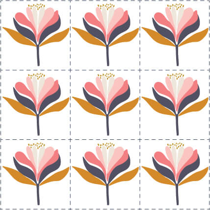
The full drop repeat is the most straightforward: artwork repeats along horizontal and vertical lines, forming a perfect square or rectangle. Think of a basic checkerboard. It’s simple to create and widely used, particularly in home decor, wallpaper, and paper products where evenness and symmetry are valued .
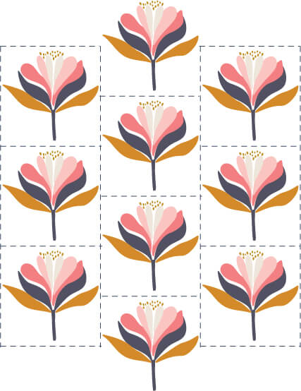
The half drop repeat staggers the horizontal repetition, dropping each row by exactly half the vertical repeat. This creates a more organic, less obvious grid. It’s especially useful when working with larger motifs where a full drop might feel too regimented. The staggered arrangement helps conceal the repeat within the artwork, allowing the eye to move across the surface without being jerked along obvious horizontal lines.
Beyond these fundamentals, designers work with several other layout types. Tossed layouts arrange motifs as if they’ve been thrown randomly across the surface, with elements facing different directions and overlapping naturally. Allover layouts pack motifs densely so little background shows through. Free-flowing layouts create strong directional movement, with some areas dense and others sparse, guiding the eye on a deliberate journey across the surface.
The Craft: Making Repeats That Work
A great repeat should be undetectable to the average viewer. It shouldn’t jump out or catch the eye. Instead, it should allow the eye to move within the artwork in a pleasing, comfortable way. When a repeat is poorly designed, it becomes the first thing you notice, distracting from the motifs, colors, and textures that should be the focus .
Professional designers know that developing thoughtful repeats is one of the easiest and least expensive ways to elevate their work. But it requires attention to detail that many overlook.
Multiple elements matter. If you’re working with hand-drawn motifs, consider creating several variations rather than copying the same element repeatedly. A second or third flower with similar but slightly different character, one petal folded gently, one leaf turned in the breeze, adds variety that makes a print feel more professional.
Flipping and rotating prevents unintentional directionality. A leaf tilted slightly to the right, used throughout a design, will make the entire pattern feel tilted. Flipping and rotating creates balance.
Scale is critical. Many designers make repeats too small, relying on Illustrator’s pattern tool to tile a four-inch square. Unless you’re creating a very small-scale print, aim for at least 32 centimeters (12.5 inches) of artwork to give your pattern room to breathe.
Color and Perception: Doing More with Less
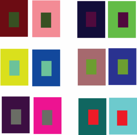
Color in textile design isn’t just about aesthetics. It’s about perception and economics. Optical illusions offer powerful lessons in how surrounding colors shift our perception of a hue.
The phenomenon of simultaneous contrast demonstrates that a color’s appearance changes based on what’s next to it. Violet and orange surrounding colors can force a color shift, making two identical greens appear different. For textile designers, this is practical knowledge. If you can create the illusion of four colors using only three, you’ve saved on production costs while maintaining visual complexity.
Some designers push this further, creating fabrics whose colors appear to change depending on viewing distance. By alternating weaves and using careful color placement, patterns can shift and shimmer as the viewer moves closer or farther away.
The classic reference text “Colour and Weave Design” by David Sutton and David Cripps explores these principles systematically, showing how color placement on different weave structures creates endless variation from simple ingredients.
Pattern as Intellectual Property: From Ornament to Asset
Historically, prints were regarded as transient ornaments, decorative variations within a collection. That perception has changed radically. Today, distinctive patterns can function as trademarks or industrial designs, becoming strategic assets within a company’s intellectual property portfolio.
This evolution aligns with trade dress protection, particularly in the United States and European Union. Trade dress recognizes that a product’s identity can be expressed through combinations of visual elements, colors, shapes, and graphic patterns. When prints become recognizable to consumers, they cease to be decorative details and become part of core brand identity.
Burberry’s check pattern exemplifies this transformation. Originally associated with trench coats and accessories, it has become a global icon requiring registration and active enforcement in multiple jurisdictions. Louis Vuitton’s monogram canvas represents billions in brand equity, defended in courts worldwide. Hermès silk scarves transcend aesthetics to become enduring symbols of heritage and sophistication.
For companies, the lesson is clear: prints must be treated as intangible assets from conception. An effective protection strategy combines three layers:
- Formal registration, whether as a figurative mark or industrial design
- Active monitoring to detect unauthorized uses across marketplaces and social media
- Contractual governance in licensing and distribution agreements defining territory, scope, and duration
This strategic value extends far beyond fashion. Stationery, cosmetics, home decor, and even food companies use visual patterns as key differentiators. Coca-Cola’s iconic graphic waves and Ben & Jerry’s playful illustrations demonstrate how prints can reinforce brand recognition across industries.
Pattern Across Scales
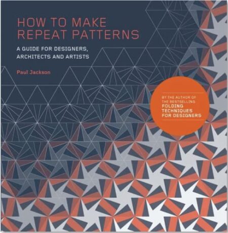
The principles of repeat design apply whether you’re working on a scarf, a building facade, or a digital interface. Paul Jackson’s “How to Make Repeat Patterns” explains, in non-mathematical terminology, how to create repeats using four simple operations: translation, rotation, reflection, and glide reflection. These operations, drawn from symmetry mathematics, underlie all pattern-making across disciplines.
For designers working digitally, understanding these fundamentals allows you to create everything from seamless website backgrounds to architectural cladding systems. The same grammar that governs a floral textile also applies to a parametric building facade or an app’s repeating icon grid.
The Bottom Line
Pattern design is a discipline that rewards patience and attention to structure. A beautiful motif is only half the work. The repeat, the color placement, the balance of elements, these are what transform a drawing into a system that can cover infinite surfaces without losing its integrity.
When you master the grammar of repeat, you’re not just making patterns. You’re building visual languages that can travel from fabric to wallpaper to digital texture, always recognizable, always coherent. And when those patterns become associated with a brand, they cross the line from ornament to asset, protected and valuable.
The best patterns feel inevitable, as if they’ve always existed. That feeling comes from getting the grammar right.
About the Author

Peter Makeshoff
Peter Makeshoff is the founder and main author of Designer Daily.