To the untrained eye, a letter is a shape. To a designer, it is an architectural marvel built from precise, named components. Mastering this specialized vocabulary does more than sound impressive. It provides the critical framework for seeing nuance, making purposeful choices, and articulating the “why” behind every typographic decision. This is the difference between picking a font and wielding type with intention.
The Core Components: Building a Visual Vocabulary
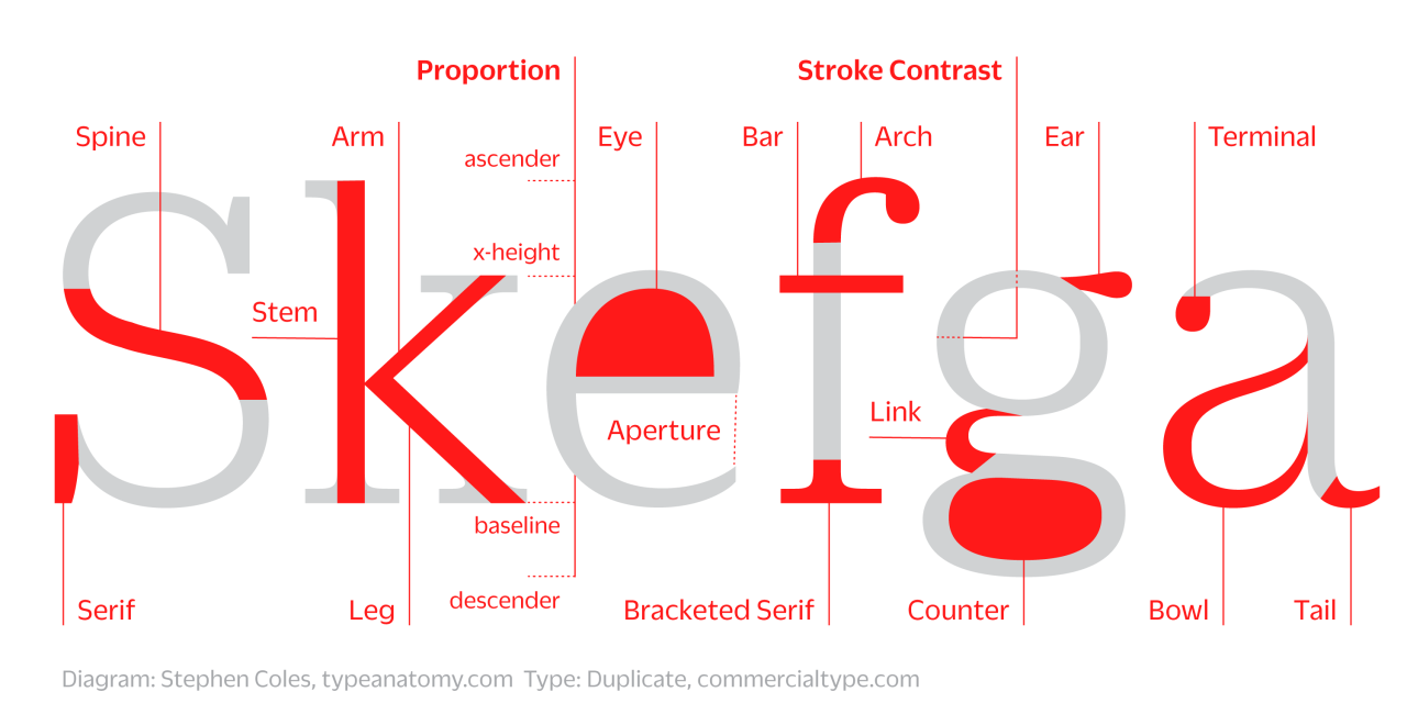
Let’s dissect the anatomy of letterforms, moving from foundational structures to distinctive details.
1. The Structural Framework: Strokes & Spaces
These are the primary “bones” of a letter.
- Stem: The main, vertical stroke in letters like ‘l’, ‘h’, ‘b’, and ‘d’. It is the primary load-bearing element.
- Bowl: The fully closed, rounded part of a letter that encloses the counter, as in ‘b’, ‘d’, ‘o’, ‘p’.
- Counter: The fully or partially enclosed space inside a letter. The ‘o’ has a closed counter; the ‘c’ has an open counter. A large counter generally improves legibility.
- Crossbar: The horizontal stroke that connects two sides, as in ‘A’, ‘H’, ‘f’, ‘t’.
- Ascender: The part of a lowercase letter that rises above the x-height (e.g., ‘b’, ‘d’, ‘h’, ‘k’).
- Descender: The part of a lowercase letter that falls below the baseline (e.g., ‘g’, ‘j’, ‘p’, ‘y’).
2. The Defining Details: Personality in the Parts
These features give a typeface its unique character and are key to pairing and branding.
- Serif: The small finishing stroke at the end of a main stroke. Styles vary dramatically:
- Bracket: A curved transition between serif and stem (traditional, humanist).
- Slab: A thick, block-like serif (bold, geometric).
- Hairline: An ultra-thin, unbracketed serif (modern, delicate).
- Terminal: The end of any stroke that does not terminate in a serif. It can be ball (rounded, as in ‘c’ in Bodoni), teardrop, slanted, or a simple scoop. Terminals are a major personality signifier.
- Spine: The main, curved stroke of the lowercase ‘s’ or ‘S’. Its tension and curve define elegance.
- Ear: The small stroke that projects from the top right of the lowercase ‘g’ (in many serif faces). A distinctive ear can become a signature of a typeface.
- Tail: A descending stroke, often decorative, as in the ‘Q’ or the descender of a ‘y’.
- Link/Neck: The connecting stroke between the bowl and loop of a double-story ‘g’. A thin link can be a delicate point of failure in dense text.
3. The Invisible Geometry: The Space That Shapes the Form
Typography is as much about the spaces as the solids.
- Aperture: The opening of a partially enclosed counter, as in ‘c’, ‘e’, ‘s’, ‘a’. A tight aperture feels closed and efficient; an open aperture feels airy and legible.
- Shoulder: The curved stroke that originates from a stem, as in ‘h’, ‘m’, ‘n’.
- Spur: A small, pointed projection off a main curve (often at the bottom of a ‘G’ or where a curve meets a stem in sans-serifs). It’s a subtle hardening of a junction.
Why This Vocabulary is Your Superpower
1. Nuanced Font Pairing: You move beyond “this looks nice” to objective analysis.
- Pairing Strategy: Look for compatible details. A slab serif with strong, square terminals pairs well with a geometric sans-serif that has similar, hard terminals. A humanist serif with soft, bracketed serifs and teardrop terminals will harmonize with a humanist sans-serif that shares its open apertures and warm proportions.
- Clashing Intentionally: Understanding anatomy lets you create dynamic tension by pairing opposites—a rigid, monotone grotesque with a high-contrast modern serif—for deliberate, editorial effect.
2. Purposeful Branding Decisions: The anatomy of your primary typeface telegraphs brand attributes.
- A Fintech Startup: Might choose a typeface with large counters and open apertures for clarity and trust, a strong x-height for density of data, and stable, low-contrast strokes for reliability.
- A Luxury Perfume: Might select a face with elegant, high-contrast strokes, flourished terminals, and a diagonal stress in the ‘o’ that evokes calligraphic craftsmanship and exclusivity.
3. Confident Client Communication: This vocabulary transforms subjective feedback into objective discussion.
- Client says: “The headline font feels too stiff.”
- You can say: “I understand. The current slab serif has very heavy, square terminals. What if we tried a typeface with bracketed serifs and ball terminals to introduce some softness and warmth, while keeping the authority you like?”
- Result: You are no longer a decorator offering random alternatives. You are a consultant diagnosing a problem and prescribing a precise solution.
Practical Exercise: The Type Detective
Take the word “Hamburgefonts” (a classic pangram). Set it in three different typefaces. For each, label:
- The style of the serif (if present).
- The shape of the terminal on the ‘e’, ‘a’, and ‘t’.
- The aperture of the ‘e’ and ‘c’.
- The style of the ‘g’ (single- or double-story? Does it have an ear?).
This exercise trains your eye to see past the whole and into the parts, building the muscle memory that makes expert typography instinctual.
Armed with this lexicon, you cease to simply choose fonts. You begin to orchestrate letterforms. You see the ear of the ‘g’, the spine of the ‘s’, and the aperture of the ‘e’ as the essential instruments in a visual symphony. This knowledge empowers you to build brands with precision, defend your choices with clarity, and ultimately, make the invisible art of type feel tangible and decisive.
About the Author

Peter Makeshoff
Peter Makeshoff is the founder and main author of Designer Daily.