As you navigate your preferred website, something grabs your attention. Beyond the vivid colors or striking images, it’s the typeface that truly stands out. This moment transcends mere reading; it becomes an immersive experience. This exemplifies the impact of current font trends.
In the dynamic realm of web design and digital marketing, grasping the newest font trends is akin to possessing a magical key for engaging your audience. This goes beyond merely beautifying text; it’s about forging an emotional bond and ensuring your message has a lasting impact.
By the conclusion of this article, you’ll have gained valuable knowledge about the most impactful typography styles of 2023. We’ll explore everything from the bold statement of expressive typography to the refined allure of geometric sans serifs, and discuss how these trends can revolutionize your branding and user interface design.
Retro and Nostalgic Influences
Groovy Retro Designs
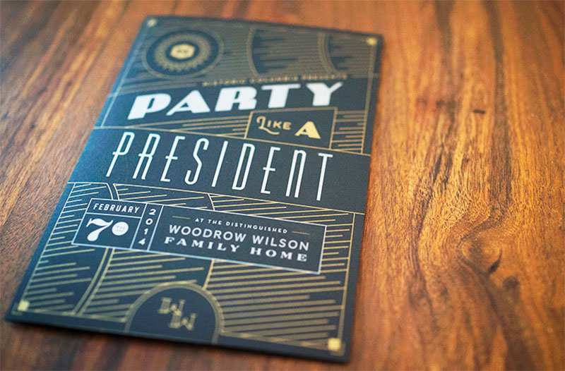
Picture those psychedelic posters from the ’60s and ’70s. That’s where Groovy Retro Designs take their cue. It’s all about bringing back those wavy vintage aesthetics.
Think bold colors, funky patterns, and typefaces that scream personality. It’s not just a throwback; it’s a celebration of an era, reimagined for today’s digital typography.
Psychedelic and Wavy Vintage Aesthetics
Imagine fonts that twist, turn, and shout. These aren’t your standard Serif or Sans Serif; they’re more like a visual rollercoaster.
They capture the essence of a time when design was all about being out there, being bold. Using these styles in web design or branding today? It’s like telling your audience, “Hey, we’re fun, we’re different.”
Mid-Century Chic
Now, let’s mellow it down a notch. Mid-Century Chic is the sophisticated cousin of the psychedelic style. Think clean lines, geometric shapes, and a touch of elegance.
It’s a nod to the 1950s and 1960s design ethos but with a modern twist. Perfect for brands looking for a balance between nostalgia and contemporary.
Art Deco Revival
Art Deco Revival is like stepping into a Gatsby party but in the 21st century. It’s all about luxury, sophistication, and geometric patterns.
Fonts in this style are not just letters; they’re architectural wonders. They bring a sense of grandeur and timelessness, making them perfect for high-end branding and print media.
Modern Interpretations of Classic Styles
This is where the past meets the present. We’re taking those classic Art Deco elements and giving them a modern spin.
It’s about maintaining the essence but making it fit for today’s digital media landscape. Think bold lines but with a cleaner, more minimalist approach.
Retro Returns with a Modern Twist
And here’s the fun part. Retro Returns with a Modern Twist is all about mixing and matching.
It’s taking bits and pieces from different decades and blending them into something new, something now.
Influence of Different Decades
Each decade had its vibe, its style. The ’70s had those groovy curves, the ’80s brought neon and boldness, and the ’90s? Well, that was all about being edgy and experimental.
Mixing these influences in font trends today means creating something unique, something that tells a story of time through typography.
Bold and Expressive Typography
Big, Bold, and Sturdy Fonts
Okay, let’s dive into something that’s really shaking things up in the world of font trends. We’re talking Big, Bold, and Sturdy Fonts.
This is where letters aren’t just letters; they’re statements. Imagine seeing a word and feeling its weight, its presence. That’s what these fonts do.
They’re not shy. They’re like the person at the party who’s not afraid to speak up, to stand out.
Emphasis on Structure and Solidity
It’s all about making an impact. These fonts have this unmissable structure, a solidity that you can almost touch.
They’re perfect for headlines that need to grab attention or brands that want to make a bold statement.
Expressive Typography
Now, let’s add a bit of emotion to the mix. Expressive Typography is where fonts tell a story, convey a feeling.
It’s not just about being bold; it’s about being expressive, being unique. These fonts have personality. They’re not just seen; they’re felt.
Emotional Connections and Brand Personality
This is where brand personality shines through.
Each font choice can evoke different emotions – excitement, trust, comfort, innovation. It’s like choosing the right outfit for the right occasion. It sets the tone, creates an atmosphere.
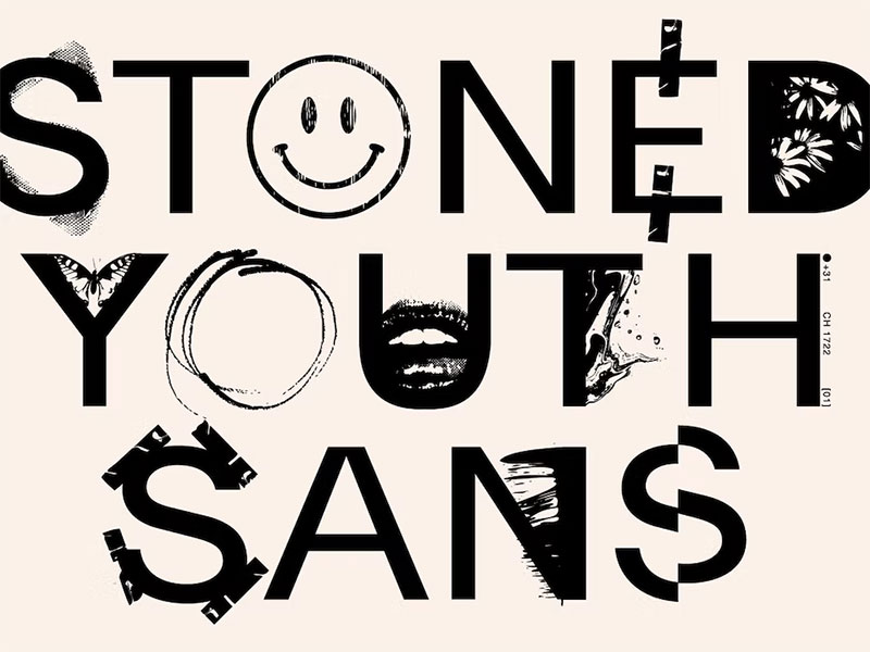
Mall Goth and Liquid Chrome
And here’s where things get really interesting. Mall Goth and Liquid Chrome – sounds like a band name, right? But it’s actually about fonts that are edgy, futuristic. They’re the rebels of the font trends.
Edgy and Futuristic Styles
Think about fonts that look like they’re from a sci-fi movie or a punk rock album cover. They break the norms, push boundaries.
While these might work for some websites or design prints, I suggest using a tamer font selection.
Innovation in Font Design
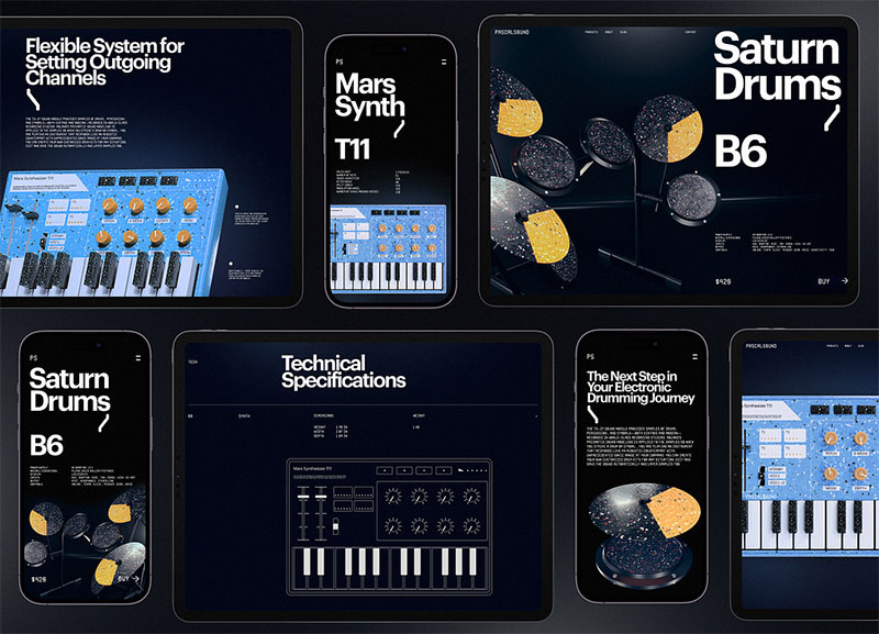
Kinetic Typography and Animated Type
So, here’s where things get really dynamic. Kinetic Typography and Animated Type – it’s like bringing fonts to life. Imagine letters that dance, jump, and change right before your eyes.
It’s not just about static text anymore; it’s about creating an experience, a visual journey.
Movement and Dynamism in Digital Media
This is where font trends meet motion. It’s perfect for digital media, where grabbing and keeping attention is key.
Think about those eye-catching social media posts or engaging website headers.
They’re not just reading; they’re watching, they’re engaged. It’s like the text is performing right there on the screen.
Custom and Variable Fonts
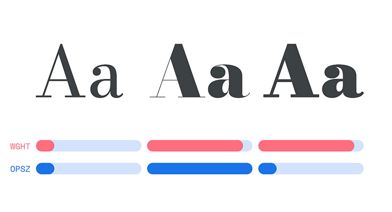
Now, let’s talk customization. Custom and Variable Fonts are all about flexibility and personalization.
Imagine having a font that can change its weight, width, or style with just a few tweaks. It’s like having multiple fonts in one.
Flexibility and Personalization
This is huge for branding and UI/UX design. It means fonts can adapt to different contexts, different messages.
Technological Advancements in Font Creation
Think about fonts that are optimized for readability, or that can adjust themselves based on user preferences or screen sizes.
It’s like the fonts are thinking for themselves, making sure they’re always looking their best, no matter where they’re displayed.
Mixing Dimensions and Styles
Mixing 2D Design and 3D Typography
Alright, let’s blend some worlds. Mixing 2D Design and 3D Typography is like making flat text jump off the page (or screen).
Collage-Style Fonts and Graphics
Think of it like a collage. You’ve got your classic 2D text, but then, bam! 3D elements come in, adding layers and depth. It’s a visual feast, a blend that catches the eye and holds it.
This style is perfect for creative projects, websites, and even branding that wants to stand out in the sea of font trends.
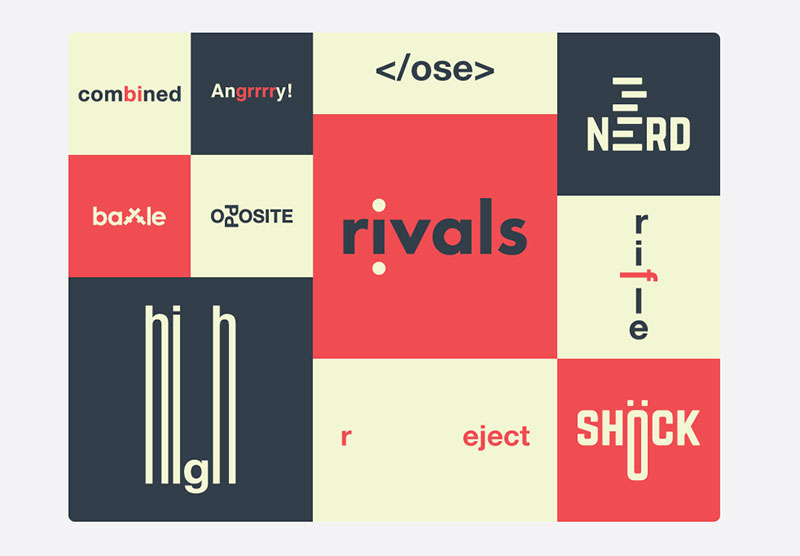
Iconographic Mashups
Now, let’s get eclectic. Iconographic Mashups are where fonts meet icons and graphics. It’s not just about words; it’s about integrating visuals into the text.
Unique and Eclectic Fonts
Imagine a paragraph where letters are intertwined with small graphics or icons that relate to the content. It’s like each letter is a little story in itself.
This style is super engaging, especially for digital content where grabbing attention is key. It’s a playful, creative way to present information and make sure it sticks.
Functional and Accessible Fonts
Geometric Sans Serif Fonts
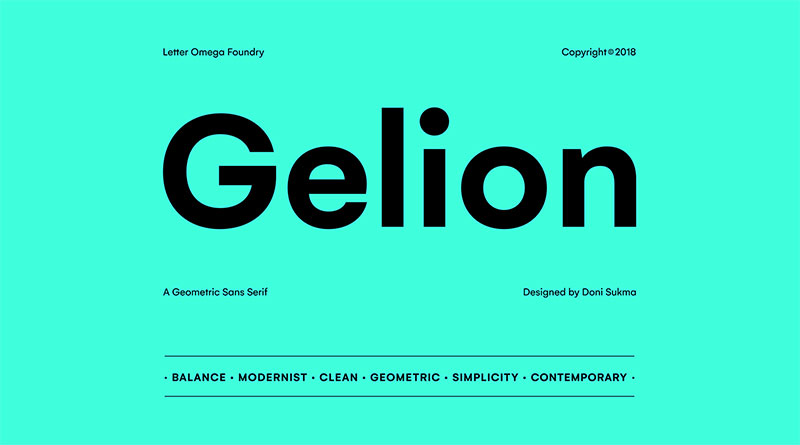
Okay, let’s talk about something super crucial: Geometric Sans Serif Fonts. These are the clean-cut, no-nonsense kind of fonts.
They’re like that friend who’s always clear and straightforward. In the world of font trends, they’re the go-to for readability and simplicity.
Functionality and Legibility
These fonts are all about being easy on the eyes. They’re designed with simple, geometric shapes, making them super legible.
Whether it’s a quick glance at a billboard or a deep dive into a website, these fonts make sure the message comes across loud and clear.
Fun and Functional Serif Fonts
Now, let’s add a bit of flair. Fun and Functional Serif Fonts are where elegance meets readability. Let’s use as example Design Your Way’s homepage that uses Lora.
Serifs are those little feet at the ends of letters, and they’re not just there for show. They guide the eye along the text, making reading a breeze.
Modern Interpretations of Serifs
These aren’t your old-school, stuffy serifs. We’re talking modern, sleek, and versatile. They bring a touch of personality without sacrificing functionality.
It’s the perfect blend for brands or projects that want to be seen as both professional and approachable.
Accessibility in Typography
And here’s the heart of the matter: Accessibility in Typography. This is about making sure everyone can read and understand the text, no matter their abilities.
Clear Lettering and Readability
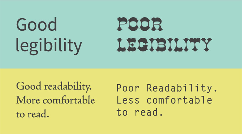
Fonts play a huge role in accessibility. It’s about choosing typefaces that everyone can read easily, including people with visual impairments or reading difficulties.
Think high contrast, clear letterforms, and ample spacing. These are great for tables, charts, and infographics.
I know a lot of designers are tempted to use fonts that are a bit quirky, but going for the readable but boring ones is best in these situations.
Conclusion
So, we’ve journeyed through the dynamic world of font trends, exploring how they’re not just about making words look good, but about telling stories, creating moods, and connecting with audiences.
From the nostalgic echoes of Retro and Nostalgic Influences to the bold statements of Expressive Typography, each trend offers a unique voice in the chorus of digital design.
Innovation in Font Design has shown us that the future of typography is as exciting as it is unpredictable, blending technology and creativity. This innovation is particularly evident in interactive websites, where fonts play a pivotal role in engaging users and enhancing user experience either on buttons, or in the headings.
Meanwhile, Mixing Dimensions and Styles has opened up a playground of visual experimentation, proving that fonts can be as multi-dimensional as the messages they convey.
About the Author

Bogdan Sandu
Bogdan is a designer and editor at DesignYourWay. He's reading design books the same way a hamster eats carrots, and talks all the time about trends, best practices and design principles.