In an era of infinite scroll and fleeting attention, the printed magazine page, or its digital counterpart, the long-form editorial layout, offers a radical proposition: an intentional space for reading. But a great magazine layout does more than just hold content; it choreographs attention. It is a piece of environmental psychology, a silent conductor that tells the reader when to hurry, when to pause, and when to settle in for a long journey.
The editor shapes the words, but the designer shapes the pace. To do this effectively, we must understand the three distinct reading modes a reader inhabits as they move through an issue. Designing for these modes isn’t just about aesthetics; it’s about creating a rhythmic architecture that guides the reader from cover to cover.
1. The Front-of-Book (FOB): Designing for the Scan
The front section of any magazine, a flurry of letters, news briefs, and cultural snapshots, is the literary equivalent of a cocktail party. The reader is flitting, grazing, and deciding what’s worth their time. Their eye is restless, and the design must accommodate this high-energy state.
- The Grid as a Crowd Controller: The FOB demands a fragmented, modular grid. Multiple entry points are key. Use small, bold images and pull-quotes as visual hooks to stop the scan. Think of each page as a dashboard of highlights, not a linear narrative.
- Typography as Hierarchy: This is not the place for long, elegant paragraphs. Use bold, declarative headings, often in sans-serifs, that can be read in a split second. Captions become crucial; they are often the most-read type in this section, acting as mini-articles in themselves.
- The Pocket-Space Mentality: Columns can be narrower, and whitespace is at a premium. The goal is density with clarity. We’re not asking for immersion; we’re offering a series of quick, satisfying visual and informational bites that reward the skimming eye.
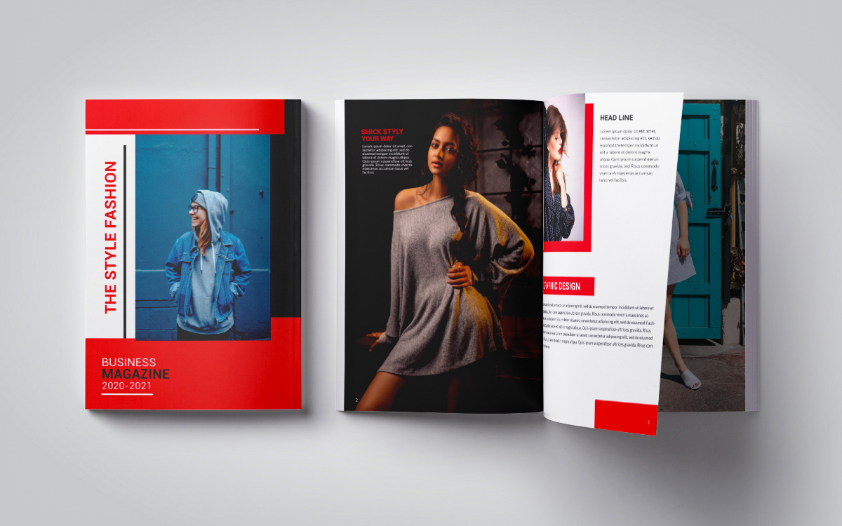
2. The Feature Well: Designing for the Sink-In
This is the main event. The reader has found a story that promises depth, and they are committing to it, whether for a 5-minute read or a 30-minute deep dive. The design’s role shifts from information delivery to atmosphere creation. We are no longer managing a crowd; we are building a world.
- Pacing Through the Spread: A 10-page feature is a narrative arc. The opening spread is the “curtain raiser.” It should be bold, atmospheric, and set the emotional tone, often with a dominant, full-bleed image. The following spreads should vary the rhythm. A spread with dense text can be followed by one dominated by a quiet, contemplative image. A multi-panel photo essay can inject a burst of energy.
- The Long Read: Typography must become invisible. Choose a highly readable serif face for the body copy, with a generous measure (line length). The ideal line length for sustained reading is between 50-75 characters. Too long, and the eye gets lost; too short, and the reading feels choppy.
- The Breather: Whitespace is the designer’s most powerful tool for pacing. Generous margins, wide leading (line spacing), and carefully placed empty space give the reader’s eye a place to rest. It allows complex ideas to land. In a feature, the space around the text is just as important as the text itself.
3. Service Journalism: Designing for the Toolkit
The service piece, a travel guide to Paris, a recipe, a style guide, or a “how-to”, exists in a unique space between scanning and deep reading. The reader may scan the whole piece first, then return to a specific section to use it. The design must facilitate both discovery and reference.
- Clarity as the Ultimate Luxury: Decoration takes a backseat to wayfinding. The grid must be rigid and highly organized. Information should be chunked into distinct, visually separate modules. Color-coding sections (e.g., all “hotels” in blue, all “restaurants” in red) creates a powerful, intuitive navigation system.
- The Indexical Image: Photography here is not just atmospheric; it’s informational. A photo of a dish should make you hungry, but it should also clearly show you what the finished product looks like. Annotated images or exploded diagrams can be invaluable.
- Standalone Summaries: Key data (addresses, prices, ingredients, step-by-step instructions) must be extractable. They should be set apart in sidebars, lists, or breakout boxes with a distinct typographic treatment. The reader should be able to find the recipe’s ingredient list at a glance, without having to re-read the surrounding story.
The Through-Line: Rhythm and Repetition
Ultimately, designing for different paces is about creating a cohesive issue-wide rhythm. The FOB’s frenetic energy makes the feature well feel more serene by contrast. The feature’s deep immersion makes the service section feel more actionable.
The job of the designer is to establish a visual system, a consistent typographic palette, a coherent grid structure, and then modulate it. We use repetition of certain elements (like a standardized running head) to create a sense of place, and variation in scale, imagery, and density to create the emotional journey.
When we design with pace in mind, we stop merely arranging elements on a page and start shaping the reader’s experience of time itself. We transform a collection of articles into a place where a reader can live for an hour. And in a distracted world, that is a powerful thing.
About the Author

Peter Makeshoff
Peter Makeshoff is the founder and main author of Designer Daily.