The social media manager’s nightmare is universal: 8 AM, a blank canvas, and a content calendar demanding five posts by noon. The amateur designer starts from scratch every time, burning hours and sanity. The professional, however, walks into an asset factory, a modular system where components snap together like building blocks, producing on-brand, high-quality graphics in minutes, not hours.
Here is how to build yours.
The Philosophy: Design Once, Deploy Forever
The core principle is simple: separate the system from the content. Your brand’s visual DNA (colors, typography, textures, and core layouts) exists as a permanent, reusable library. Each new post is just a fresh combination of these pre-built, approved parts.
Step 1: The Foundation – Brand Libraries
Before any templates, establish your raw materials.
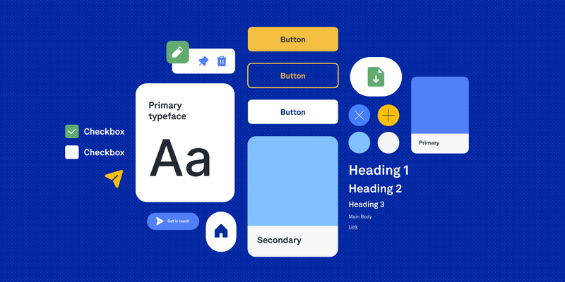
Color Palette as Components:
In Figma or Canva, create dedicated Color Styles. Name them functionally, not descriptively. Not “Light Blue,” but “Primary Background,” “Call to Action,” “Link Text.” This forces intentionality. When you update a color style, every asset using it updates instantly.
Typography as System:
Define Text Styles for every recurring need. H1 Headline, Body Copy, Pull Quote, Stats Number. Include size, weight, leading, and tracking. In Canva, save these as brand kits. In Figma, use text styles linked to your design system. Never manually adjust font properties again.
Texture & Overlay Library:
Create a dedicated page or folder of reusable background elements: subtle noise textures, abstract gradients, geometric patterns, photo overlays. Make them semi-transparent and layered so they can be dropped behind any content.
Step 2: The Component Library – Building Blocks
Now, design the atomic elements that will populate your layouts.
Core Components to Build:
- Image Frames: Pre-sized, pre-styled containers for photos. Create variants: circular (avatar), rounded rectangle (post), full bleed (hero).
- Button & CTA Modules: Pre-set button shapes with your brand colors and typography applied. Include hover states if designing for interactive formats.
- Icon Sets: Source or create a consistent icon library (line icons, filled icons) and store them as components. Never search for a “thumbs up” icon again.
- Divider Elements: Decorative lines, dots, or shapes that separate content sections.
- Quote Blocks: Pre-styled containers for testimonials or pull quotes, with your chosen quotation mark styling baked in.
Naming Convention: Name components by function and variant: Button / Primary / Large, Image Frame / Portrait / Rounded.
Step 3: The Template Library – Pre-Baked Layouts
This is the factory floor. Create 5-7 core layout templates that cover 90% of your recurring content types.
Essential Templates:
- The Quote Post: Large typography, small logo, subtle background texture.
- The Announcement: Bold headline, supporting visual, clear CTA button.
- The Split Screen: Image left, text right (or vice versa).
- The Stats/Data Post: Large numbers, explanatory subhead, brand-accent chart or graph placeholder.
- The Event/Webinar: Date, time, speaker placeholder, registration button.
- The Carousel Cover: Title, engaging visual, “Swipe →” indicator.
- The Behind-the-Scenes: Photo frame with casual, friendly typography overlay.
Build Them Smart: In each template, every element should be an instance of your core components, not a one-off shape. The headline in your Announcement template should be an instance of your “H1 Headline” text style. The button should be an instance of your “Button / Primary” component.
Step 4: The Workflow – Producing at Speed
With your factory built, the daily production workflow transforms:
The Daily Briefing:
- Copywriter provides the message: “New blog post: ’10 UX Tips.'”
- Social manager chooses the appropriate template: Announcement.
- They swap the component instances:
- Drag in the “Blog” icon from the icon library.
- Replace placeholder headline with actual text (style auto-applies).
- Drop in a relevant photo from the shoot folder into the image frame.
- Adjust colors via theme if needed (light mode vs. dark mode variants).
- Export in 90 seconds. Consistent, on-brand, and fast.
For Canva Users: Create a Brand Kit with your colors and logos. Save your templates as “Templates” in your team folder. Use “Magic Resize” to instantly adapt a square post to a story or banner format.
For Figma Users: Use “Publishing” to share your library with your team. Use “Swap Instance” to quickly change component types. Use “Batch Styling” plugins to update colors across dozens of frames at once.
Step 5: The Governance – Keeping the Factory Clean
A factory without maintenance becomes a junk heap. Schedule:
- Monthly Audit: Delete unused components and templates.
- Quarterly Refresh: Update color styles seasonally? Build it into the system by creating “Seasonal” color sub-libraries.
- Version Control: Keep a “Master Library” file and push updates to team members rather than everyone editing local copies.
The Result: Consistency as a Byproduct, Not a Goal
When your asset factory is humming, brand consistency isn’t something you police, it’s something the system enforces. Every graphic automatically uses approved colors, correct fonts, and proper spacing. The creative energy once spent on repetitive layout decisions is freed for what matters: better messaging, smarter content strategy, and the occasional genuinely innovative campaign.
Stop designing each post. Start designing the system that designs the posts. Your future self, staring down a content calendar at 8 AM, will thank you.
About the Author

Peter Makeshoff
Peter Makeshoff is the founder and main author of Designer Daily.