Fonts, you see them every day. On your phone, your favorite website, that cool poster you just walked past. They’re part of our everyday life.
And for me, as a designer, they are more than just characters on a screen – they are a crucial element of effective communication.
This is your personal guide through the maze of typography in web design.
You’ll see why fonts matter, how to pick ’em, and the coolest trends to watch out for.
Basics of Typography
A quick crash course in typography. It’s the art of arranging type. The goal? To make written language legible, readable, and appealing when displayed.
Fonts are the different weights, styles, and orientations of typefaces. For instance, ‘Times New Roman’ is a typeface, but ‘Times New Roman Bold’ and ‘Times New Roman Italic’ are fonts.
In web design, typography impacts how a user experiences a website. Good typography = happy, satisfied users. Poor typography, well, let’s just avoid that!
History and Evolution of Web Fonts
Once upon a time, web designers were restricted to system fonts. The same-old, same-old that everyone had on their computers. Arial, Georgia, Times New Roman – the classics.
Then, bam! Web fonts arrived, shaking up the scene. These custom fonts, downloadable from the web, allowed us designers to get really creative. And trust me, we did.
The Anatomy of a Font
Each font has a unique anatomy – a combination of parts that define its style, mood, and visual impression. Things like the stem, bowl, and counter of a letter can dramatically change the way a font feels. Like an artist with a paintbrush, understanding the anatomy of a font allows us graphic designers to create just the right atmosphere on a web page.
Serif Fonts: An Overview
Let’s get into the nitty-gritty. Serif fonts. Ever noticed those little feet at the end of strokes in some fonts? Those are serifs.
Think Times New Roman or Georgia.
Serif fonts feel classic, trustworthy. They are usually used in more formal or traditional contexts. But beware, on screens, especially smaller ones, they can be tricky to read.
Sans Serif Fonts: An Overview
Now, sans serif fonts. Sans, from the French for ‘without’, so, fonts without serifs. They’re clean, modern, minimalist.
Arial and Verdana are classic examples. Or check out Roboto, a personal favorite of mine.
Sans serifs are the go-to for digital design. Why? They’re easy on the eyes and look great even at smaller sizes.
Script and Decorative Fonts: An Overview
Let’s move on to some show stoppers – script and decorative fonts. These fonts have flair, personality. They can mimic handwriting, like Great Vibes, or be thematic and decorative, like Pacifico.
These can be a lot of fun, but remember, moderation is key. They might not be ideal for long paragraphs, but for headers or small accents? Absolutely!
Understanding Font Pairings
It’s not all about individual fonts, folks. Pairings are key. Just like a good wine and cheese, fonts can bring out the best in each other.
Balancing a serious serif with a clean sans serif can create contrast and keep a design interesting. For instance, pairing something like Playfair Display (a serif) with Source Sans Pro (a sans serif) can work wonders!
Accessibility and Font Choice
Now, accessibility. That’s a big one. Choosing a font is not just about style, it’s about making sure everyone can enjoy your content.
For instance, fonts with tall x-heights (the height of a lowercase ‘x’) are often easier to read. The characters are more distinct and less likely to be confused.
Also, avoid fonts with too much stylistic flair for body text – they can be tough for people with visual impairments.
Popular Font Choices in 2023
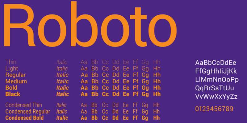
So, imagine stepping into a room where everything’s clean, neat, just the right amount of sterile. That’s what Roboto gives you. It’s crisp, smooth, perfect for a professional vibe. Whether you want to lay down some serious content or give users an easy read, this font’s your buddy.
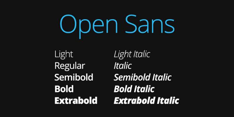
Open Sans? Think friendly. Think inviting. Like that café on the corner where everyone knows your order. It’s a humanist sans serif type, great for readability. When you need your site to be approachable yet straightforward, this font’s got you covered.
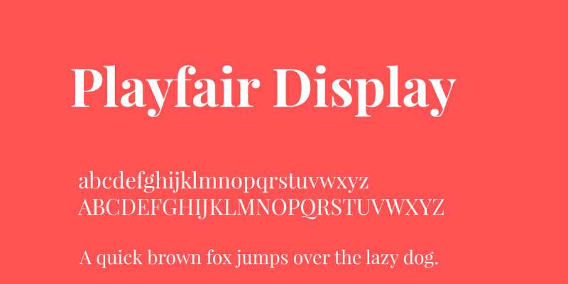
Elegance has a name, and it’s Playfair Display. As if it just strolled out of a Victorian novel, it’s the one you pick for a more traditional, classic look. It sings on headers and titling, adding a dash of drama and style.
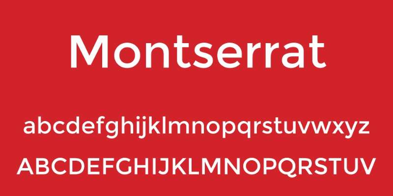
Montserrat? Now that’s urban chic. Inspired by old signage in Buenos Aires, this font carries a touch of that nostalgic charm. But don’t let that fool you; it’s a super versatile workhorse for modern designs too. If you don’t want to use this font but a similar style, there are lots of alternatives to use.
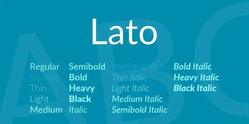
I’ve got one word for you: balance. Lato, with its semi-rounded details, offers a nice blend of seriousness and warmth. A great pick for body text, it’ll keep users comfortable as they explore your site.

Merriweather feels like a hearty meal in winter – warm, comforting. Designed especially for screens, it guarantees readability, even when the size is dropped down. Pull it out when you need a reliable serif.
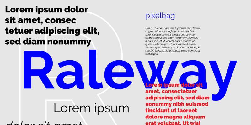
Elegance that can cut glass – that’s Raleway for you. With a distinctive combination of thin and thick lines, this font is all about making a statement. Heads up, it makes headlines shine.
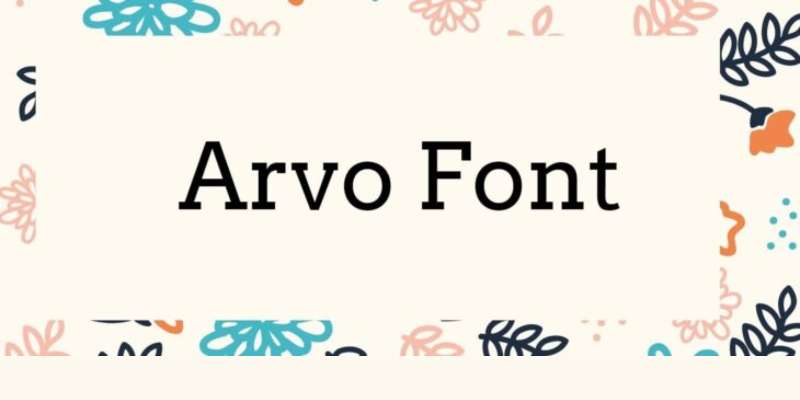
Here’s to Arvo – your solid block of granite. It’s a geometric slab-serif that’s confident, assertive, reliable. It’s like having a chat with a straightforward friend who tells it like it is.
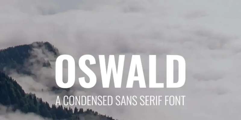
Picture New York in the 50s. Now imagine that vibe captured in a font – that’s Oswald. It’s great for headers, giving your site a unique personality without overpowering the design.

PT Sans is a fresh breath of Siberian air – inspired by Russian sans serif types. It’s a great all-rounder, working well in both body and header text. It’s like a Swiss Army knife in your font toolbox.
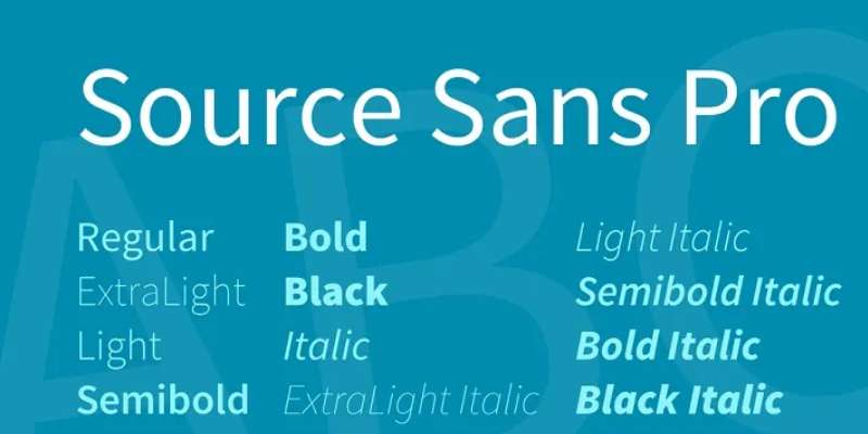
Gather ’round, Adobe fans. Here’s a hit from your favorite family: Source Sans Pro. Clean and versatile, it’s a go-to when you want your text to be effortlessly legible.
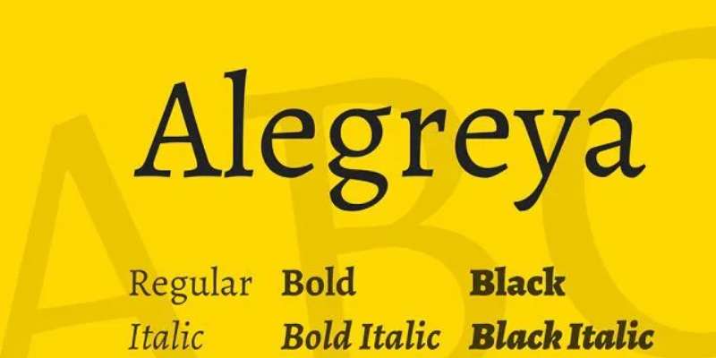
Alegreya is the charismatic stranger at a party. It’s a dynamic serif, perfect when you want to add some life and rhythm to your page. It’s about charm and readability coming together.
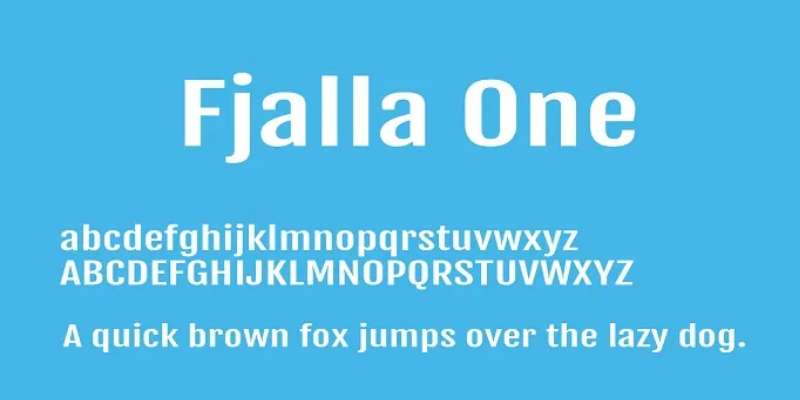
Fjalla One? Now that’s one strong espresso shot. It’s a medium contrast display sans serif. Ideal when you need your headings to punch through and grab your readers’ attention.
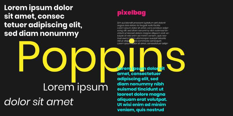
Poppins? It’s like the cool, sleek tech gadget everyone’s talking about. This geometric sans serif is great for a minimalist and modern look. Plus, it supports an extensive range of languages.
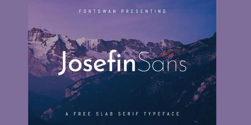
Stepping into the spotlight is Josefin Sans – a font with vintage vibes and a modern twist. Sleek and slender, this font adds an elegant yet playful touch to any web design.
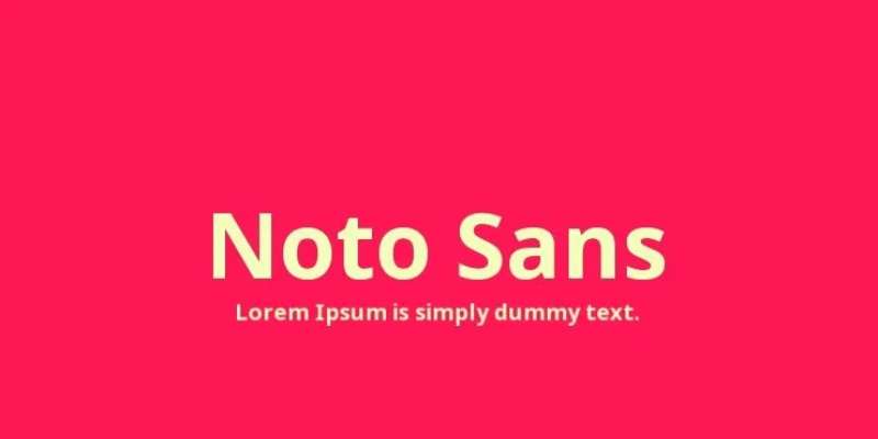
If there’s an all-around people pleaser in the font world, it’s Noto Sans. It’s like a chameleon, blending seamlessly into any design while ensuring readability. A little minimal, a little modern, a lot of awesome.

Ubuntu – it’s more than an operating system. It’s a font that is friendly and approachable, without losing a hint of tech sophistication. It’s versatile, it’s modern, and it’s ready to rock your site.
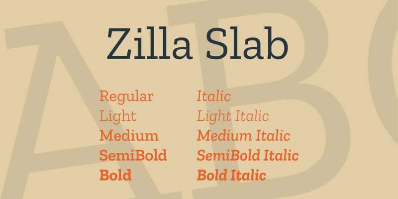
Say hello to Zilla Slab – the underdog with a killer punch. Contemporary with a hint of quirkiness, it’s great for when you want to spice things up a bit, add a little character.
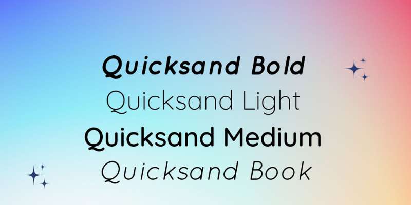
Take a moment and imagine walking on a beach – that’s the vibe of Quicksand. A fine rounded sans serif that comes off as casual yet sophisticated. This font adds a touch of ease and clarity to your design.
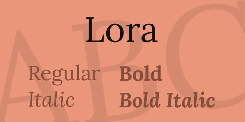
Finally, let’s talk about Lora. Think of a well-aged whisky, smooth with a bit of bite. That’s what this font offers – balance. For a traditional look with a modern twist, this font is a shoo-in.
Best Practices for Choosing Fonts for Websites
Here’s the lowdown. Understand your brand and audience. Choose fonts that reflect the brand personality. Balance aesthetics with functionality. And always, always consider readability and user experience.
Implementing Fonts on Websites
It’s not just about picking the right fonts, but implementing them right.
Using CSS, you can style your fonts to the nines. You can also animate it with various effects to make it look more modern. Don’t overdo it, though.
Troubleshooting Font Issues
Every now and then, you might hit some bumps. Maybe a font isn’t displaying correctly, or there’s a compatibility issue with a specific browser. But hey, that’s part of the game. There are always solutions to these common issues.
The Future of Best Fonts for Websites
We’ve journeyed through the world of web fonts, from their anatomy to their future. Fonts have the power to evoke emotion, guide your audience, and tell a story. As designers, they are our silent partners, helping us communicate more effectively.
The future holds exciting developments. So let’s keep learning, experimenting, and creating stunning websites with the perfect fonts!
About the Author

Peter Makeshoff
Peter Makeshoff is the founder and main author of Designer Daily.