
Before there were landing pages, before there were social media feeds, before there was a website at all, there was the brochure. It was a tool that did something digital rarely can: it created a tactile, sequential, and often surprising experience. A well-designed brochure is not just a piece of paper. It is a journey.
This is the art of the fold.
The Language of the Fold
A brochure is defined by its fold, which determines the layout, the flow of information, and the reader’s experience . Each fold type speaks a different language.
The bi-fold is simple: one fold, four panels. It is a format for clarity. The large, uninterrupted panels are designed for visual impact, making it ideal for product catalogs, high-end menus, and real estate listings where a single, powerful image needs to breathe .
The tri-fold is the most familiar and versatile. It has three panels on each side, creating a natural progression. The reader unfolds it panel by panel, following a built-in narrative. This is why it works so well for travel guides, service overviews, and event promotions. It is a format for storytelling .
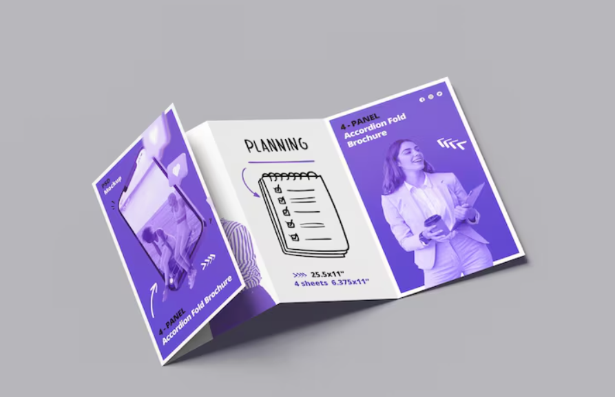
The Z-fold unfolds like an accordion, creating a continuous spread. This is the format for timelines, step-by-step processes, and instructional content. Each panel can represent a stage, a day, or a step, encouraging the reader to move through the information in a structured sequence .
The gatefold opens from the center, with two outer panels folding inward like gates. This creates a sense of drama, hiding a larger, central visual that is revealed only when the reader engages with the piece. It is a premium format, often used for luxury brands or special events .
The Forgotten Craft of Designing for the Fold
The magic of a brochure is not just in its appearance, but in its physicality. This is where the craft of the fold becomes critical.
A fold is not just a line on a page. It is a physical crease that occupies space and alters the paper’s behavior . Designers who ignore this reality create brochures that look perfect on screen but come back from the printer with text sliced by a fold line or images that bleed into the wrong panel .
For example, in a standard trifold, the three panels are not all the same width. The inside flap, which tucks into the brochure, must be slightly narrower than the cover panel. This allows it to fold flat without buckling. A designer working in thirds will produce a brochure that will never close cleanly .
Similarly, you must keep images and critical text away from the fold lines. Even a small image placed flush to the fold can, after printing and creasing, end up sliced onto the adjacent panel . This is a craft learned through experience, a knowledge of the physical behavior of paper that cannot be simulated on screen.
Why the Brochure Endures
Digital media offers speed, but a printed brochure offers permanence. It is a physical object that can be held, kept, and revisited . It removes the distraction of notifications and the friction of a webpage, creating a more focused reading experience. A brochure is a tangible commercial you can touch .
By choosing the right fold and designing with an understanding of its physical nature, you create a piece that not only delivers information but also engages the reader in a physical interaction . It is a lost art that, in a digital age, has become a powerful way to stand out.
About the Author

Peter Makeshoff
Peter Makeshoff is the founder and main author of Designer Daily.