In a world of infinite, algorithmically-driven visual noise, a poster has less than one-third of a second to perform a neurological miracle: to intercept the automatic, dismissive scroll and force a conscious pause. This isn’t about aesthetics; it’s about cognitive warfare. Modern poster design is a science of applied neuroscience, where understanding the brain’s pre-attentive processing, the visual information it absorbs before conscious thought, is the difference between being seen and being scenery.
Here is how to engineer that critical pause.
Phase 1: The Pre-Attentive Strike (0-0.3 Seconds)
Before a viewer reads a word or understands a concept, their visual system performs a rapid, involuntary scan for survival-relevant patterns. Your poster must win here.
1. Extreme Contrast: The Neurological Siren
The human visual cortex is wired to detect edges first. Maximum contrast creates the strongest possible edge signal.
- Action: Don’t just use dark and light. Use black and white. Or a single saturated color against a neutral field. A bright yellow circle on a deep blue ground is not a design choice; it’s a biological trigger. This contrast creates a “visual pop-out” that the brain cannot ignore.
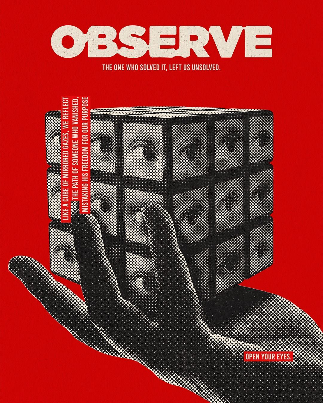
2. The Face & Gaze Lock: Hardwired Attention
We are neurologically primed to detect faces and follow gaze. A poster with a human face looking directly at the viewer creates an instantaneous, reflexive sense of being seen, a powerful interrupt.
- Action: If using a face, ensure the eyes are visible and the gaze is direct or intentionally leading towards your key message. A face looking off the poster can pull attention away from your content.
3. Isolated Singularity: The One Against the Many
The brain is a difference engine. A single red apple in a bowl of green ones is instantly spotted. This “odd-one-out” principle is your compositional superpower.
- Action: Isolate one and only one dominant visual element. A single piece of bold typography, a lone icon, a solitary figure. Every other element must be subordinate. Visual clutter is cognitive static; it gives the brain an excuse to disengage and scroll on.
Phase 2: The Hierarchical Hold (0.3-2 Seconds)
If you win the pre-attentive battle, you earn 2 seconds of conscious processing. Your visual hierarchy must now deliver the message with ruthless efficiency.
The “Flicker Test” Hierarchy:
Blur your eyes or look away and glance back. What do you see in order?
- The Primary Attractor: The element that won Phase 1 (the high-contrast shape, the face).
- The Headline: The largest, boldest text. It must be a benefit or a provocative question, not a name. “Feel Alive” works. “Summer Festival 2025” does not.
- The Call to Action/Key Detail: The essential “what, where, when” or “learn more.” It should be the second point of contrast, often through color or placement (e.g., a colored button shape).
- The Supporting Ecosystem: All other details (fine print, logos, secondary info) must be visually organized and low-contrast, forming a supportive texture, not competing for focus.
The Rule of Thirds, Recalibrated: Place your Primary Attractor at one of the four intersections of the rule of thirds grid. But crucially, use the opposing intersection or leading lines to anchor your headline or CTA. This creates a dynamic visual tension that guides the eye on a deliberate Z-path across the composition.
Phase 3: The Mnemonic Imprint: Making it Stick
A poster that is seen but not remembered is a failure. Memory is encoded through association and emotion.
1. Color as Emotional Code:
Color is not decorative; it’s semantic. Use it to instantly code the poster’s emotional genre.
- Red: Urgency, excitement, passion. (For a dance party, a political rally.)
- Blue: Trust, calm, intelligence. (For a tech conference, a museum lecture.)
- Yellow/Orange: Optimism, creativity, warmth. (For a community market, a children’s event.)
- Monochromatic/Black & White: Sophistication, timelessness, stark drama.
2. Typography as Voice:
The typeface is the poster’s tone of voice before a word is read.
- A bold, condensed sans-serif shouts with modern urgency.
- A classic serif speaks with authority and tradition.
- Hand-drawn letterforms whisper intimacy and craft.
- Crucially, never use more than two typefaces. A display face for the headline, a neutral workhorse for details. Font chaos reads as mental chaos.
3. The “Gap” Principle:
The brain dislikes unresolved patterns. If you show part of a familiar shape, letter, or face that is cleverly cropped or integrated with negative space, the viewer’s mind will subconsciously “complete” it. This act of completion creates engagement and makes the poster interactive on a cognitive level, dramatically increasing recall. Think of the iconic FedEx arrow or the CBS eye.
The Final Test: The “Thumbnail” Reality
Your poster will first be encountered as a 2cm-tall image on a social feed. Design at thumbnail scale first.
- Create your layout at 1000px wide.
- Immediately shrink it to 150px wide. Can you still identify the Primary Attractor and read the headline? If not, simplify. Aggressively.
- The final poster is just a larger, more detailed version of a successful thumbnail.
The Poster as a Neurological Event
A successful modern poster is not a placard to be posted. It is a designed neurological event, a precise sequence of visual stimuli engineered to hijack attention, guide processing, and embed itself in memory.
It operates on the logic of the meme and the efficiency of a traffic sign. It understands that in the economy of attention, you are not competing with other posters. You are competing with TikTok, breaking news alerts, and the internal monologue of a passerby. To win, you must speak in a faster, clearer, more primal visual language than everything else in the room.
Stop designing for viewers. Start designing for visual cortices. Your 0.3 seconds start now.
About the Author

Peter Makeshoff
Peter Makeshoff is the founder and main author of Designer Daily.