
It started as a quiet irritation, a minor visual tic. I saw it in a logo, a poster, a website, and I thought it was a mistake. The letters were overlapping, the lines were breaking, the boundaries were dissolving. It was a new kind of visual style, and I did not like it. I assumed it was a passing fad. I waited for it to fade. It did not. The trend I hoped would die kept showing up, in more places, with more confidence, and eventually, I realized it was not going anywhere.
The Trend That Refused to Fade
The trend was the deliberate use of visual distortion, of breaking the rules of legibility and clarity. It was the use of “vaporwave,” “Y2K,” and “dirty” design. It was the revival of early internet aesthetics, the embrace of “digital decay” as a deliberate style. It felt like a step backward, a rejection of the craftsmanship and clarity that I valued.
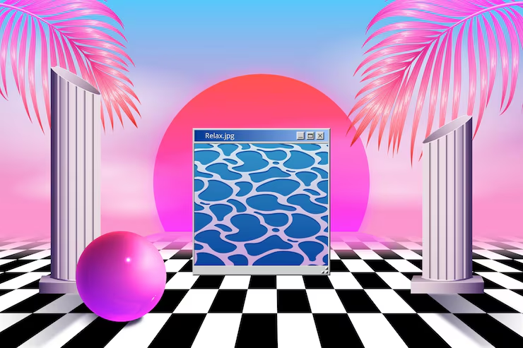
I was not alone in my dislike. I was not alone in my hope that it would disappear. There was a small group of designers who shared my frustration. We exchanged articles, examples, and complaints. We were convinced that the trend was a sign of decline, a loss of standards, a failure of taste.
But the trend persisted. It grew. It evolved. It became more sophisticated. It moved from the margins to the mainstream. It appeared in advertising, fashion, and even in the branding of established companies. I could no longer dismiss it as a temporary aberration. It had become a significant part of the visual language.
The Realization
The turning point came when I realized that my dislike of the trend was not a criticism of the trend. It was a criticism of my own assumptions. I had assumed that good design had to be clear, legible, and polished. I had assumed that the role of the designer was to remove friction, not to create it.
The trend that I hoped would die was not a rejection of design. It was a rejection of my definition of design. It was a reminder that visual communication is not a single language, but a family of dialects. It was a reminder that the rules of design are not universal truths. They are conventions that change over time.
The trend that I hoped would die was not a failure. It was a provocation. It challenged me to think about design differently. It pushed me to consider the value of imperfection, the power of nostalgia, and the role of emotional resonance in design.
The Lesson
The lesson was not to embrace every trend. The lesson was to recognize that design is not about following the rules. It is about understanding them well enough to decide when to break them. The trend that I hoped would die was a reminder that design is a conversation. It is a dialogue between the designer, the audience, and the culture. Trends are not good or bad. They are responses to the cultural conditions in which they emerge. They are signs of what people are thinking, feeling, and wanting.
The designer who dismisses a trend without understanding it is the designer who has stopped learning. The designer who studies a trend, even one they dislike, is the designer who continues to grow. Trends are not just visual styles. They are cultural signals. They tell you what people are paying attention to. They are worth listening to.
The Bottom Line
The trend I hoped would die did not die. It taught me something. It taught me to be more curious and less certain. It taught me that my job is not to judge trends but to understand them. The designer who can see the value in what they do not like is the designer who will continue to evolve. The trend is not a threat. It is an opportunity. It is a chance to learn something new, to see the world differently, and to grow.
The trend that refused to die was not a failure. It was a lesson. It was a reminder that design is not about being right. It is about being open. The trend I hoped would die did not die. It made me a better designer. It showed me that the best way to deal with something you do not like is not to ignore it, but to understand it.
About the Author

Peter Makeshoff
Peter Makeshoff is the founder and main author of Designer Daily.