A website layout is a pattern (or framework) that specifies the structure of a website. Its function is to structure the content on a website for both the website’s owner and the users. It provides obvious routes for navigating inside websites and prioritizes the most critical parts of a website. A plethora of websites gleam with color, vibrant graphics, and valuable material. But what remains when color, movies, pictures, and substance are removed? When you get down to the fundamental bones of a website, you’ll see that it’s the layout that actually pours brilliance into the website.
Many designers assume that the web layout for each site they work on should be entirely unique to meet the project’s objectives; however, this is not the case. If you look at popular websites, you’ll find that many of them have a similar design. This isn’t through chance or laziness; it’s because certain layouts offer major advantages. As you read the list, keep in mind that each site succeeds in its own manner and strives to fulfill a certain goal. While one site could be a great example of aesthetic design, another might be a great example of interactivity.
Create the layout/look for a layout that fits the message you want to send. Sections should be linked together to form a full tale. Each link in this chain represents a new chapter in your story. Finally, every website has a grid structure that lies beneath the website design. These columns and rows organize your material and direct the user’s gaze around the page. You may construct a variety of various methods inside these grids. Every website has an underlying grid on which the layout is constructed by the designer. Here are a few examples of website layouts:
Single column layout
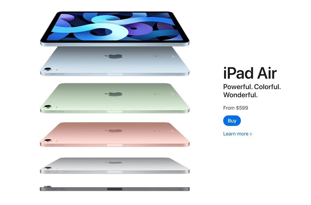
Despite being the most straightforward style available, it has gained in popularity substantially since the rise of the mobile web. Because the website may utilize the same design on smartphones, tablets, and desktop computers, development time is reduced.
This theme is used in many personal blogs that adhere to minimalistic design principles. This is a typical web design layout. Furthermore, single-column layouts work well for generating a pleasant reading experience since they focus the user on the information without any distractions on either side. That is why the blogging platform Medium uses it for all of its posts.
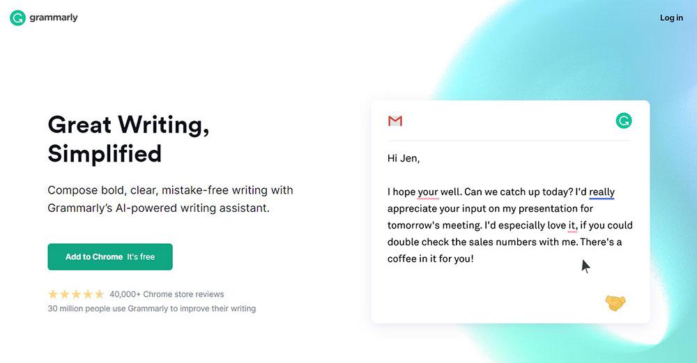
Split screen
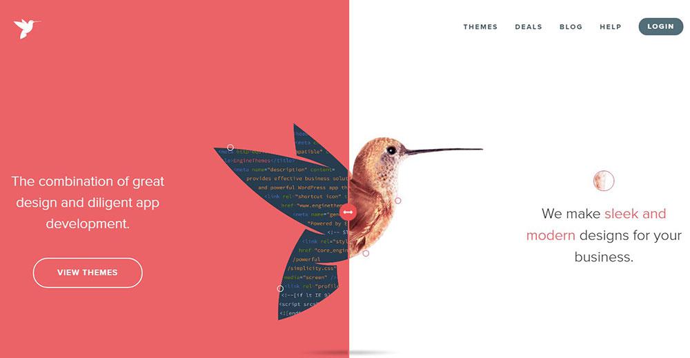
A split-screen (or one screen divided in two) web layout is ideal for a page with two important pieces of content. It enables designers to show both objects at the same time while giving them equal attention.
Split-screen layouts are ideal when your site provides two dramatically different user journey variants, such as two distinct sorts of instructions. Split-screen designs do not scale well as the material expands, so avoid using them if you need to give a lot of textual or graphic information in split parts.
Asymmetrical layout
The absence of equality between two sides of the layout is referred to as asymmetry. Asymmetry has long been a prominent approach in the art world, and it has lately gained popularity among designers when building website layouts. The designer encourages the user to stay visually engaged by altering the width, size, and color of each asymmetrical bit of content.
Often people confuse asymmetry with imbalance, although asymmetry aims to achieve balance when using equal weight for two portions is either impractical or undesirable. Asymmetry allows for the creation of tension and dynamism, and it enables improved scanning behavior by concentrating a user’s attention on specific items (focal points).
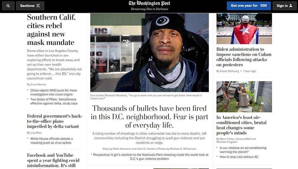
Content-focused layout
On news sites or blogs, web designers frequently employ the content-focused style, which typically features a major column for text and one or more side columns for supplemental information.
This style has the advantage of allowing you to adjust the line length of the core content by altering the width of the side columns. This is significant because if the text’s line length is too long or too short, it becomes difficult to read, decreasing understanding and memory of the information.
When done correctly, however, the content-focused layout is perfect for any copy-centric website. The key is to divide the material in this layout into little, easy-to-digest pieces.
Fixed sidebar
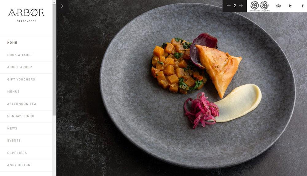
The main menu is the first thing most people look for when they want to browse a website, therefore it’s important to get it right. In addition to top-side horizontal navigation, menu choices may be kept visible by putting them in a fixed sidebar. The sidebar is a vertical column on the page’s left or right side. The sidebar remains fixed and constantly visible in this web layout, but the rest of the page changes when visitors scroll down the page. This way, navigation is still possible. This is something that you usually see in photography website templates so you can browse the catalog of photos quickly.
A grid of cards
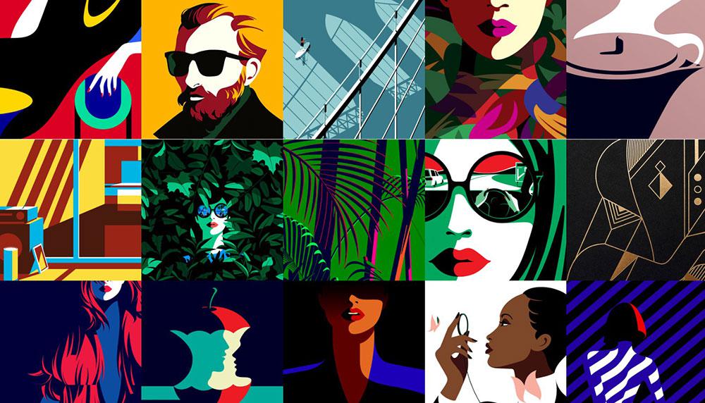
Cards are excellent containers for clickable information because they enable designers to show a large amount of information in a digestible fashion. Visitors may discover the material they want by clicking or tapping on a card with a bite-sized preview (typically a picture and a brief description).
The most significant aspect of a grid of cards is that it is virtually endlessly manipulatable. Grids can vary in size, spacing, and several columns, and card styles can vary depending on screen size (cards can be rearranged to fit any screen). Cards perform so well in a responsive grid layout because of this.
Boxes
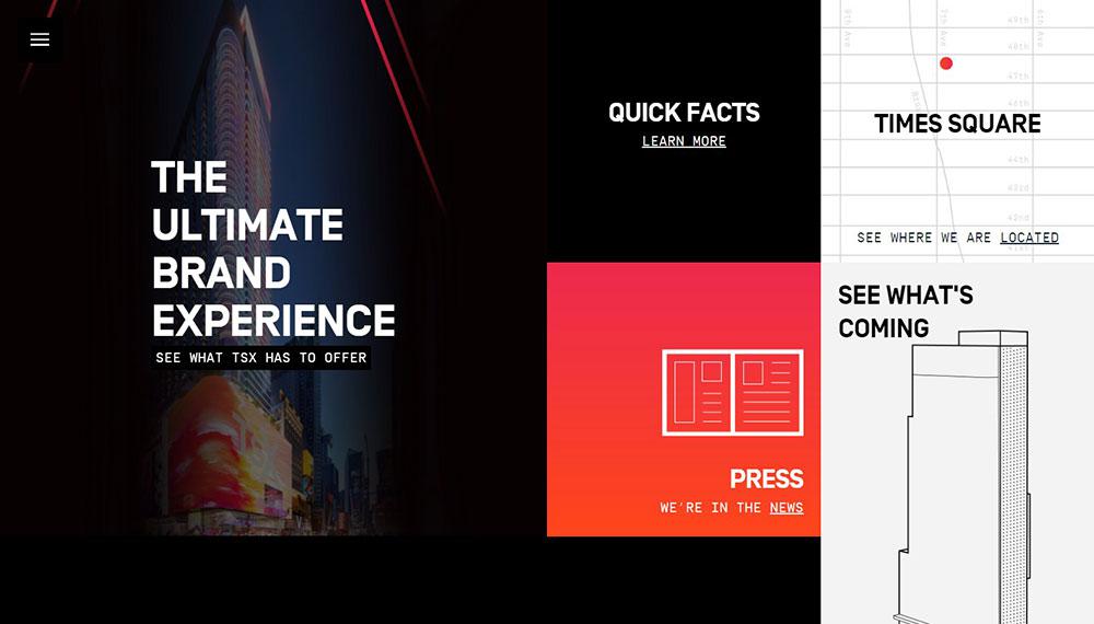
This style has a huge header-width box and several smaller boxes, each of which takes up a fraction of the larger box’s screen real estate. The number of smaller boxes might vary between two and five. Each of the boxes might be a link to a larger, more complicated page. You generally see this layout on furniture WordPress themes or other sites that want to present just a few products in a grid-like structure.
Magazine layout
The magazine layout, as it is presently seen, is a mixture of several different styles, all of which serve to give the news a regal atmosphere.
As the name indicates, this layout technique is commonly used in magazines or news sites to display a variety of various articles. They are inspired by print layouts and allow for the use of headlines and images to introduce content. That may be a fun way to present what is simply a list of links.
Full-screen layout
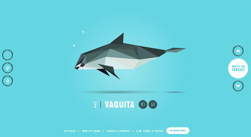
Full-screen layouts, as the name implies, fit on a single screen and do not need the user to scroll. As a result, they are great for storytelling or presentations.
Full-screen layouts work best when complemented by strong visuals. As a result, they are an excellent choice for websites with a lot of photography, graphics, or video. Not that you have to strictly adhere to the single screen method.
You should also think about how the layout will adapt to different sizes. Will the full-screen method, for example, work on a mobile device? Also, would graphics crop or just decrease as the screen size changes? At lower sizes, you can readily identify the focus areas of photos that have been cropped out of the viewing area.
F-shape layout
This website style was developed based on how consumers read material on the internet. According to the F-shaped scanning pattern, people generally scan large blocks of material in a way that resembles the letter F or E. Our eyes begin at the top-right corner of the page, scan horizontally, and then drop down to the next line and repeat until we find anything that piques our interest (interesting content). This scanning behavior applies not just to desktop users, but also to mobile users.
Alternating layout
The alternating layout pattern is one of the most prevalent on the internet, and you see it in restaurant and café websites, sales tools, or any other SaaS, corporate sites, and more. It is composed of a succession of content blocks, each of which has a two-column layout. Typically, the blocks have an image on one side and text on the other.
The fact that the picture switches sides is what gives it its name. As a result, the first block will have content on the left and an image on the right, while the following block will have the opposite layout. It is a layout technique that is very useful for describing the characteristics or benefits of a product.
Radial symmetry layout
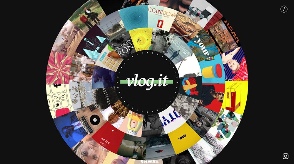
Radial symmetry is a less prevalent form of layout. There is a center point from which linked objects radiate in a rounded shape.
To do this, you must first understand your target audience’s behavior, requirements, and expectations, and then craft a suitable message that fits well on a layout. The layout’s duty will be to make the message stand out and be so persuasive to the users that they can’t help but accept it.
About the Author

Bogdan Sandu
Bogdan is a designer and editor at DesignYourWay. He's reading design books the same way a hamster eats carrots, and talks all the time about trends, best practices and design principles.