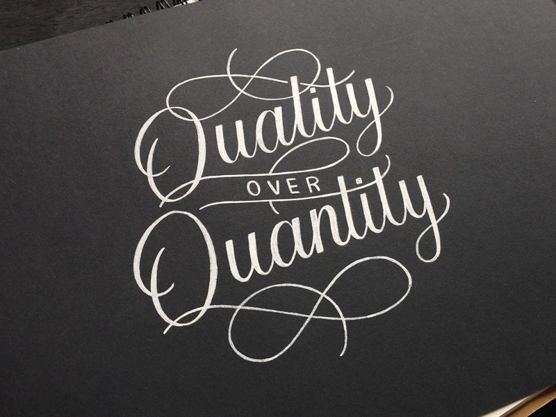
Hand drawn typography has grown into a field of its own. Illustrators, designers and letter artists are working with multimedia to make their own contributions to this growing trend.
From traditional sign making long used by local communities, to illustration used in publishing, hand-drawn typography creates a sense of creativity, uniqueness, and playfulness in illustration and design.
Creating your own lettering, even if it’s just simply by doodling, can be a creative form of expression. However, with all of the potential opportunities in this field, creating your own lettering is a means of developing your own skills.

There are many different techniques that experienced typographers use in their graphic design projects. This is because typography is an art and a science, with rules or formulas which create effective pages which are intuitive to readers.
When creating your own hand-drawn letters or fonts, follow these basic rules to help your page look both unique and effective.
You can always download free handwriting fonts from an article or another, but it delivers a bigger satisfaction to actually create one.
Inspire yourself from the best work out there
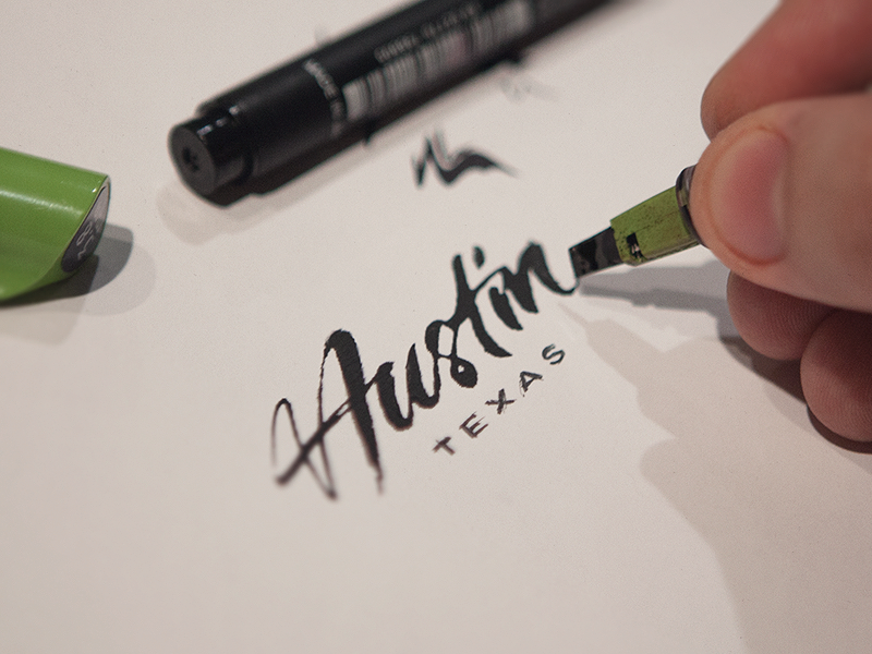
When you create your own lettering, it is different than handwriting. Instead, you are drawing or illustrating your font.
To do this, it is helpful to create a folder of inspirational ideas. You can explore the work of other lettering artists too.
Many publish their work online, so you could always browse Pinterest or YouTube to find inspiration.
Create a formula for your lettering
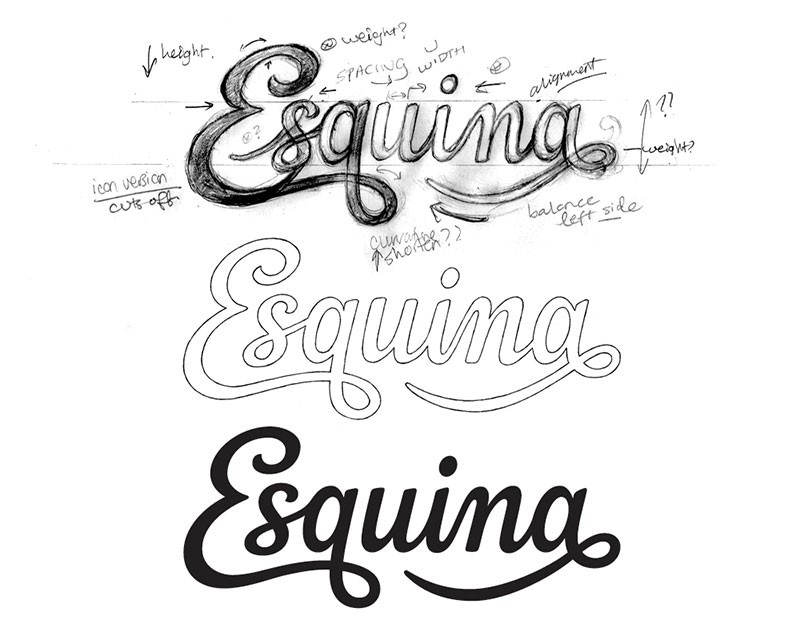
When you create and design your own lettering, begin by measuring the height and width of the letters you will use on your page.
This will depend on the design of our letters and how you would like to lay them out. Some fonts are small and wide, while others are narrow.
Many designers use a ruler to layout the type on their page, making lines around the letters they are inspired by to show the width or height.
These measurements are then transferred to a page where the designer begins to experiment with his/her own font designs.
Use shapes to map out your page
When creating the space for a font, designers often map their page using empty shapes. Thus, a large rectangle may be used to represent the space where a headline will eventually go. Speech bubbles create spaces to be filled by text.
These shapes give an indication of the length or height you’d use for your fonts. However, hand-drawn letters do not have to be constructed in straight lines and can vary in height or curve in wave format, depending on the design.
Use different sizes to create hierarchy
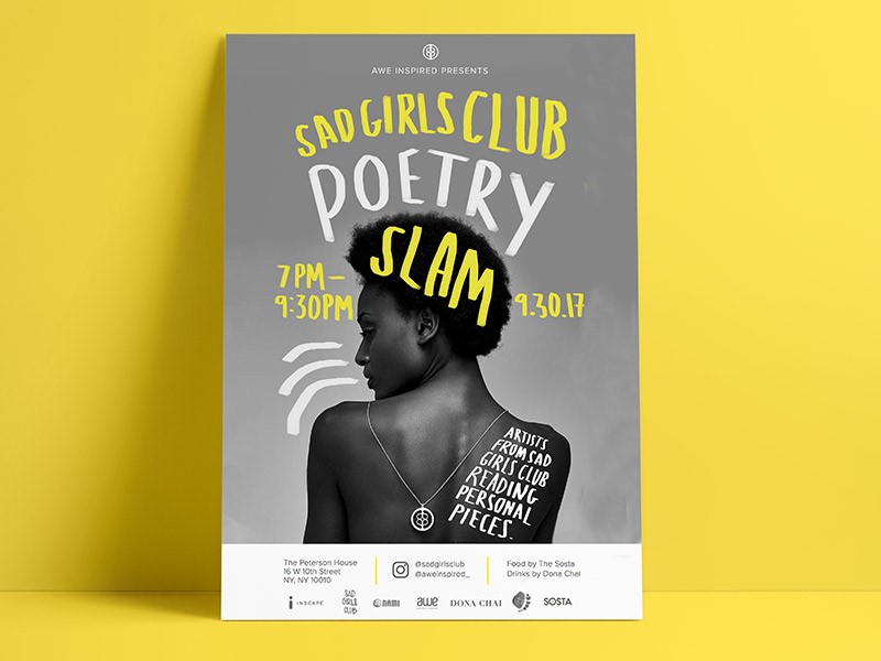
When you design your letters or fonts, you can use different sized fonts for different words, depending on importance.
This is an easy way to create hierarchy, or evaluate the importance of a message. You can shrink unimportant words such as ‘and’ but then increase the size of important words in order to grab your reader’s attention.
Once you have placed your words on the page, you can adjust or resize them as you go along. If you’re drawing by hand, this requires a pencil and eraser. Gradually, a sleek, clean-lined page will begin to emerge.
Focus on consistency

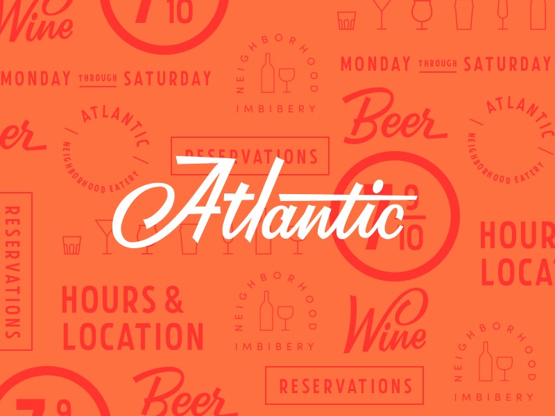
When you are working on a larger project, it’s helpful to make sure the different aspects of your design are consistent. If you create a brand logo, for example, it has to be exactly the same in all areas of the project.
In order to create identical lettering, you can create a stencil. If work has been done already, make careful reference, as even slight deviations can make a project look messy. Top level designers work with a consistency which creates a fluid flow across the page.
Do your research
If you’re creating typography by hand, this often creates a historic or vintage element. Do some research before you get started.
Many contemporary logos use vintage style (exploring what is already out there enables you to set yourself apart).
However, you could also draw on historic images or references in order to create an interesting font. You could also look at how people used fonts or lettering in years gone by in order to create the mood of the era.
Once you know what you would like to achieve, go out and sketch! Create more than one design, exploring what works best and refining it until you are happy with the result.
Pay attention to the message your typeface is communicating. Explore how many different fonts you would like to use in your design, and how to pair them with each other.
Look at your layout, and how you would like to place your different fonts and how this fits in with the mood or historical element you are portraying.
Transform with Photoshop
Once you’ve created your font, import your design into Photoshop. Your next step would be to change your design from a colored photograph to a high contrast black and white image. Using Photoshop using greyscale mode.
Choose image > mode > Grayscale
Alternatively, click Layer > Adjustment Layer > Black and White
Within the same menu you can select from:
Levels: Use the highlighted eye drops on the left of the menu. You can use the white dropper to define the pure white parts of your image, and the black dropper will define pure black aspects.
Brightness and Contrast: This can help you to contrast various aspects of your image in a manual way. You can adjust these two factors until you achieve a high contrast between light and dark.
Selective Color: Use this to define the texture of your image. Play with the amount of black you would like within the image in order to achieve a high level of contrast.
Polish your image using Illustrator
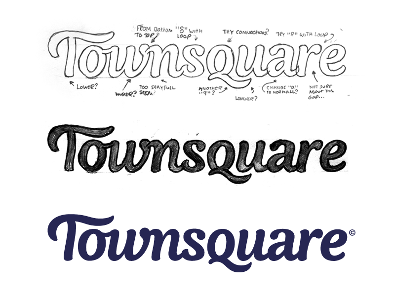
Once you’ve created your rastor image, you will need to turn it into a vector using Illustrator.
You will need to import the high contrast image into Illustrator. Make sure it is selected and then use Image Trace. You will be able to create a vector sketch from your design. You can then tweak your image to be as sleek or messy as you would like.
Once you have created your vector, you can make some final changes to the style. You can expand the object and Ungroup it in order to access the anchor points of your vector. Using the toolbar, you can add, delete or move these anchor points.
If you’d like your work to be very sleek in order to use it as a logo, you can tighten it up in order to create smoother lines.
Summary
These helpful tips will assist you to create hand-lettered fonts which can be used with consistency, giving a touch of creativity and uniqueness to your graphic design pages.
About the Author

Bogdan Sandu
Bogdan is a designer and editor at DesignYourWay. He's reading design books the same way a hamster eats carrots, and talks all the time about trends, best practices and design principles.