Data is extremely important in the digital era, and the new tools we have for gathering and combining data are vitally necessary for things to function properly. In reality, the web is constructed on data, with the primary goal of making all of the world’s knowledge widely available to everybody.
Businesses are eager to leverage data to gain a competitive advantage, but all the data in the world won’t help if your stakeholders don’t grasp it, or if their eyes glaze over as you give your highly insightful research.
It’s difficult to gain clear insights from a flood of figures and statistics. You must have the facts presented in a logical, easy-to-understand format so that you can effectively apply your learnings. This is where data visualization comes into play. Infographics have just lately entered our lives as a tool for improving user experience in website design.
This post discusses key techniques for displaying data as well as strategies to guarantee that your data visualization is effective along the process.
Keep it simple
The use of simple English will make your analysis more understandable to everyone, including those who are as immersed in the jargon as you are. Nobody has ever read a simple line and thought to themselves, “Well, that was too simple to grasp.” Jargon and acronyms, which are frequently employed in government, have the potential to alienate individuals.
Anyone who has seen corporate reports will be accustomed to multicolor pie charts and graphs, which frequently employ whatever colors are selected by default in a template or even in a website’s color palette. This is a missed chance to capitalize on the narrative potential of color — the key component upon which our sense of sight is built.
You could try getting a WordPress table plugin to help you with that, assuming your website is on WordPress. They come out of the box with various settings that can help you create WordPress charts and tables that look better than anything else out there.
Design for a Specific Audience
Within data, visualization is used to illustrate patterns, offer context, and describe relationships. While a designer has no control over the patterns and relationships within a given collection of data, she may pick how much data to present and what context to provide based on the audience’s demands. After all, a visualization, like any other product, is useless if the user cannot use it.
Before creating the visualization, consider what the audience will be searching for in the chart. Recognize your audience’s needs and preferences. Learn about their history. When producing successful and attractive data visualizations, keep your viewer’s information demands in mind.
Recognize That Presentation Matters
The first step in presenting data is to recognize that how you display data matters. Analysts frequently believe they are not being heard by stakeholders, or that their analyses or suggestions are never implemented. The issue is that if you don’t communicate facts properly to business users, it’s quite simple for them to tune out.
Don’t Scare People with Numbers
Analysts enjoy numbers. But not everyone does! Many of your stakeholders may be intimidated by numbers, data, and charts. However, when presenting statistics, there are a few simple things you can do to make numbers appear more “pleasant.”
The number of decimals “required” depends on the range of your data. You don’t require two decimal places if your results vary from 2% to 90%. On the other hand, if your numbers are near (for example, all values are within a few percentage points of each other), it’s critical to include decimal places.
Be Particular With Your Formatting
Some somewhat more complicated layout adjustments can assist direct readers down the page more effectively and keep them intrigued. Creating a hierarchy of your content is one of the most significant examples — the most important ideas and words should be at the top as headlines or brief sentences. They should be larger than the rest of the text, and a tiered approach should be used to proceed down the page to the least critical information.
It’s also a good idea to use subheadings to segregate material, place text in dot points to make it easier to read, use strong paragraph breaks, and bold or highlight significant terms as appropriate.
Use Videos to Display Data
Numerous videos on the internet these days are essentially footage of individuals chatting with little or no props. Frequently, this is simply a multimedia reproduction of an existing article.
The reason why people choose to watch a video on a topic rather than read about it. Even if watching the video takes the same amount of time. As long as it takes to read the text. Many individuals see reading as extra work and choose the easier choice.
Take Advantage of Imagery
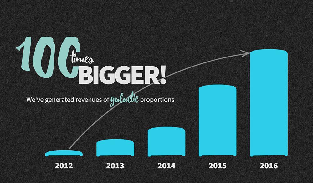
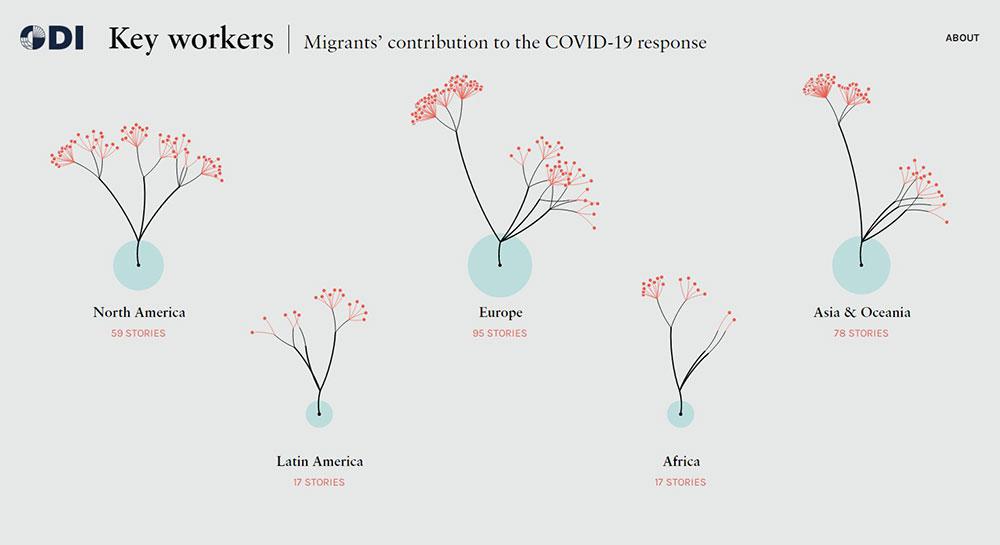
People often say a picture is worth a thousand words. This is certainly true when attempting to convey complex topics or transmit enormous volumes of data. Graphs and charts are not the only forms of visual representation. Infographics are incredibly popular methods for delivering facts in a more interesting and engaging style. These are frequently utilized as a part of a website’s content marketing and SEO strategy.
Informative and engaging infographics may be readily shared and uploaded on other websites, resulting in backlinks to your homepage. The natural process of members of the public sharing infographics illustrates the efficacy of transmitting facts in this format.
Less Is More
Your website could be the central location for all of your company’s information, but it’s necessary to keep in mind that you don’t want your viewers to become distracted and leave your site.
Before choosing the pages that will be featured on your site and the material that will be included, it is critical to consider what information is truly necessary for your consumers to have. The concept of “less is more” definitely applies here, as you want to stay professional while communicating all of the necessary information.
Directly Label Data Points
A great number of designers rely on legends to explain to readers which symbols or colors in their charts represent which data series. Legends, although simple for the creator, is difficult for the reader. They make readers glance back and forth between the legend and the facts, putting undue strain on their working memories.
A preferable option would be to label the data series directly on the chart. It’s frequently more difficult, but hey, you’re the designer. It is your responsibility to do the work so that the reader does not have to.
Design for comprehension
After you’ve finished your visualization, take a moment and analyze what basic features may be added, changed, or eliminated to make the data easier to grasp for the reader. You could want to add a trendline to a line chart, or you might notice your pie chart has too many slices (use 6 max). These few adjustments make a significant effect.
Use Visual Salience to Focus Attention and Guide the Experience

Visual salience, or the ability of a visual piece to stand out from its surroundings, is a significant technique in data visualization. It may be used to direct the user’s attention to the most significant information in a visualization, aiding in the prevention of information overload.
We may make our designs clearer and easier to understand by employing visual salience to emphasize some aspects and conceal others. A few visual variables—color and size, primarily—are our keys to creating and controlling visual salience.
Differentiate Numbers with Color
Often the simplest answers are the best. If you are showing a vast amount of data that is constantly changing. Colors can assist to highlight changes at a glance.
This helps the reader to immediately identify changes in odds and grasp the market’s overall tendencies. Finance and stock market websites, such as Google Finance, take a similar strategy. Typically, red denotes a negative tendency in stock prices. When they become green, it means their worth is rising.
Remove anything that doesn’t support the story
This does not imply that you eliminate half of your data points. However, please bear in mind things like chart clutter, additional writing, needless images, drop shadows, ornamentations, and so on. The beautiful thing about data visualization is that design may assist to improve and tell the story.
Choose the right data visualization for your data
This is one of the most important data visualization tips. There are several visualization graphs available. However, selecting the proper one is critical to clearly show the essential trend in the data.
Choosing the proper graph for your visualization will also ensure that the message is easy to understand and that the viewers are drawn to your work. Each graph serves a distinct function, therefore it is important to understand when to utilize which graph.
Choose the chart that tells the story
There could be more than one approach to appropriately show the data. Consider what you’re attempting to accomplish, the message you’re conveying, who you’re attempting to reach, and so on.
Don’t Mix Chart Types for No Reason
Avoid and don’t combine chart kinds just for the sake of it. When data sets are presented together, they should convey a story or offer insights that would not be feasible if they were presented separately.
Unfortunately, far too many charts involve squeezing numerous data series onto them just to save space for adding another chart. The issue is that as soon as you combine those two sets of data, your end customers will believe there is a link between them.
Watch your placement
You may have two excellent stacked bar charts that are supposed to allow your reader to compare points, but if they are too far away for the reader to “understand” the comparison, you’ve already lost.
There are several methods for displaying data on a website. The most effective techniques, though, are to make the information intriguing. Attractive and easily recognized at a look.
It’s often attractive to create a beautifully detailed, delicate, exploratory representation, but that’s generally a poor strategy. Let the audience’s knowledge and goals govern whether and how much data should be included, and curate the data to create the story you want to portray.
About the Author

Bogdan Sandu
Bogdan is a designer and editor at DesignYourWay. He's reading design books the same way a hamster eats carrots, and talks all the time about trends, best practices and design principles.