Many people are choosing to sell products online as it is now easier than ever. When designing and maintaining an online shop you should focus on the shopping cart as one of the main areas of importance.
Having a checkout that runs smoothly and is easy to access is by far the most important element within a successful e-commerce site.
Having a well-designed e-commerce website is all about getting trust from the customers and it is for this reason that the checkout area on the payment page needs to be very secure and well-designed.
A well designed and simple layout will make the customer feel more at ease when they enter their payment information and their private details.
The problem with an e-commerce website is that if they are too vague and unwelcoming they can drive customers away. This mostly happens when the web development company handles the UX as well. Shop owners then risk losing over half of all their customers. So how do you make sure that your shopping cart is well tweaked to all the potential customers? For starters, let UX designers handle UX. Still, here are a few guidelines on designing the checkout interface.
Registration should be optional
The benefit of registration is that they can allow one the ability to gain information about their customers. However, this may deter new customers from using the website and will stop sales of products from taking place.
The best websites really will give the customer the choice of whether they want to register or not as many people do not enjoy sharing their personal information but may still wish to buy the products on the website. The annoyance of having to fill out a registration form is a danger of putting the customer off for life.
So how does one get a customer to register without intruding on the purchase? One method is to ask the customer if they wish to register once they have made the purchase by offering them a set of forms to fill in. This may be as simple as a username and password.
The single-page checkout
The trend these days with the modern checkout design is to have a single page checkout which is easy to understand and quick to fill out.
These are the most popular ways to purchase orders as multiple columns have shown to confuse and deter customers from making the initial purchase.
Once you have a single page flow in your checkout area of the site, you are much more likely to get your customers purchasing the products that they want to buy.
If you’re using WooCommerce and you want to enable this functionality, look through the best WooCommerce plugins. There surely is one that has this one built in. If you’re using Opencart or something else, you might need to look into their guides to see if they have a solution for this.
Have a back button in the design
It can be a very good idea to have a back button in the checkout process. If this is not implemented, when the customer chooses to go back on the process they may get an error message which will cause frustration and problems for the purchase. Having a back button allows the customer the ability to check their details.
If a back button is not implemented and the customer gets an error message, they are likely to give up on the whole process altogether.
Optimize for mobile
Many web designers forget that customers often use their phones to browse websites and may use this device to purchase products that they find online.
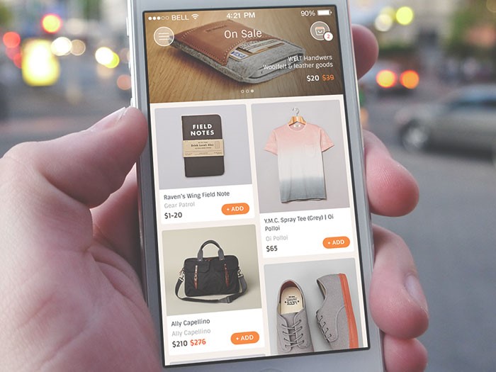
However, many websites are not optimized for mobile devices and will not be able to sell products to the customer in this way. In order to maximize profits, the individual needs to make sure that their website can work on many different mobile devices. This often means cutting back on the design of the site for mobile devices by removing input fields and focusing on the essentials.
A checkout on a mobile device should also be as simple as it is on the web and should not try to make the customer register for the site before they make their purchase. You should constantly do tweaks to the whole buying process and make sure everything is as smooth as possible for the end user. Look into web application testing to streamline your optimization process instead of doing things oldschool.
Set the shipping address as billing address
It is always a good idea to combine the shipping address and the billing address to make things simpler for the customer as they will often be making a purchase from home.
By doing this the checkout form becomes simpler for the customer and they will quickly understand that their shipping address is also the billing address by default.
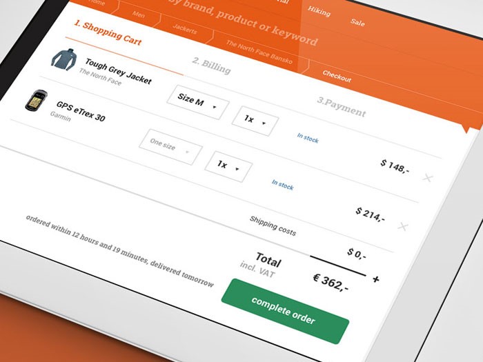
Display all cart items
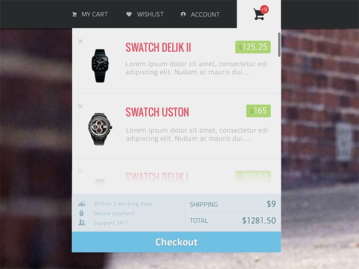
It is important to clearly show what the customer has bought when they are at the checkout stage of their purchase. This is also important if you are offering a special type of shipping such as express delivery.
If you are in any way unclear about the purchases that customers are making at this stage, they may very well abandon the purchase and give up completely on the website.
Trust is vital
Trust is one of the most important elements in a website as an individual has never even met you and is trying to make a purchase of a product that they need.
However, the good thing is that online shops are becoming more and more popular as one of the main ways in which to buy products while security and design are also developing at a rapid rate. Just as in the real world, there is always the possibility of data being lost or stolen. However, these situations are rare.
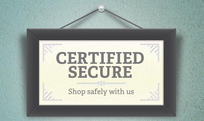
Keeping the customer feeling safe and confident is the key goal and this can be done by offering a more personal experience. Showing phone numbers and other easy ways to contact the shop is always a good idea.
Another good idea is to have trust signals which can be placed throughout the site. These are simply symbols that have been designed and state things that will keep the customer feeling safe and secure.
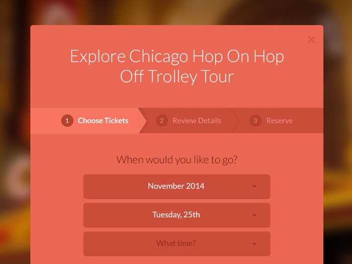
Use progress trackers
A well-designed checkout page will give the customer the information they need in order for them to feel safe within the checkout process. In this situation, a progress tracker is used to show the customer exactly what stage they are at with the checkout process so that they know how much further they have to go until the order is completed.
Use descriptions for your form fields
There will also be many moments when one will need to enter information regarding personal information such as the email address. Some customers will understand what this information is needed for. However, others may need a small description which can either be on the show or hidden behind an arrow button to explain what the information is used for.
Use only relevant fields in your forms
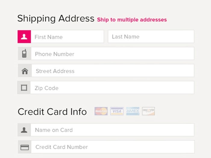
It really is a good idea to avoid as many forms as possible and stick to the bare essentials as customers often feel like their personal information is invaded.
This technique can be seen in some of the bigger websites, which always stick to the minimal amount of forms, allowing customers to quickly enter the information and make a purchase without unnecessary hassle.
Avoid multi-columns
It is also a good idea to avoid multi-columns as these can confuse the customers when they least expect it. The customer wants to enter their data quickly and does not want to spend on time and energy on forms that they don’t understand.
The problem with having several columns on one page is that users begin to wonder whether these columns are related and this begins to bring confusion to the user.
Consider closed checkouts
The final thing to make sure when setting up an e-commerce site is to make sure the customer fully understands what they are purchasing and how much they have paid for that product. It is important to outline any other costs when the customer makes their purchase so that they know exactly how much they are spending.
Finally, the customer should feel completely confident that their purchase has been processed and that it is on the way to them. Once they feel this, they are likely to rely on the website for more product purchases in the future.
About the Author

Peter Makeshoff
Peter Makeshoff is the founder and main author of Designer Daily.