Website visuals aren’t just for show; they’re the backbone of the entire user experience.
When I sit down to design a website, the visuals aren’t an afterthought – they’re a priority. They’re what grabs the attention, stirs emotion, and keeps users hooked. It’s the melody to the lyrics, the style to the substance.
We’re in a world that’s rapidly becoming more visual by the day. From the snap-happy culture of Instagram to the animated madness of TikTok, it’s clear: our eyes are always hungry for more.
It’s a world where seeing is not just believing, but also engaging, sharing, and converting. So, trust me when I say, visuals are more than just “nice to have” – they’re a “gotta have.”
The Basics of Effective Visual Design
Aligning with Underlying Design Rules
There are underlying rules of design – stuff like contrast, alignment, repetition, and proximity.
For example, ever noticed how certain colors just pop together while others feel, well, off? That’s color contrast doing its magic.
Addressing Target Audience Needs
Understanding who the site is for, what they need, and how they think is paramount. Let’s say you’re designing for skateboarders; they’d probably appreciate edgy graphics and bold fonts.
But if your audience is for a meditation retreat? Probably best to keep things serene and minimalist.
The Balance Between Aesthetics and Functionality
Looks great, but where’s the functionality? The magic happens when website visuals don’t just look great but also elevate the user experience.
Beauty and brains, my friend. That’s the combo to aim for.
Oh, and pro-tip? Always keep mobile design in mind. The world’s gone mobile, and you don’t want your visuals to look all wonky on a smartphone.
Types of Effective Visuals for Websites
Dynamic Elements
Intuitive user interfaces
An intuitive user interface is about making sure that when someone visits a website, they instantly “get it.” No confusing buttons, no hidden menus, just smooth sailing.
The right website visuals ensure that users feel at home, knowing where to click without even thinking about it.
Interactive elements
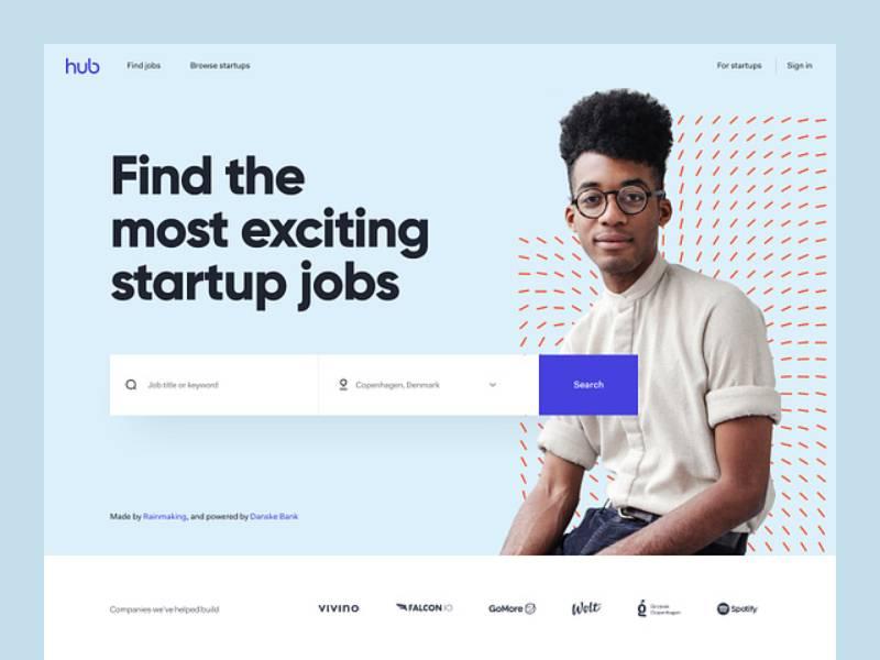
Ever been to those sites where stuff moves, changes, or even dances around as you interact with it? Those are interactive elements. Think of them as the toys in the digital playground, especially useful for startup landing pages.
Interactive elements like sliders can play a crucial role in enhancing the user experience on a website.
These sliders showcase the best products or services, allowing users to easily explore different options with a simple swipe or click.
Sliders are not just fun; they’re functional, providing a dynamic way to present information and guide visitors to the content you want them to see.
So, when designing your website visuals, don’t forget to consider the inclusion of engaging interactive elements like sliders to keep your audience engaged and informed.
Background and Atmosphere
Wallpaper-like backgrounds
Your website’s background sets the mood. Remember setting a wallpaper for your first phone or laptop? It’s kinda like that, but for everyone who visits.
A calm ocean might give off chill vibes for a meditation site. A bustling cityscape? Perfect for an urban events page. The right wallpaper-like background tells a story even before the words do.
Textured backgrounds
That’s where textured backgrounds come into play. Maybe it’s a subtle grain, a soft gradient, or a faint pattern that almost looks hand-drawn.
These textures add depth and character to the website visuals, making them feel more tangible, almost touchable.
Typography and Branding
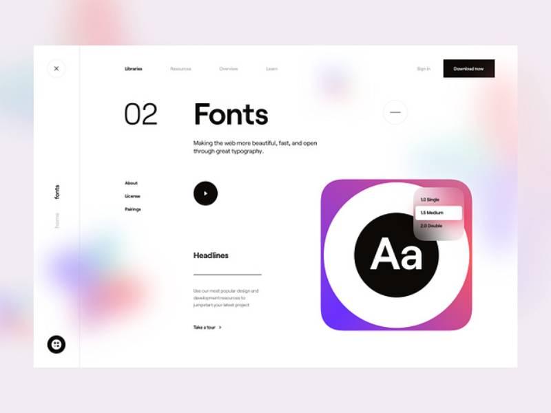
Expressive typography
Fonts, they’re not just letters; they’re personalities. A bold, chunky font screams confidence. A delicate, scripty one? Elegance all the way.
Expressive typography ensures that the way words are presented resonates with what those words are saying. It’s like matching the right voice to a song.
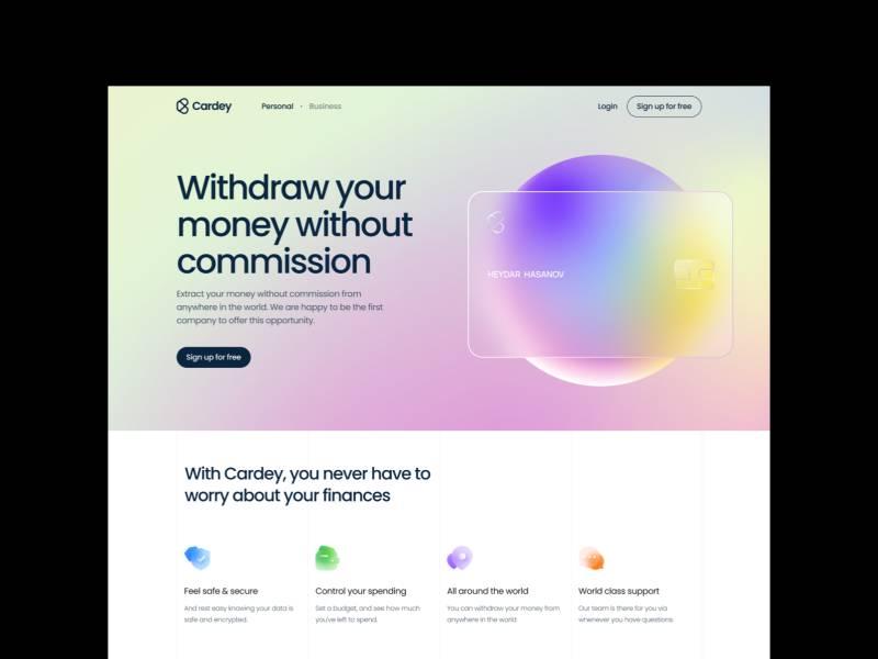
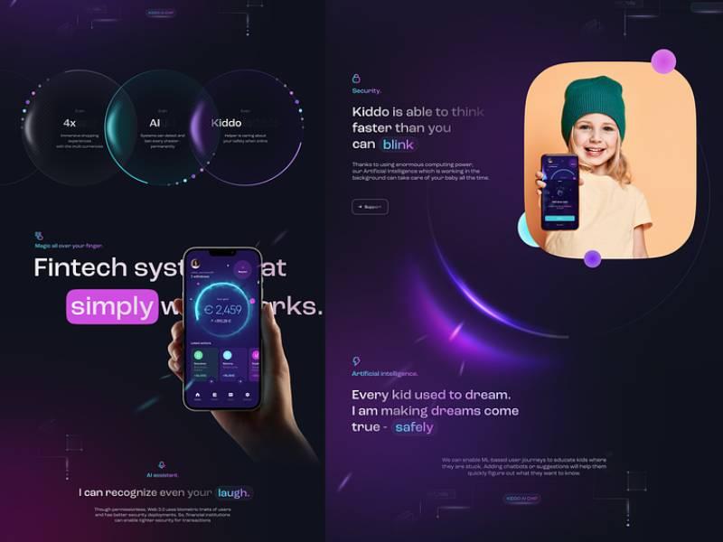
On-brand color schemes
Colors, oh man, they’re the silent communicators. They can make us feel warm, cool, excited, or calm. And for a brand, colors are like its fingerprint.
An on-brand color scheme ensures that the website visuals are instantly recognizable, oozing the brand’s vibe.
Think McDonald’s red and yellow or Spotify’s distinct green. Instant recognition, instant connection.
Whether you’re aiming for a vibrant and youthful look or a sophisticated luxury color palette, the colors you choose play a pivotal role in shaping the perception of your brand.
Multimedia Integration
Natural photography
Nothing beats the real deal. Natural photography brings authenticity to the digital realm.
Whether it’s candid shots of people, breathtaking landscapes, or behind-the-scenes glimpses – real photos bridge the gap between the screen and reality.
Video tours and presentations
Why tell when you can show? Video tours give visitors a front-row seat to whatever’s on display.
It could be a walk-through of a property, a demo of a product, or even an intro to a team. Moving visuals bring dynamism, making the message loud, clear, and engaging.
Innovative Visual Techniques
Unconventional Scrolling Experiences
Gone are the days of just up-down scrolling. Now, we’ve got sites that take you on a journey left to right.
But a word of caution: it’s gotta make sense.
Micro-interactions and Subtle Animations
You know those little animations that happen when you do something on a site? Maybe a button that bounces, a heart that pulses when you like something, or a tiny loader that’s surprisingly fun to watch? Those are micro-interactions.
They’re like a site’s way of giving a nod, a wink, or a high-five. It’s subtle, but it makes the experience a touch more human, a tad more delightful.
Gradient Effects and Hovering Features
Ah, gradients! They’re like the ombre of the website visuals world. They add depth, drama, and a splash of sophistication.
Combine that with hovering features, where elements change or morph as the cursor hovers over them, and you’ve got a digital masterpiece in the making.
It’s about creating layers, adding intrigue, and making users go, “Whoa, did you see that?”
Case Studies of Websites with Stunning Visuals
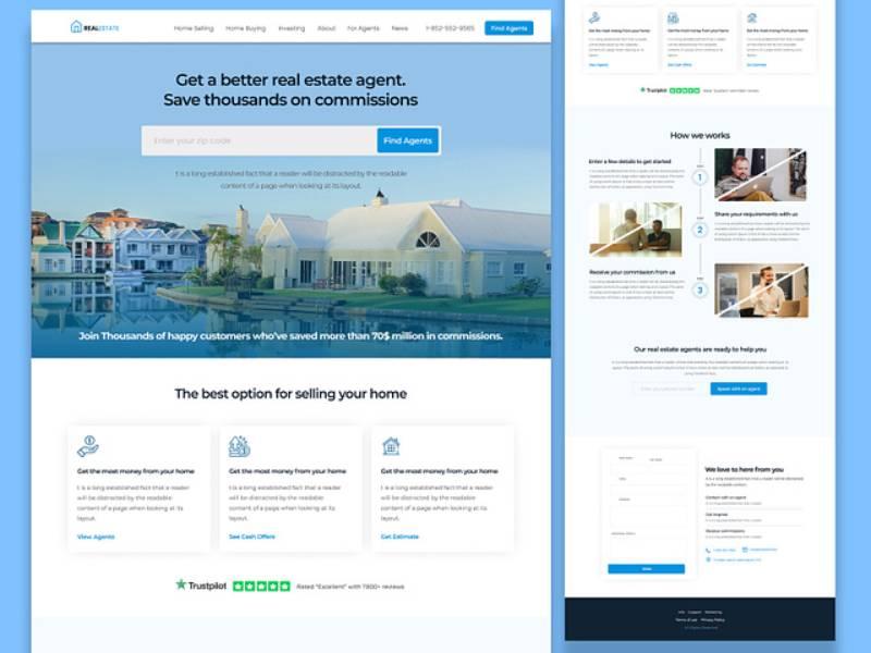
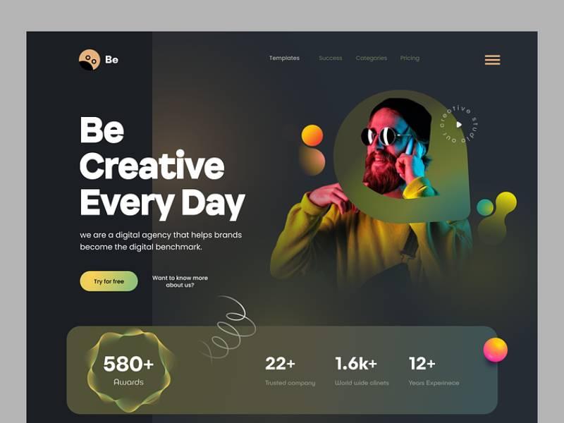
Portfolio Websites
Minimalistic designs
Imagine walking into a clean, bright, open space. Your eyes aren’t assaulted by clutter; instead, they’re drawn to the few items carefully chosen to be there. That’s what minimalistic design in website visuals is all about.
Why’s it so rad? ‘Cause less is actually more. With fewer distractions, whatever you do put on there stands out. BIG time. It’s like putting a single diamond on display. It shines brighter ’cause there’s nothing around to steal its thunder.
Cool thing is, minimalistic doesn’t mean boring. With the right colors, typography, and structure, a minimal site can scream creativity without actually, you know, screaming.
Showcasing prominent case studies
When you’ve done awesome stuff, you want to show it off, right? Like, “Hey, check out this wicked project I smashed out of the park!” That’s where prominent case studies come into play on portfolio sites.
They’re not just about saying, “Hey, I did this.” It’s about the journey, the process, the challenges, and the sweet, sweet victory at the end.
Website visuals that showcase these stories let potential clients or employers peek into your brain, see how you roll, and basically think, “Damn, we need this genius on our team!”
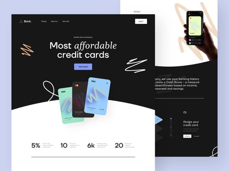
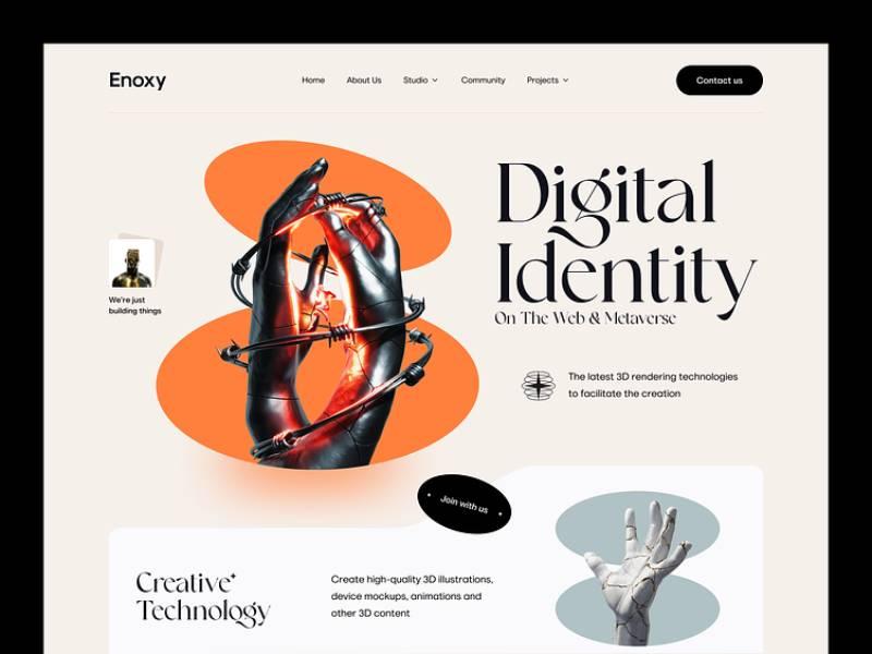
Corporate and Brand Websites
Reflecting brand identity
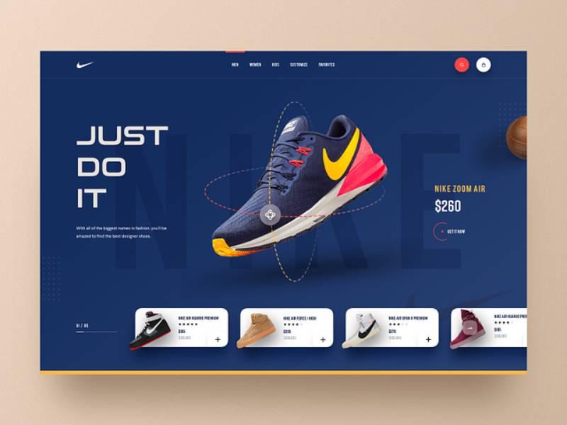
Ever walked into a room and immediately known who it belongs to? Maybe it’s the color on the walls, the style of the furniture, or just the vibe. That’s what strong brand identity does on a site.
It’s the color schemes, the logo placements, the images, and the overall feel that makes you go, “Oh yeah, this is definitely Nike” or “Man, Apple nails it every time.” When website visuals are on point with the brand identity, you don’t need a sign to tell you where you are. You just know.
Comprehensive service descriptions
Alright, imagine you’re browsing a site and you’re like, “Cool, cool, cool… but what do they actually do?” That’s a fail. Corporate sites gotta spill the beans. Clearly.
Be it through kickass infographics, interactive modules, or just some snazzy, easy-to-digest bullet points, the services or products on offer should be as clear as a summer’s day.
The aim? No visitor should bounce off thinking, “Wait, what was that about?”
Venue and Event Websites
Virtual tours
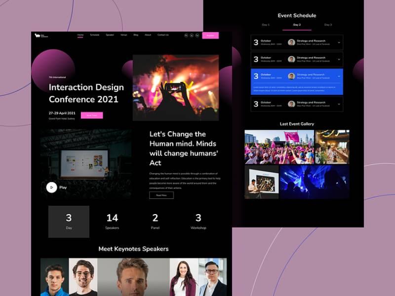
So, you’re throwing this epic event and you want peeps to know exactly how awesome the venue is. Enter: virtual tours. It’s like Google Street View but, you know, for indoor spaces.
Click here, and bam! You’re in the main hall. Click there, and whoa! You’re on the balcony. Virtual tours in website visuals give a 360° peek into a space. It’s the closest thing to being there without, well, being there.
Features and suggestions for events
Say you’re on a site, looking up a venue for your next big thing. Wouldn’t it be dope if the site not only showed you the venue but also dropped some hints about what you could do there?
Like, “Hey, this spot has killer acoustics. Perfect for a live band,” or “The lighting here? Totally Insta-worthy!”
Website visuals that combine venue features with event suggestions make the whole planning gig a breeze. It’s like having a buddy who knows the place back-to-front giving you the inside scoop.
The Impact of Visuals on User Experience
Enhancing User Engagement
The “Wow” Factor
Alright, so imagine walking into a room with dazzling lights, popping colors, and just a general vibe that screams “stay a while.” That’s what top-tier website visuals do.
They pull you in.
They make you want to stick around and explore, not just skim and bounce. It’s like being at a party where every corner has a new surprise waiting.
Nobody wants to leave a party like that, right?
Mood Setters
Beyond the glitz and glam, website visuals set the mood. Maybe it’s the calm serenity of a wellness site with pastel tones and floaty graphics.
Or the hard-hitting, dynamic vibes of a sports brand with stark contrasts and bold motions. Whatever it is, when the visuals speak, the audience feels it.
Improving Navigation and Accessibility
Visual Maps and Guides
Think about using visuals as breadcrumbs. Not the ones you eat, silly! But the ones that guide the way.
Little icons, markers, even dynamic illustrations can steer visitors around a site like a GPS for the web.
And just like you trust your maps app to get you to that new hipster cafe, these visual cues guide users where they wanna go.
Clear, Simple, Direct
If your grandma can’t figure out where to click, you’re doing it wrong.
Website visuals should be intuitive. A big, bold button here, a clear-as-day menu there. It’s about making sure users don’t need a manual to navigate your site.
Boosting Conversion Rates
Visual Trust Builders
You ever get that feeling when something just looks… trustworthy? That’s the magic of solid website visuals.
Quality images, coherent design, and intuitive layouts aren’t just about looking pretty.
They scream professionalism. And when folks trust what they see, they’re more likely to, say, buy what you’re selling.
Engage, Don’t Enrage
Here’s a no-brainer: Happy users are more likely to convert. If your website visuals are engaging and enjoyable, users won’t just browse; they’ll interact.
Maybe they’ll sign up, make a purchase, or share with their pals. That’s the ultimate goal, right?
FAQ about website visuals
What’s the Best Color Scheme?
The best color scheme? That depends on the brand’s identity, audience, and what vibe you’re going for. Balance, contrast, harmony, all those artsy words play a role.
Typically, a mix of complementary colors with a clear distinction between text and background works like a charm. If in doubt, consult a color wheel; it’s like a compass for the design adventurer.
How Can I Make My Website More Visually Appealing?
Ah, the eternal question. The pursuit of beauty, right? It’s not just about eye candy; it’s about user experience. Think about fonts, spacing, images, and layout.
Keep it consistent, make sure it all jives, and don’t overload with too much bling. You’re building a digital living room, not a circus tent. Keep things tidy and intentional, and your visitors will feel right at home.
What Are the Latest Trends in Web Design?
Trends? Oh, they’re like the weather; always changing. As of my knowledge cut-off, things like dark mode, 3D elements, minimalism, and scrolling transformations were hot stuff.
But seriously, don’t just follow the herd.
How Important Are Images on a Website?
High-quality images, relevant to the content, can make a world of difference. But remember, balance is key. Too many pictures and you’ve got a photo album, not enough and you’re in the Sahara. Find that sweet spot.
Should I Use Videos on My Website?
Videos, huh? Well, they can be a dynamite tool if used wisely. Engaging, informative, and potentially viral. But here’s the catch: they must be relevant and not hinder the loading time.
Nobody likes a slowpoke site. So, weigh the pros and cons, and if it’s a fit, roll the camera. But don’t force it, keep things organic.
How to Choose the Right Fonts?
Mixing fonts can be fun but keep it to two or three max. Think of it like seasoning a dish; a sprinkle here and there adds flavor, but overdo it, and yuck!
What Is Responsive Design, and Why Is It Important?
In today’s world, people browse everywhere, all the time. So if your site’s not playing nice with all those screens, you’re missing out. It’s like throwing a party and forgetting the snacks. Unthinkable!
How to Optimize Loading Time?
Loading time is like waiting in line at the coffee shop. Too long, and people walk away. Compress those images, minimize the code, use proper caching, and test, test, test.
You’ve got a split second to make an impression, so make sure it’s not a spinning wheel of doom. Time’s money, and nobody’s got time to waste.
What Is UX and Why Is It Crucial?
UX, or User Experience? That’s the heart of the matter. It’s how the user feels when navigating your site. Confused, lost, frustrated? Bad UX. Happy, engaged, satisfied? Good UX.
Think of it as being a good host at a party. You want everyone to have a good time and know where the bathroom is. Get the UX right, and you’ve got a winner.
How to Ensure My Website Is Accessible?
Accessibility, a truly noble goal. Your website should be open to everyone, like a welcoming hug. Screen readers, contrasting colors for the visually impaired, easy navigation for all.
Think of it like building ramps instead of stairs. Everyone should get to join the party. It’s not just a nice thing to do; it can be a legal requirement. So roll out the welcome mat for all.
Conclusion
Navigating the world of website visuals is like riding a fashion-forward roller coaster: ever-changing and endlessly exciting. Far from mere decoration, these visuals act as the first impression, setting the tone for user experience and storytelling.
From minimalistic designs for bakery websites to dynamic elements for e-commerce platforms, they’re not just about aesthetic appeal; they carry the weight of storytelling and emotional engagement. As technology rapidly advances, so do user expectations, requiring designers to continuously innovate and adapt.
The key to success in this dynamic landscape is lifelong learning—keeping up with trends, experimenting with new tools, and embracing both successes and failures as growth opportunities.
In essence, the journey of crafting website visuals is an ongoing adventure, as thrilling as it is pivotal, in shaping the online world one pixel at a time.
About the Author

Peter Makeshoff
Peter Makeshoff is the founder and main author of Designer Daily.