Top Strategies for an Effective Flyer Mailer Campaign
Email gets skimmed, social ads get scrolled, and even beautiful digital creatives can vanish in a blink. But a flyer mailer campaign is different. It arrives in the real world, in someone’s hands, demanding a few full seconds of undivided attention. And if you’re looking to turn that moment into something truly memorable, a dimensional format opener like Red Paper Plane pop-up mailers can transform a quick glance into an experience that stays on their desk for days.
Define One Audience and One Action Before You Design Anything
A flyer mailer works best when it has a single job. Think of it like a one-page landing page that must do three things fast: catch attention, communicate value, and guide the next step.
Start by answering two questions.
Who is this for?
Pick one primary audience segment. If you try to speak to everyone, you’ll end up with generic copy, a scattered hierarchy, and a layout that can’t decide what matters most.
What should they do next?
Choose one primary action such as register, redeem, schedule, request, or visit. Then write the call to action in plain language. If the action feels vague, the whole flyer will feel vague as well.
USPS encourages mapping the customer journey and planning touchpoints when you integrate mail with digital. Even if you’re running a print-first campaign, decide the next step early so every design decision supports it.
Make Response Effortless With a Print-to-Digital Bridge
A flyer mailer becomes more measurable and more convenient when it connects cleanly to a digital next step.
Canada Post highlights the reality of jammed inboxes, noisy social feeds, and constant smartphone alerts, and positions direct mail as a tangible channel that delivers a tactile experience digital can’t replicate. The same guide also notes that direct mail works beautifully alongside digital, creating a practical bridge from print to a trackable next step.
In practical design terms, that means this:
Use one destination.
Send everyone to a single landing page per campaign or segment. Don’t split attention across multiple links unless you have a strong reason.
Use two access methods.
Include a QR code and a short, readable URL. Some people will scan. Some will type. Your job is to remove friction for both of them.
Label the action.
Treat the QR code like a button. Add a clear label such as “Scan to RSVP” or “Scan to see pricing.” Give it whitespace and strong contrast so it’s easy to find.
Repeat the call to action once.
Once near the top and once near the end is often enough. Repetition is helpful when it supports scanning, not when it clutters the page.
Design Within Mailing Standards so Your Work Arrives as Intended
A flyer mailer campaign can stumble if the piece is difficult to process, too rigid, too flimsy, or shaped in a way that triggers non-machinable handling. Mailing standards exist so designers can create pieces that the Postal Service can process effectively on sorting equipment.
Pitney Bowes’ Mail Coach guide explains processing categories in terms of physical standards and notes that letter-size pieces can be nonmachinable when their aspect ratio (length divided by height) falls outside 1.3 to 2.5, along with other physical characteristics like thickness and rigidity.
If your campaign is mailing in the United States, a few practical checks from USPS Postal Explorer help you avoid surprises:
Stay within letter size standards.
Postal Explorer provides physical standards for commercial letters, including minimum and maximum dimensions and thickness considerations tied to machinability.
Avoid square proportions.
Postal Explorer flags a square envelope, with an aspect ratio of 1, as nonmachinable. That single detail can affect cost and handling, so it’s worth designing around early.
Watch thickness and uniformity.
Postal Explorer includes thickness requirements and identifies uneven thickness as a cause of non-machinability. If you add inserts or layered elements, prototype and test early so you don’t redesign late.
For designers, this isn’t just production trivia. Mailing standards shape your canvas. When you design with them in mind, you protect the look, timing, and budget.
Treat the Address Side as a Functional Interface
A flyer mailer is both a design piece and a deliverable. The address side has requirements and expectations, and it is a common place where campaigns lose quality.
Use a simple rule: keep the address area calm.
Keep the address field clean.
Avoid busy textures, gradients, or high-contrast photography under the mailing information.
Protect scannability.
Give the address and barcode areas a light, consistent field with enough contrast for readability.
Respect the likely placement of labels and markings.
Don’t place critical copy where it may be covered by postal marks, barcodes, or addressing labels. Publication 25 exists to help designers anticipate processing realities and design accordingly.
If you are using a self-mailer design, confirm where folds land relative to mailing information so the piece stays readable and processable.
Use Personalization for Relevance, Not Decoration
Personalization can be useful, but only when it improves relevance. Keep it simple and intentional.
Personalization options that often help:
- Name in the headline or salutation
Use it only if it doesn’t force awkward line breaks or shrink type in ways that hurt hierarchy. - Segmented versions
Create two or three versions where the hero image and one proof point change by industry or persona. Keep the grid consistent to keep production manageable. - Unique response tracking
Use segment-specific QR codes or URLs that lead to the same landing page with a parameter for attribution.
This approach keeps the campaign designer-friendly because you do not have to rebuild the entire piece. You’re swapping modules while keeping layout integrity.
A Grounded Creative Approach: Design a Flyer That Earns a Second Look
If you want a concept that feels fresh without hype, design your mailer around a “second look” moment.
This can be as simple as:
- A front headline that sets a promise
- A reveal that delivers the proof
- A final panel that makes the action easy
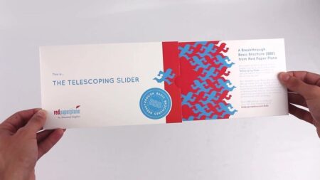
Or, if the campaign warrants it, a pop-up format where the opening motion reveals the core idea and creates a desktop display that keeps the message present.
Red Paper Plane pop-up mailers work especially well for this because they combine that immediate “wow” moment with functional staying power. Once opened, they sit on a desk as a three-dimensional reminder, not buried in a stack of flat mail.
The goal isn’t novelty. The goal is attention that holds long enough to communicate clearly, then reduces friction sufficient to earn the click, scan, or visit.
About the Author

Peter Makeshoff
Peter Makeshoff is the founder and main author of Designer Daily.