Each of us is likely to base our opinions about the company based on the experience we had with its site’s user interface. If given a choice, we will pick the most user-friendly interface, and there is no need to explain reasons for that. Many businesses spend enormous sums of money for the work of designers in order to stay up with the newest trends while not neglecting the user experience. One finance related website that provides their users with the methods to buy gold with IRA, with the use of modern design methods, it increased their revenues and conversion rates. In this article, we are going to look at the UI design trends for 2022 that will be for your benefit.
Neomorphism
Neomorphism is now a prominent fashion trend and most likely will remain, at least until the end of the decade. The latest interface design trend is to make items appear as though they are real analogues of things we use. For example, the calculator software may be designed to seem like its actual real-life equivalent. It is a wide belief that this trend was started by Steve Jobs himself, in the initial versions of iOS system. But later it was decided by Apple to simplify the design and to abandon the neomorphism trend with the latest system versions.
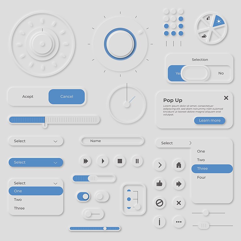
Interfaces that try to mimic neomorphism combine realistic aspects with flat design, mainly with the use of of lighting and soft shadows. Such interfaces appear very clean, more futuristic, and more realistic. One such example is when you press a button on the sensory display, these symbols may seem and feel like you are hitting real buttons, giving you an in-depth feel of realism.
Because it is both functional and sophisticated in looks, this style may be challenging to master due to its complexity. Some new users report being perplexed by the utilization of lights, shadows, making them unsure of what to click on. In order to avoid creating such mistakes, the designer must not only stick to the fundamental rules of depicting elements but also take into account the extra states of the elements in order for them to be simple to use and understand.
Gradients, vibrant colors, and a straightforward design.
Bright colors with gradients are becoming increasingly trendy in web design. The ultra-minimalist design style is still very much in style for many years already. The trend is for a restricted color palette, straightforward shapes, and a lot of free space, all in order to create a page separation and visual hierarchy.
The positioning of navigational components
Since the birth of the internet, the navigation bar has been the most critical component of web design. Slowly but steadily, it developed from an unimportant part to the reason companies hire big teams of developers and designers with analytical firms to analyse what users click on. Many apps and websites start implementing a single button menu, allowing for more information to be presented on the screen while still providing access to the navigation bar if there is a need for the user.
About the Author

Peter Makeshoff
Peter Makeshoff is the founder and main author of Designer Daily.