The human mind is an impressive machine, one sensitive to the world’s influence on the senses. Sight affects our perception and learning the most, which is why visual marketing is such an important field, especially to the hectic 21st-century digital market. Graphic design is heavily depended upon to attract consumers, considering 65% of people retain information more easily through images. Colors, fonts, and structures all elicit a response from the viewer. The aim of graphic designers is to ensure it is as positive as possible and that it leads to an increase in sales and brand awareness. Without intimate knowledge of how each feature of a design can steer a mind, however, there are pitfalls that can sabotage even the best professionals.
Source: HelloPrint
Print Design
Color is as important in promoting an emotive image as any other feature of a design. Some things are obvious: a plain black photo canvas, for example, would not do for a happy family portrait. Cheap leaflet printing for a new beach resort is more likely to create a sense of peace and relaxation with a light turquoise rather than say a red background. A correct combination of colors is not just pleasing to the eye, but can do wonders for a marketing campaign too. The right colors can be used on something as simple as business cards to inspire emotions, like trust and confidence. According to Apium Tech, 76% of people associate red with speed and 28% think of fun when seeing the color orange.
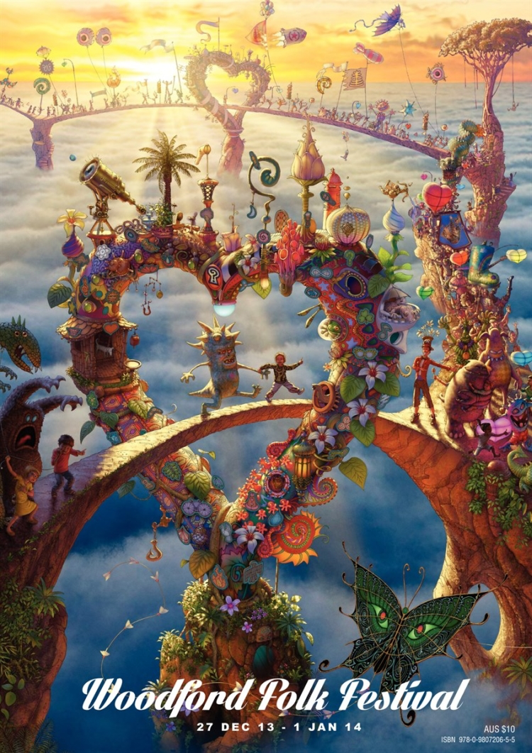
In a strong example of this, HelloPrint lists five inspiring festival posters showing the significance of color use in larger marketing materials. All of the custom banners depicted use shades of red and orange to excite viewers. Itself an established provider of design and photo printing in the UK, HelloPrint is praised by its 400,000+ customers for providing high-quality productions, which, of course, involves carefully selecting the color scheme of a personalised poster, in addition to whether it will be waterproof, neon, or even adhesive.
Digital Design
The size of a display is a factor that determines how effective a design is on screen, especially if it contains text. With mobile devices being used as much as computers, it is essential that the viewer can at least see the image, logo or advert, let alone enjoy its aesthetic composition. HubSpot has collected some of the best graphic design portfolios of 2019 to demonstrate what a superb artwork compatible with any technological platform looks like. Fonts are sized and stylized in order to effectively inform readers while stimulating their vision. These works are distinctive because of their sharpness of detail no matter how minimalist or complex, formal or playful they may be.
In terms of presenting textual material, Brook Perryman’s portfolio illustrates some good strategies, such as using brief phrases of differently proportioned and colored words. The eye is immediately attracted to the information that is made to stand out from the rest. Even on a smartphone screen, her designs are legible and chromatically alluring without any redundant or vague feature spoiling the experience.

Source: HelloPrint
Clearly, there is much to consider in graphic design. Having said that, the abundance of helpful guides available online and elsewhere can keep you updated on the latest trends and statistics. Engaging with as many aspects of this field as possible and constantly improving on your art is all that is needed. Practice makes perfect, after all.
About the Author

Peter Makeshoff
Peter Makeshoff is the founder and main author of Designer Daily.