In simple terms, typography is the design of letters to make written words both readable and appealing. The origins of typography go back to ancient Greece, around 3,500 years ago. It was first implemented in the punching of currency and official seals. Instead of writing the letters every time, the Greeks used a Phaistos Disk, which had symbols carved into its metallic body. Typefaces are sets of characters that follow a certain style, which are the building blocks of typography. Typefaces can be often confused or used interchangeably with fonts, but since technology has blurred the line anyway, it’s not wrong to use them interchangeably from a digital perspective.
As a beginner typographer, you probably have some questions on getting started or nailing down certain styles, which is why we’ve created a brief list of the best tips from the pros.
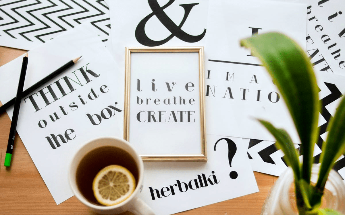
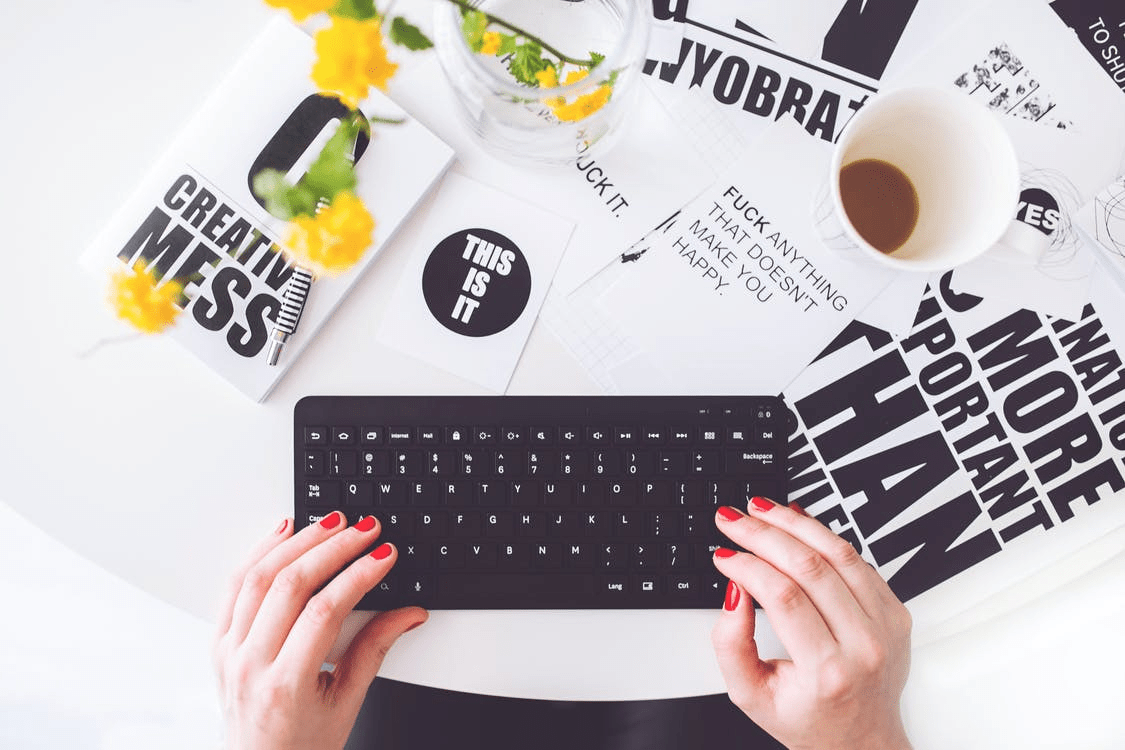
Visual Hierarchy
Aesthetically pleasing designs have to be organized and easy on the eye. Visual hierarchy is a popular method in typography that allows the designer to aesthetically combine functionality and design. Visual hierarchy can be used to give cues to the reader to help them navigate through text smoothly, no matter how big it is. Typographic hierarchy is a common visual hierarchy arrangement that can be seen in action if you look at newspapers’ copies. It’s the formatting of headings, subheadings, body, citations, and other text into different visual cues. These cues allow a reader to quickly notice and discern the most important elements from less important ones in a textual piece.
Anagrams and Kinetic Typography
While anagrams may be used in static typography, their potential in kinetic typography is endless. You wouldn’t believe the number of words that you can create from a 5- or 6-letter word. Kinetic typography is the art of designing moving text, giving a much bigger canvas for the designer to utilize. You may want to use a word composed of the same letters of a previous word to make the design more interesting, and for more help with this technique, you’ll probably want to use a letter unscrambler, which you can download on your phone. Unscramblers allow you to dissect a word and discover most of the possible anagrams you can form using its letters. The moving frames of kinetic typography will make it easy for you to transform anagrams into other words cleanly.
Fonts and Mood
You may have favorite fonts that you prefer to use over unfamiliar ones, and while that isn’t necessarily wrong, you’re limiting the mood you set to specific choices. If you haven’t noticed, fonts can have their own personality, ranging from serious to silly. It’s not advisable to designate one or two fonts that work with any content. Being able to establish tones by taking advantage of the visual aspects of fonts is what a professional typographer would do. Some of the unfamiliar fonts you use can actually be used to attract attention because most people could also be unfamiliar with them.
Size and Context
As a typographer, ensuring the smooth readability of your designs should be at the top of your list. No one wants to squint their eyes to read text or wiggle their eyes all around the reading medium because of large text. If you’re looking for standards, 10 to 12 is good for prints, while 15 to 20 pixels are ideal for web projects. This is still not a holy grail for typeface size because the nature of the project may dictate special characteristics and sizes. If the typography isn’t exactly for known formats like business cards or big texts, you may need to improvise a solution that works in the context of the project. Projects that do not contain a lot of texts can give you some room to go the extra mile with stylizing your fonts.
Typeface Pairs
Finding the right font can sometimes mean finding the right pair. While a lot of projects may only require the use of one typeface like in posters, some designs would look much better with two different typefaces. The introduction of a contrasting typeface to your design is a double-edged weapon if you use the wrong pair, it will look mismatched and wrong. But if you manage to find the right pair of fonts, their strengths will complement each other. Typeface pairs can be found on book covers and advertisements, so you won’t have trouble finding material to inspire you. Typography is a fine art that works on capturing the beauty of meaning and assigning it an aesthetic quality. As a beginner typographer, you should always take your time to practice as much as you can before taking on any official projects. It’s okay to feel overwhelmed when you’re approaching a field as vast as typography, but the more you learn about it, the more interested you’ll become.
About the Author

Peter Makeshoff
Peter Makeshoff is the founder and main author of Designer Daily.