One crucial component of an excellent website is to have clear communication. It is vital as it establishes a relationship between the brand and the user. Around ninety percent of all information is text. Text is represented through typography – it is a way to communicate efficiently. It is the primary thing that leads your website.
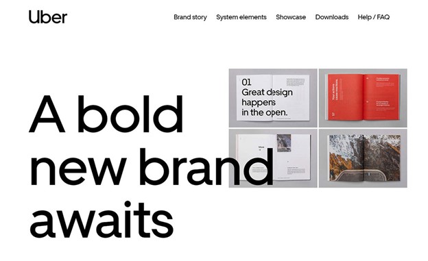
Many designers pay attention to the visual details. Although those elements are essential, they often forget about the typography of the website. Not only does it enhance the visual aspects of the website, but it also makes the website more readable and attractive. This is the key to an excellent user experience. These typography tips will help you unlock an impressive UI for your websites. Stencil Giant has implemented these and helped with website conversions.
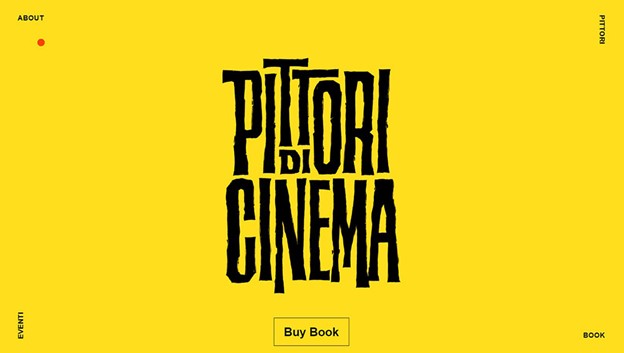
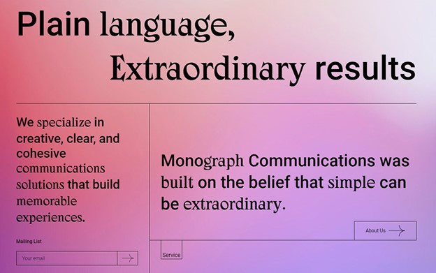
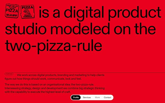
Minimalism is always a good option.
One colossal mistake designers make adding various fonts to make the website look more exciting and fun. This is a mistake. This will make the whole website look overloaded and overwhelming to look at. That is why you should always opt for minimalism when it comes to fonts and text styles. You will be able to achieve detailed results if you use less of it. Even the plainest design of the font can make the website more interactive.
Consider context and audience when choosing fonts.
Another mistake many people make when creating their website is not thinking of your website’s content and audience. Different fonts bring out different moods. Depending on what your website is about, you should choose an adequate font. Picking the coolest fonts for your website might not be the best possible thing.
Fonts can present a lot of emotions. That is why you should think of our clients and what they would like to see.
Keep the Number of fonts used at a minimum.
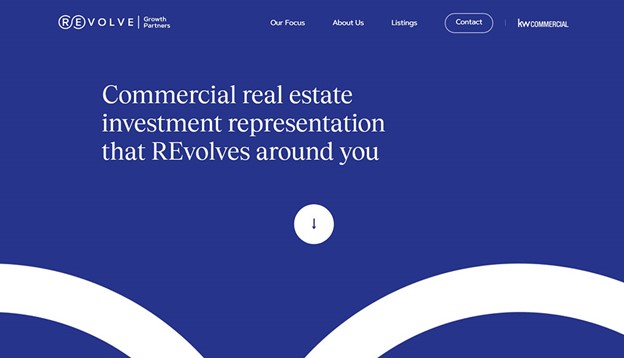
It is always a good idea to keep no more than three different fonts on your website. If you add all kinds of fonts, you will make the whole site look disorganized, unstructured, and unprofessional. Think carefully before you use different fonts. If you want to add more fonts, make sure they come from the same family of fonts, and complement one another. A good font combination does wonders for the way your site looks and feels.
Avoid All Caps
Another thing you should probably avoid is text in caps. This text can be hard to read, and people will be disinterested in what your website has to say.
Scale your headings
When you’re using headings in your text, make sure to use no more than two. Although they serve as signposts, please don’t overdo them. If your primary header is 180-200%, make sure that the second heading is 130-150%. This will make the text more digestible.
Pay attention to letter spacing.
Whitespace is another element that plays a massive role in how your text is perceived. Think also about the spacing between the words and the sentences. You don’t want the spacing to be too big nor too small.
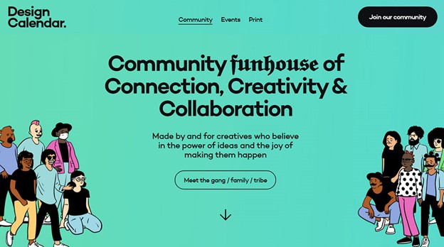
Typographic hierarchy makes things work.
If you want to create a design that will be visually appealing to the users and their perception, make sure your elements of the website are organized in the right way. Establish a strong visual hierarchy that way. You will be able to guide the users through the content on the website easily. The key elements and information should be placed bigger, and somewhere they can be instantly noticed.
Give importance to contrast.
Another important factor that continues to a great web design is contrast. If your differences are significant, they will make the whale text easy to read and digest. If the discrepancy is insufficient, it will make the users not read what you have to say. This will result in less traffic and conversions.
Add white space between the headers and the body text.

We’ve mentioned that spacing is crucial. It brings the focus of the reader to the essential elements. You want the spacing to be just right so that it won’t be too hard on the eyes. For example, if you’re setting the body copy and the headers, ensure that the spacing should be either 15px, 20px, or 30px.
Try To Use Standard Fonts
Sometimes you would think that having custom fonts will make you look more professional and unique. However, in some cases, it would be best if you stuck to the system fonts. They are simple and will deliver the message without any effort.
Yet, if you want to change fonts in WordPress from the standard ones to some that have a more neat look, do so, but make sure they’re fit for your audience.
Align Texts Properly

Another essential factor that you should keep in mind is alignment. This is especially necessary for mobile-based typography. The human brain likes to read the text in blocks on a small screen. Usually, books are left-aligned, which means a ragged edge on the block’s right side. Adjust it properly and make sure that using ‘justified’ alignment does not result in inconsistent white space.
Have appropriate Line length
Many designers overlook the line length. We can define the line length as the number of words per line. What makes the right line length is the ability to sell the user through the text without effort. It should be natural and comfortable on the eyes. The key to a great design is the legibility of the book.
You can use a line length that has forty-five to ninety characters. You can also limit the width of the text block. For example, the desired line length of a column should be forty-five to ninety characters.
Deep attention to mobile typography
You will find that many designers try to experiment with typography to do more original work. Although this works for desktop websites, it is not the same for mobile versions. This is the place where designers are short of space. This type of typography needs a lot of attention to detail when designing. That is why it can be a challenge to do mobile web design.
Choose a Typeface that works Well in various Sizes.
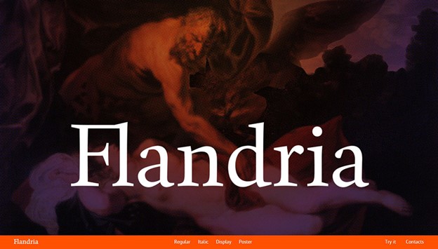
It is necessary to make your website adjustable to all kinds of resolutions and interfaces. Many devices don’t have the same features, so the website has to be flexible. It is crucial to pick a typeface that will be compatible with all kinds of weights and sizes.
Take Functionality into Account
Many text components in a mobile website enable the user to complete particular operations, for example, conveying a message or initiating a call. The mobile web typography should be produced carefully to guarantee that users realize that a specific text is a Call-To-Action button or executes a particular functionality.
Avoid Coloring Text in Red or Green
Color-blindness is a natural situation, particularly amongst individuals (8% of men are color blind). It’s advised to use other ideas in addition to color to distinguish important information. Also, avoid using red and green colors alone to convey information because red and green color blindness is the most common form of color blindness.
Never Ever Skimp on Testing
Test typography on screens and display settings that fall on the far edges of average—such as nearly-outdated smartphones, the most massive hi-res monitors, and screens turned up blindingly bright. Designs that pass extreme conditions are ready for full user access.
Typography is a big deal. Poor typography choices can distract users from reading. It’s essential to make typography readable, understandable, and legible. The typeface, font size, appearance, line height, and letter shapes are portions within typography that must be precisely poised to accommodate a comfortable reading experience. With specific tips, you are on your way to beautiful web typography.
About the Author

Bogdan Sandu
Bogdan is a designer and editor at DesignYourWay. He's reading design books the same way a hamster eats carrots, and talks all the time about trends, best practices and design principles.