The internet is constantly changing and evolving. As a result, it is important to stay dynamic. As a graphic designer, you’ll know that trends change and what works well and converts for your clients one month will be different the next. We need to be aware of the trends that are emerging, and those that are fading out. This is especially true with typography because it often forms the basis of our projects.
It’s helpful to know that typography trends don’t simply emerge out of nowhere. Instead, they slowly grow, flowing through the different design niches. Eventually, as they become more and more popular, these trends reach the mainstream. This is why in order to predict the big trends of 2018, it is helpful to look at the growing influences which shaped 2017.
Some of these trends are exciting and will bring changes into the design industry. As we’ve become familiar with the trends of the past few years, something new can only bring vitality.
Let’s take a look at the trends emerging for this year!
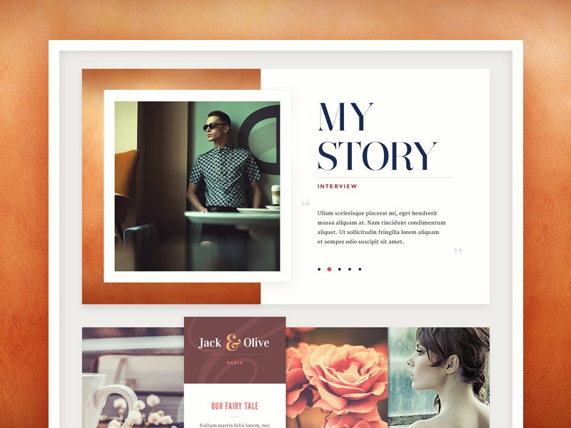
The return of the serif
After the cleanly lined minimalism of the past couple of years, it’s time for serifs! Serifs are warm and retro, bringing up images of the 1970s. This offers up an alternative to the commonly used Helvetica, which has dominated the digital design market.
Chaotic and creative
Minimalism has dominated the design field over the last couple of years. However, the trend is moving to chaotic designs which offer broken elements and juxtapositions. Although this may seem confusing or even overwhelming, it actually engages the viewer.
Using typography in this way offers a sense of creativity, creating interest for the viewer. Viewers often spend a great deal of time exploring these unconventional sites, which results in a higher conversion rate.
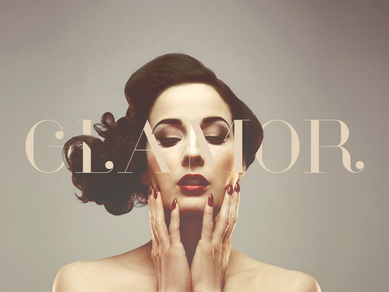
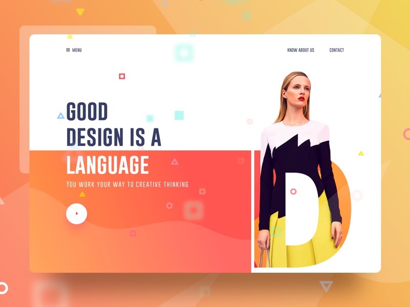
Overlays and cutouts
Overlays and cutouts are beginning to emerge as a new trend which hasn’t taken over 2018 yet. These trends are bright and vibrant, offering a unique approach to web design.
Designers are using animation, striking photography or parallax backgrounds. Sometimes these vivid images overlay the text. Other times they are used in the background. After the flat design trend of recent years, this new method of working brings the site alive.
Highlights
This new trend is reminiscent of the schoolroom. Designers are using colored fonts or underlying specific words in order to draw attention to a message. This technique is currently being used in both headlines and body text. Many sites are starting to use typography to catch viewer’s attention.
In the past, designers have often used striking illustrations to call attention to a message. The new trend is to use different typographic techniques. This new trick draws on a sense of nostalgia and is rapidly emerging as a popular choice.
Variable fonts
In the past, designers had a couple of choices when it came to fonts. We could make our fonts bold or italic or keep them light.
Now though, there is a range of different options which enable us to add weight to a page. Fonts can now be given different weights and axes. This allows us to customize our pages, bringing a unique and creative edge to our designs.
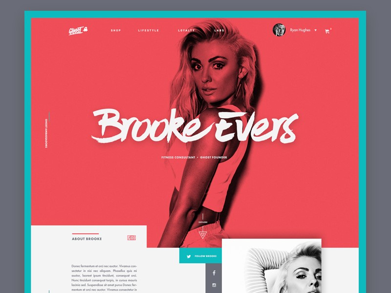
Hand drawn lettering
The creative touch of hand-drawn lettering returns again and again to our web designs. This unique approach to design is expanding from simple handwriting into hand-drawn letters. Hand drawn fonts are being offered as a unique option for headers and logos.
When thinking of the popularity of Disney, Coca-Cola or the New York Times, it’s easy to see how a well-designed font can bring identity to a brand. This one of a kind creation is shaping a new trend in typography.
This is especially relevant with all the Arabic fonts that you see in the media lately and their hand drawn style.
Gradients
Gradients have been an emerging web trend in recent years. This movement was made popular by Instagram, which incorporated a gradient into their logo background. The design community cheered, and gradients became a new trend.
However, this trend is no longer limited to backgrounds. Designers are beginning to use gradients within the lettering itself. This is a new trend which is emerging for 2018. Using gradient in lettering depends on the size of the font you use. It can be used to create a 3D effect, or more simply add a sense of style or flair to typography.
Background gradients are changing too and moving towards color transitions rather than simple shading. Combining gradients in background and typography will keep you on top of the trend for 2018.
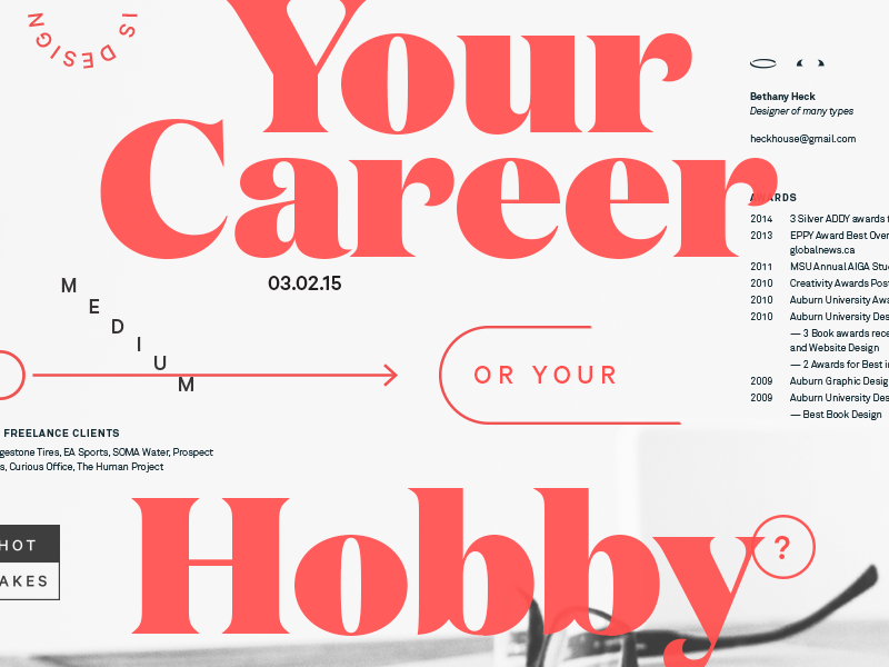
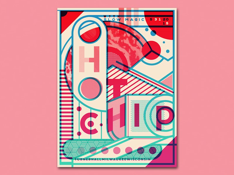
Maximalism
This trend is all about creating a bold and attention-grabbing font which is large and shouts out to viewers. This trend offers something new when compared to the subtle use of the font in recent years.
However, it still doesn’t turn its back on the minimalist trend. The style is still clean-lined and the page remains uncluttered. This trend is the new maximalist – minimalist step for webpage design.
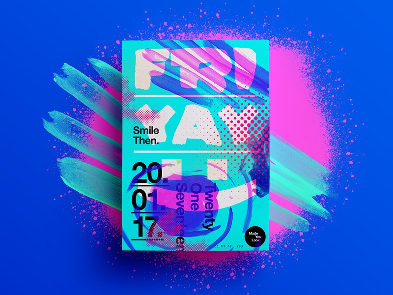
Hiding content
This new trend can be very effective when done well. It sounds counter-intuitive, but designers are now starting to hide some of their content, while still keeping the page legible and easy to read. This trend is all about cutting out letters (or parts of letters) while ensuring your viewer can still read or scan the content.
This trend can be hard to master. If used badly, it can prevent your viewer from reading your content. It can also make your site look neglected and very unattractive. However, when used well, it is a creative way to add interest to your site. And it just works.
Off-kilter kerning
Kerning creates spaces between lettering that makes your page easy to read. Traditionally, kerning makes the spacing between letters uniform and adds symmetry to your page. However, new trends are shaking this up. More space is being added between letters to create a clean and open feeling on the page.
This new technique widens the distance between letters in order to create an easy, relaxed feeling to your site. As a result, viewers often remain engaged and spend a leisurely amount of time on your site.
Clean-lined and geometric typography
This is a new, modern typeface which is starting to emerge across the web. Totally clean-lined and without serifs, geometric fonts are useful for sites which focus on science, technology, and engineering. This font uses single lines and rounded circles to create a futuristic feel.
This font style adds sophistication to a website. Legible and easy to digest, this is a popular choice for logos and headers. It can also be used for business cards. 2018 presents the opportunity for geometric fonts to move into mainstream design.
Handwritten fonts
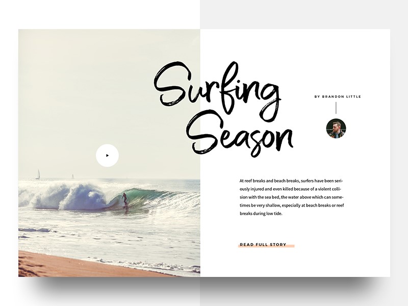
Handwritten fonts give a personal touch to a site. These fonts are taking on new elements in 2018 however. Instead of simply representing a handwritten script, they are now incorporating the appearance of brush strokes. Although still personal and unique, these fonts evoke memories of sign writing.
Handwritten scripts range from offering feminine flourish to masculine scrawl. We can see this trend feature strongly in 2018. Movie posters, invitations, business cards and logo design will all incorporate this unique look
Watercolor
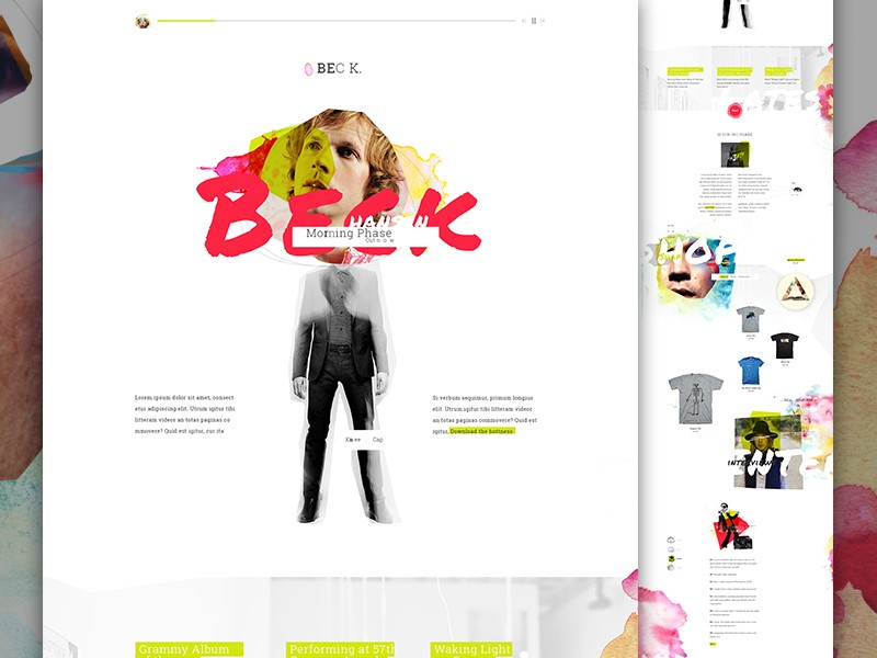
Watercolor has been emerging as a recent web trend. Recently, however, it has been incorporated into the new movement towards handwritten fonts. Typography now gives the appearance of being written using watercolor paint.
Although this font doesn’t bring an edge to your site, it does have feminine flourish. Watercolor offers a unique and personal touch which brings sophistication to your designs.
Summary
The world of fonts is changing at such a rapid rate. As designers, there is a wider range of fonts to choose from and multiple ways to bring them to life on a site.
By pushing the boundaries, designers are able to create new and interesting works of art which shape future choices. As new trends emerge there are many new opportunities to explore and develop the typography we use and the way we incorporate it into our designs.
About the Author

Bogdan Sandu
Bogdan is a designer and editor at DesignYourWay. He's reading design books the same way a hamster eats carrots, and talks all the time about trends, best practices and design principles.