When we first look at a design or artwork, we often don’t think about what we see. Instead, we focus on aspects of the work that grab our attention.
This is called pre-attentive vision. It begins when a design grabs our attention, but we haven’t yet thought about it. We scan information, which is recognized by the unconscious.
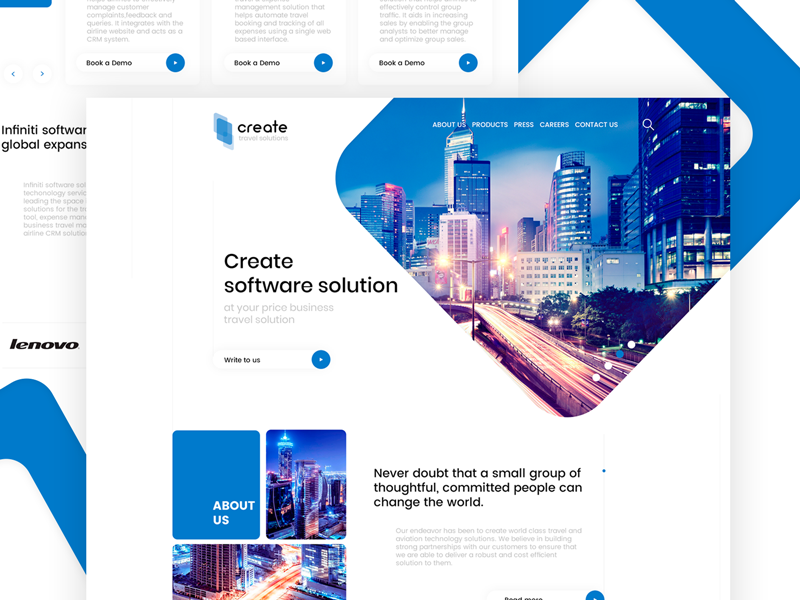
A designer often aims to attract the eye to the most important aspect of a poster, website or image by organizing information and showing a viewer where to look. Using line, color, hierarchy, framing, depth, shape, and motion helps aspects of a design to POP out at a viewer.
Color and Semiotics
Capturing user attention with color means recognizing that color sends out messages.
When looking at color, people first respond to light, and levels of color saturation. They then respond to the emotional message a color brings.
Peirce’s Trichotomy of Signs explains that color has:
- Iconicity: This is the emotional message of color. Dark colors are often seen to be heavy, while light, fresh colors can be cheerful. We might also look at what colors resemble, such as the green of grass, or the warmth and passion of fire.
- Indexicality: The link between color and context. A grey sky is seen to represent rain, while a blue one represents a sunny day.
- Symbolicity: This is the abstract meaning behind color and is often more emotional than logical. This is the language behind color, which connects red to passion or love, blue to spirituality or peace, and yellow to happiness. This language can be complex and isn’t always easy to understand.
How to design using color:
Use balance and contrast
Picking three colors, and using the dominant color 60% of the time, the secondary color 30% of the time, and the accent color 10% of the time provides balance within a design or color scheme.
As the eye often notices saturated color first, the most saturated color should be used for important content, that which seeks to bring a message.
Using the brightest color as an accent color means that this color will draw our attention not only because it is saturated, but also because it is sparse, and contrasts with the space behind it. This shows the viewer that the message is important.
Link color to shapes
We do not only form messages in connection with color but also associate color with a shape. Color, and shape, when combined together, often give off new meaning.
Green and blue may be associated with sky, spirituality, peace or even nature, but place these colors together along with the easily recognizable shape of the globe, and they take on an easily recognizable meaning. Likewise, a red rose gives a different message to a jagged red line.
When working with color, it is important to determine how this color interacts with shape, and the meanings the combinations evoke.
Use texture
When a texture is contrasted with a simple background, it can be used as a means of attracting attention, causing a message to pop out. Texture adds depth to a message, and brings it to life, sometimes becoming more prominent than shape or line.
However, when using texture to construct a message, the background cannot compete for attention, otherwise, the textured message will simply add to the noise on the page.
Make use of the Gestalt Principles
Gestalt shares that the whole is more than the sum of its parts. The human brain looks at the overall design and how this interconnects and takes a message from this, rather than breaking down the individual parts. The following Gestalt principles are therefore helpful in creating an effective design:
Proximity: the more closely objects are placed next to one another, the more likely the mind will see them as interconnected. These objects don’t have to share colors or characteristics to be seen as related.
Similarity: Objects which share characteristics will be seen to be more similar than those which do not share similarities. Objects may be seen to be related because of color, shape, size or texture.
Symmetry: Symmetry helps to create order, and people seek order. As a result, they often see objects to be symmetrical. Symmetry does not only rely on shape but may also use color or texture.
Boundary: Boundary is used to frame or enclose like elements, separating them from others.
Connectedness: Connectedness is used to show the how different objects relate.
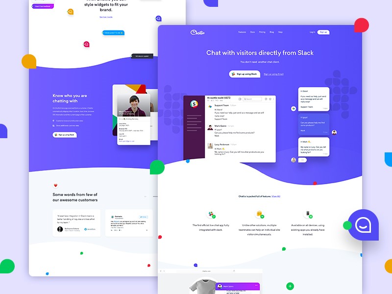
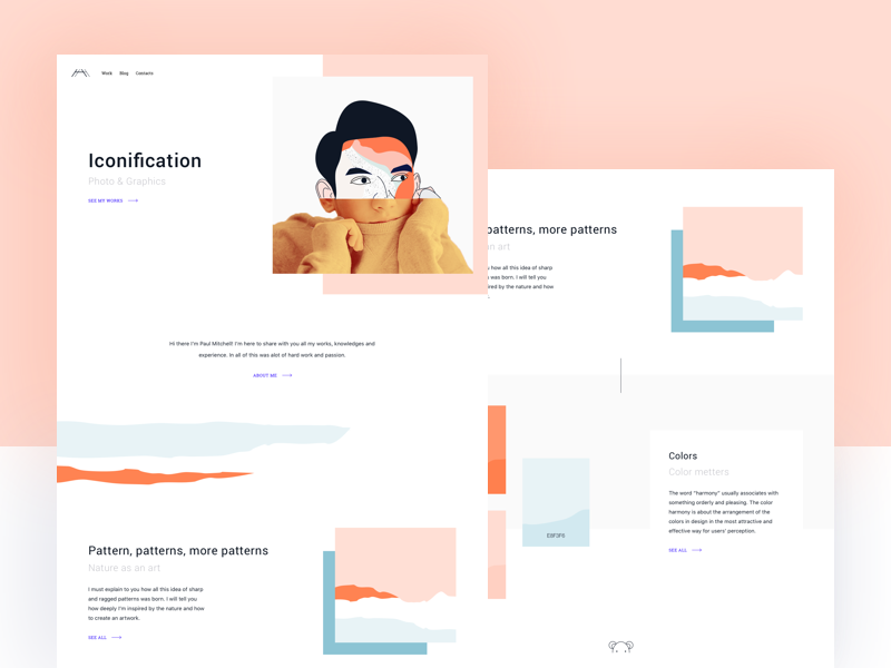
How to grab the attention of site visitors
Site visitors are always potential customers. Holding their attention long enough to show what is on offer is therefore crucial. The following factors assist with grabbing a visitor’s attention:
Our brains can be quite selective when it comes to focus. This is because without filtering out a great deal of irrelevant information, we would often feel overwhelmed. Therefore, designing a website which grabs attention would need to take into account how the brain focuses.
We know that the brain will pay attention to physical needs when we are hungry, recognize the names of those close to us, pays attention to areas we have chosen to focus on and can be captured by emotion. Our brains also pay attention to novelty and contrast.
Use novelty
When designing it is helpful to be different, bringing in something which is weird or unusual in order to attract attention.
This is because our brain screens out everyday background noise, or that which is overly familiar. People will, however, pay attention to contrast or difference. Be quirky when designing a site. Use CSS text effects, illustrations, and clever animations for that.
Inspire emotion
Use color effectively, be visual, aim for warmth and friendliness in your copy, and your visitors will feel welcome.
They will also feel an emotional connection, meaning that they will pay more attention to your site.
The language of color
Color can be very effective in creating emotion in visitors. This is because colors have a language, and visitors relate to them on an emotional level. Used effectively, a color will create the effects you need. Here are common messages perceived behind 10 popular colors:
Red
Red is the color of passion, power, and warmth. It is attention-grabbing but should be used in small doses.
Blue
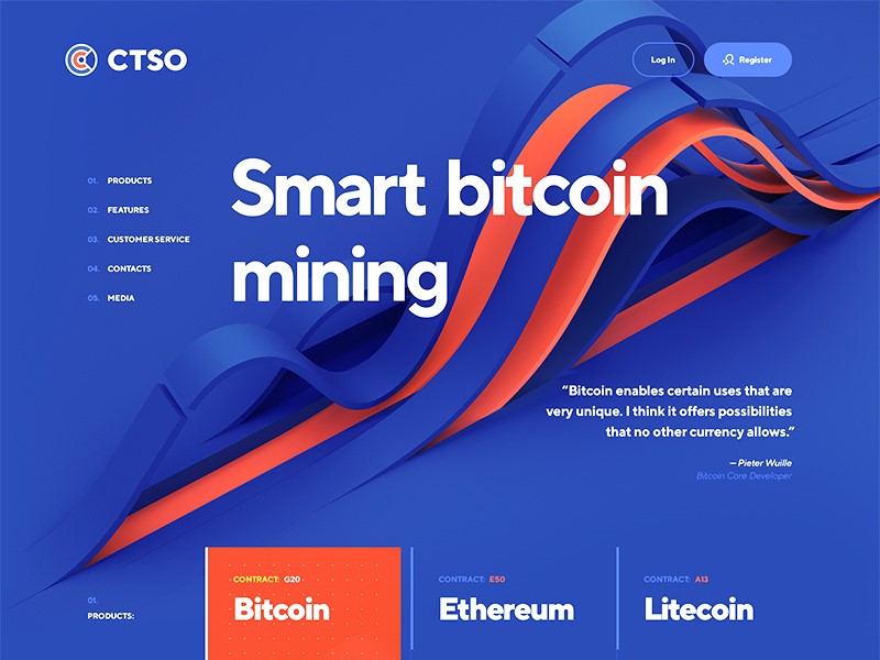
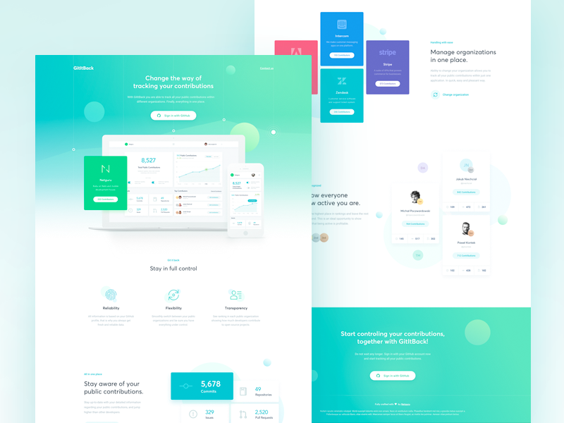
Blue is seen to be calm, cool and trustworthy. It is often very effective when mixed with orange.
Pink
This is the color loved by girls. Fun, romantic and feminine, this is the color aimed at a young female audience.
Yellow
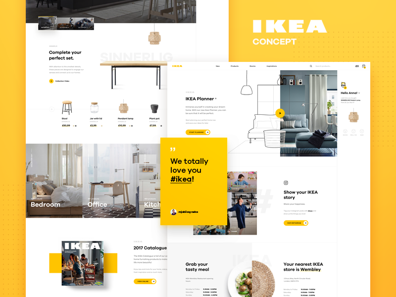
Yellow is a strong, bright and sunny color which can be used to capture your audience’s attention. It lets them know you are confident.
Green
Green is warm and inviting, and links to goodwill, environmental awareness, and health. It is also the color of money and may represent wealth.
Gold
Gold is another elegant, prestigious color, symbolizing wealth and pedigree or achievement.
Orange
Orange represents warmth or energy. This is a powerful and attention-grabbing color which feels cutting edge.
Purple
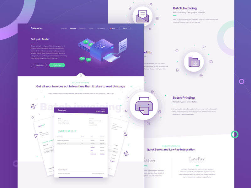
Purple is the color of luxury and has been associated with royalty. It will add a sense of prestige and even decadence to your designs.
Brown
Brown is warm, earthy and homely, and brings a feeling of ease.
Black
Black is extremely versatile and can be used in many different contexts.
It can be modern or traditional, exciting or relaxing, and it is up to the designer to choose how best to use it. Black can add drama or depth to a design.
About the Author

Bogdan Sandu
Bogdan is a designer and editor at DesignYourWay. He's reading design books the same way a hamster eats carrots, and talks all the time about trends, best practices and design principles.