Color psychology is described as the relationship between colors and human behavior. Certain colors can trigger responses in people, making them feel specific feelings. Color psychology is not cast in stone as people’s perceptions of color may differ. However, some colors are related to emotions, behaviors, and decision-making processes for the average person.
What are these colors, and how can you utilize them to boost sales at your restaurant?
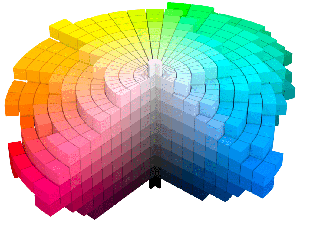
Pulling it together with color
When evaluating color choices, make choices that create a cohesive brand appearance. Your brand starts with a name, logo, and slogan. The colors you choose for these should flow into your restaurant décor and as far as the uniforms your staff wear. When these facets are too different, they become detached in the customer’s mind. Another aspect to apply your chosen colors to is signage.
Visit mandoemedia.com to explore digital signage from Mandoe Media that allows you to blend colors for a high-resolution graphic display that does not detract from your restaurant’s aesthetic.
Embrace the rainbow
Across the color spectrum, each hue has an associated emotion or response trigger, and how you use them depends on the ambiance and aesthetic you want to achieve.
However, choose your colors wisely as experts estimate that the shades you rely on account for around 90% of the first impression people get from your brand and establishment.
A restaurant is a place people patronize to relax and enjoy themselves. Therefore, overusing colors that evoke high emotions might not be appropriate. As a restaurant owner, you want patrons to linger as they spend more money that way.
What follows is a brief breakdown of different color groups and what they signify in color psychology. However, ensure that you dip into more than one of them as they are more effective when used in combinations as none work well in isolation.
Light colors
Lighter colors, such as white, beige, and light grey, create the illusion of space and are ideal if the restaurant floor size is small. They maximize any natural light that enters the restaurant through its windows.
Combined with mirrors, these colors make a room feel considerably larger than it is. Light colors are also relaxing, which ensures that diners will unwind and feel comfortable in your establishment.
However, do not rely on light colors alone in any aspect of your restaurant’s brand and aesthetic. Without a dash of darker, richer colors, light colors can act as a diet suppressant. Perhaps customers subconsciously associate the blandness of these colors with the food and dining experience.
Natural colors
Green and brown are regarded as relaxing colors as we see them often in nature. Natural surroundings are an antidote to stress, and using them in your restaurant will have the same effect on patrons. The added advantage of using these colors is that they come in so many shades, which creates the potential for seemingly endless combinations.
Warm colors
Red, orange, deep yellow, and warm browns are earthy colors and perceived by the brain as welcoming. People feel comfortable in an environment where they sense they are safe. Our brains associate warmth with safety, which could go back to the idea of fire protecting one from the cold and other lurking dangers. Warm colors are appetite boosters, making them desirable for any restaurant owner.
Cold colors
Blue and purple are cold hues and tend to make many people feel unwelcome when overused. Therefore, a restaurant featuring only shades of blue in its décor could make patrons want to leave sooner rather than later. Even in a maritime-themed restaurant, blues should be used in combination with warmer, more welcoming colors, such as red.
About the Author

Peter Makeshoff
Peter Makeshoff is the founder and main author of Designer Daily.