Hospital navigation is not like finding your way through an airport or a shopping mall. The stakes are higher. The users are often anxious, sleep-deprived, and navigating unfamiliar territory while someone they love is in distress. A confusing sign isn’t an inconvenience. It’s a failure that can compound fear at moments when clarity is most needed.
Wayfinding in healthcare is a high-stakes design challenge. The principles that make it work offer lessons for any system where users may be under pressure.
The Psychology of Stress and Navigation
Research shows that stress fundamentally changes how people process spatial information. When cortisol levels rise, the brain narrows its field of attention, focusing on immediate threats while filtering out peripheral cues. In practical terms, this means a stressed visitor may walk past a large sign they would normally notice. They may struggle to hold multiple directions in working memory. They may revert to familiar patterns rather than processing new information.
Wayfinding systems for high-stress environments must account for this. They can’t rely on subtle cues. They can’t assume users will read and retain complex instructions. They need to be almost impossibly clear.
The Legacy Problem: How Hospitals Grow
Most hospitals weren’t designed as cohesive systems. They grew in phases, adding wings and floors as needs changed and budgets allowed. The result is often a “spaghetti floor plan” where corridors meet at odd angles, elevator banks are hidden, and departments that should be adjacent are separated by labyrinthine paths.
A 2015 study in HERD: Health Environments Research & Design Journal notes that “the multi-building, multi-floor, multi-department nature of hospitals can make orientation confusing for anyone unfamiliar with the setting”. This isn’t an oversight. It’s the accumulated weight of decades of incremental growth.
The challenge for wayfinding designers is to impose clarity on structures that were never designed for it.
The Principles of Healthcare Wayfinding
1. Clear Entry and Immediate Orientation
The moment a visitor enters a hospital is critical. They are often at their most disoriented, scanning for cues about where to go. A well-designed entrance provides immediate orientation: a central information desk, clear signage at the point of entry, and visual sightlines to key destinations like the main elevator bank or registration area.
The best hospital entrances don’t make visitors ask “where do I go?” They make the next step obvious.
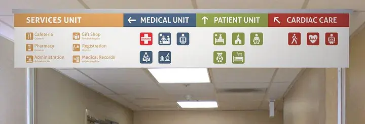
2. Consistent Visual Language
Signage systems in hospitals often suffer from what researchers call “inconsistent and non-intuitive wayfinding elements”, signs that look different from floor to floor, department names that don’t match what patients were told, symbols that require interpretation.
A unified visual language solves this. The same color coding, the same icon system, the same typography everywhere. Visitors learn the language once and apply it throughout the facility. The Dana-Farber Cancer Institute in Boston is often cited as a model: its signature yellow corridor, large-scale wall graphics, and clearly labeled elevator banks create a system that feels almost intuitive.
3. Color as Code
Color coding is one of the most powerful tools in healthcare wayfinding, but it must be applied consistently. The Children’s Hospital of Pittsburgh assigns distinct colors to each zone, carrying the color from floor maps to corridor accents to door frames. Visitors don’t need to remember department numbers. They just need to follow the blue line.
The key is integration. Color shouldn’t be an afterthought applied to signs. It should be woven into architecture, flooring, wall treatments, lighting, creating a seamless visual thread that guides visitors without requiring them to read.
4. Decision Points
Wayfinding research identifies “decision points” as the places where visitors are most likely to get lost: elevator lobbies, corridor intersections, the transition from public to clinical areas. These are where signage must be most explicit.
The best systems use what designers call “signage layering” at decision points: directional signs that show what’s ahead, confirmation signs that show you’ve arrived, and over-distance signage that provides reassurance between turns.
5. Human Backup
No signage system is perfect. That’s why the most effective hospital wayfinding integrates human support. Information desks positioned at key decision points. Volunteers trained to escort rather than simply point. Staff who understand that answering “where is radiology?” is part of patient care, not a distraction from it.
Research consistently shows that when visitors are stressed, they seek human help even when signs are clear. Designing wayfinding without accounting for this is designing in a vacuum.
The Scale Problem: Large Campuses and Multiple Buildings
For large medical campuses with multiple buildings, traditional signage often fails. The Sutter Health CPMC Van Ness Campus in San Francisco solved this with what they call “visual anchors”: distinct architectural features visible from a distance that help visitors orient themselves across the complex. A recognizable tower, a distinctive atrium, a unique landscaping element, these provide mental landmarks that signs alone cannot offer.
Digital wayfinding is increasingly part of the solution. Interactive kiosks, QR codes linking to indoor mapping, and integration with hospital apps allow visitors to navigate on their own devices. But these tools must supplement physical wayfinding, not replace it. A visitor whose phone is dying or whose hands are full needs to find their way regardless.
What Hospitals Teach About Design Under Pressure
The principles that make hospital wayfinding work apply anywhere users may be stressed, rushed, or distracted. Airports, transit stations, convention centers, government buildings, all face similar challenges.
- Assume nothing. Stressed users miss cues that seem obvious to designers. Over-clarify.
- Create redundancy. Multiple cues (color, text, symbols, human support) ensure that if one fails, others catch the user.
- Test with real users. A wayfinding system designed at a desk is untested. A system designed with stressed, distracted, confused users is proven.
- Design for decision points. This is where users fail. This is where clarity matters most.
- Provide reassurance between decisions. Users need to know they’re still on the right path, not just where to turn next.
The Bottom Line
A hospital that’s hard to navigate isn’t just inefficient. It’s stressful in ways that compound the stress of illness. A clear, intuitive wayfinding system doesn’t just help people find their destination. It tells them, at moments of fear and uncertainty, that someone thought about their experience, that the institution they’ve entrusted with their care respects their time and their worry.
That’s the deeper lesson. Good wayfinding isn’t just about getting people from point A to point B. It’s about communicating care. When the design works, users don’t notice it. They just feel, somehow, that they’re in good hands.
About the Author

Peter Makeshoff
Peter Makeshoff is the founder and main author of Designer Daily.