Leigh Hunt said once that color is the smile of nature. Being so simple in general, colors can tell almost everything about our personality and the view of life. Moreover, they can easily capture us or distract from anything in the world. Are you sure that you really know the power of colors? I think that no one knows it thoroughly. However, we have a chance to dive deep inside to see the influence of color anywhere, even in web design.
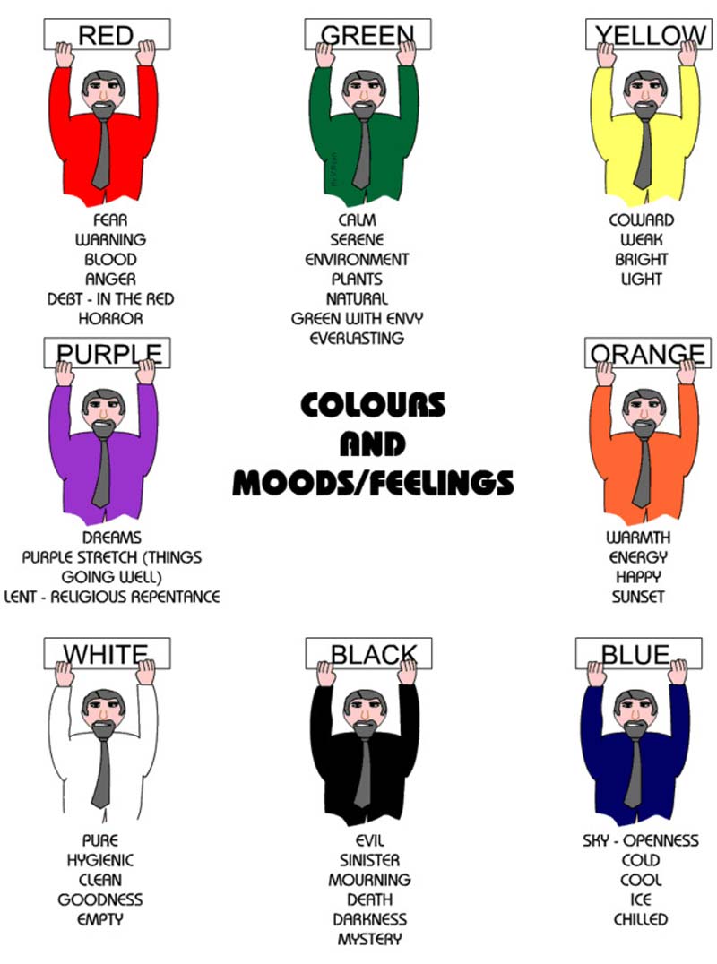
In fact, we all have an addiction to some color in clothing, accessories, shoes, whatever. And it is not a general preference. As we know, preferences may change depending on the mood, period of life, or even the weather around. For example, when I’m sad or nervous, I prefer surrounding myself with dark blue. This color makes me feel calm and peaceful. Meanwhile, being happy and excited with something, I pay my attention to red, pink, or white stuff around. That is how the psychology of color works for me.
Probably, you have the same, maybe, you don’t, however, the psychology of color is a powerful tool for endearing people of different nations and mentalities. You can unite and divide people with color, you can persuade them act the way you need with color, and you can even influence on their behavior with color. We only seem so strong and independent but, actually, we are weak enough, especially when it comes to the influence on our subconscious.
Basically, you may say that web design has nothing to do with colors. However, this industry wants to influence on people’s behavior, therefore, web design definitely needs colors to capture people’s attention and recognition. Studying the psychology of color in web design, you get an essential knowledge base that allows you to understand what colors actually persuade people to act and to get involved. For this reason, we have lots of marketers who work hard to compel us with colorful advertisements.
Your Conversion Rate Depends on Color
It’s important to note that color can boost or kill your conversion. Lots of people worldwide use online stores to purchase necessary goods, and a bulk of these purchases is based on color. To say more, every time you see some colors, you have a bunch of active processes in your brains and they direct you on next reactions and actions. For example, you hate yellow and this color really drives you nuts. You will never purchase things in a yellow-designed online store. Believe it or not, but it’s true! 🙂
Of course, it’s impossible to set all possible favorite colors on your designs, however, the psychology of color allows you to minimize a negative impact and to highlight a positive one, so, you can capture more visitors and boost your conversion.
The Right Placement to Avoid Color Overdose
It happens that working too hard and being truly crazy about doing everything right, we can overdo things, and it is not for goodness. When it comes to colors, you definitely need to be careful because just one wrong choice can make you fail. Additionally, there are 5 key places you should pay your attention to. I’m about your site’s newsletter pop-up, buttons, banners, headlines, and background tones. The point is that each color makes us feel different things, therefore, analyze your target audience to choose the best one.
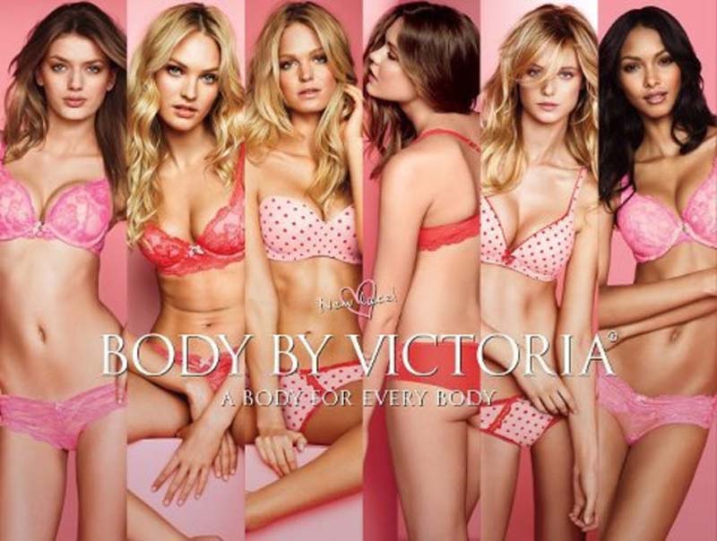
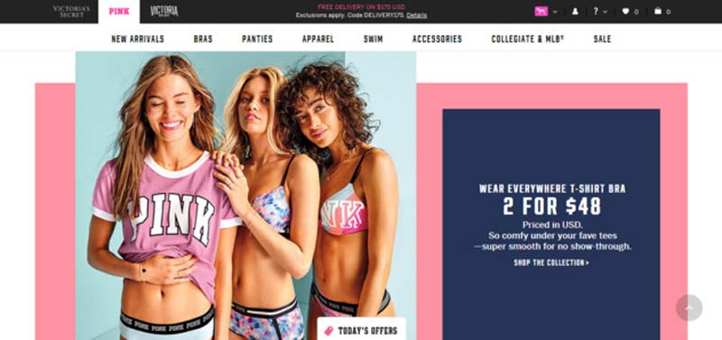
For example, take a close look at Victoria’s Secret brand. Mostly, they highlight their brand’s design with the hues of pink and beige. It’s not only about the cuteness of this color, pink is about femininity, love, and something longterm, intuitive, and sensitive. That’s why tons of women worldwide choose Victoria’s Secret as something special that absolutely meets all women’s needs.
8 Proven Color Solutions to Hit the Mark
Of course, everyone has its own favorite color. However, using the psychology of color in a right way, you can easily achieve your goals. To help you succeed in web design, I prepared the most good-looking colors that will make people click your website’s link over and over again.
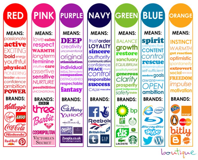
Blue. Blue can be defined as a color of reliability, peace, dignity, intelligence, and loyalty. Also, it’s a color of unexplored water and heaven, therefore, people feel something deep and calm in it. Here are some cool facts about blue.
- 53% of flags have a blue color in the core;
- It’s a first favorite color of people all over the Globe;
- The most popular blue product in the world is blue jeans;
- All European languages name aristocratic people as blue-blooded.
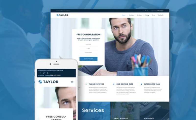
As a matter of a fact, if your future website relates to finance, medicine, or any other sphere of life that needs trust, blue is a perfect color to boost the engagement on your website. For example, view out a financial accounting WordPress theme Taylor from TemplateMonster.
This theme is based on a blue color to make the future website look safe, comfortable, and trustworthy for its clients.
Green. Green presents itself as a color of nature, growth, and fertility. Green seems even a bit more than just a color. Being so pleasant to people’s eyes, this color is mentioned as a real symbol of ecology.
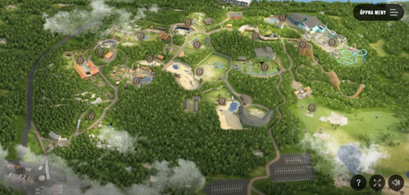
Lots of people worldwide use green to promote their organic foods, volunteering organizations, and more. By the way, darker shades of green often can be used for money-related websites. This is because of its relaxing and soothing effect. Therefore, if you own an environmental-related website, green is a perfect match for you! There is a wonderful example below, it’s a green website of a wildlife park made by Significant Bit.
Pink. Pink is known as a color of flirt and romance, and the coolest bubble gum ever. 🙂 Pink is funny, cheerful, lovely, and sweet. So, if you’re going to build a women’s website, feel free to use pink and its hues as the main color there. It will definitely help you to gain pleasant emotions from your visitors. Let’s get back to the Victoria’s Secret with its skillfully crafted Pink Collection presentation.
Red. Red is a powerful color of love, strength, passion, seduction, violence, anger, and more! Red is your way to well-done CTA buttons because it stimulates people to act. This color is special and here is why.
- 77% of flags include red color;
- It is an international color for a stop sign;
- Red is a second favorite color of all people worldwide.
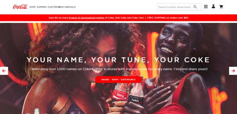
Despite the fact, that red is defined as a color of danger, people love it, and it can be a wonderful solution for a youthful website. A Coca-Colawebsite is a great example of a cool red design.
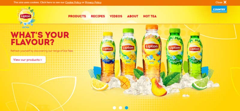
Yellow. Yellow is a truly multimeaning color. It can be a source of energy, intelligence, and warmth. It can also be defined as the best color to beat all worries and depression. Meanwhile, yellow is a color of various cautions.
Every time we visit a waterpark, we see a bright yellow caution, which allows us to look under one’s feet because of a wet floor. However, yellow is pretty good for kids websites because this color easily takes children’s’ attention. Lipton presents a great example of a yellow-based design.
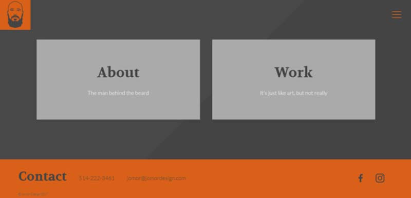
Orange. Orange is a color of vibrancy. It is full of energy, excitement, adventure, cheer, and warmth. People just hate or love orange, and there is no golden mean. There are some facts about this color below.
- Orange usually reminds people about fruits and juices;
- This color is defined as a color of vitamin C;
- Orange shows up such important things as hazard cones and high-visible police vests.
However, this color will be perfect for launching a technology-related website. For example, orange come in handy in the design below. It’s a web design-related website by Jomor Design.
Purple. Purple is a color of luxury, sophistication, and supernatural. This color has a bright history, and symbolizes magic and mystery. Catch some facts about purple below.
- Only two flags worldwide include this color;
- It’s a color of mourning and grief in Brazil, Italy, U.K., and Thailand.
- Purple symbolizes the gay community in a plenty of countries in the West.
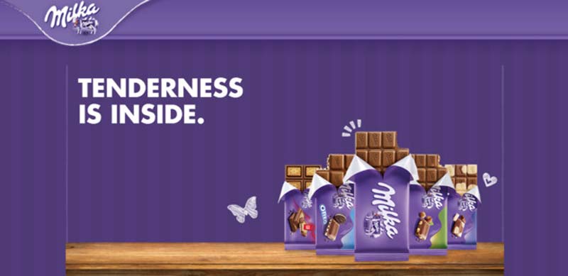
By the way, Milka website has a great purple look.
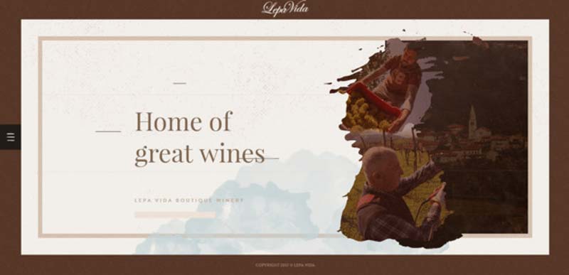
Brown. Brown is a color of reliability, peace, and relaxation. It is perfect for health and wellness-related websites. Lepa Vida, a home of great wines, has an elegant brown-designed website created by Nemanja Milosevic.
To sum it all up…
As you can see, the psychology of color really matters everywhere, and web design industry is not an exception. It evokes mood, hence, just one wrong color can cause you a low conversion rate and even a failed business.
Therefore, if you want to get in touch with your audience and to promote your product or service, you’d better hire a color-friendly web designer. 🙂 Or, you can visit TemplateMonster’s gallery and view a huge variety of their incredible WordPress themes for any color.
Stay Tuned!
What is your favorite color? What do you think about the psychology of color in web design? I’m happy to hear from you, so, please, drop me a line in the comments section below. Sharing is caring, therefore, you are very welcome to share this article with your friends so they could explore the real psychology of color! Wish you a colorful day!
About the Author

Peter Makeshoff
Peter Makeshoff is the founder and main author of Designer Daily.