Web design changes rapidly year on year. After all, many design elements are only added after the route and wireframe of a site has been built, so adjusting things like typography and images is technically a relatively easy process. That doesn’t diminish its importance however, as the visual aesthetic of any website is what will always get noticed first. Having a strong, unified brand look has never been more important; with so many fish in the sea, standing out is necessary if you want to be noticed.
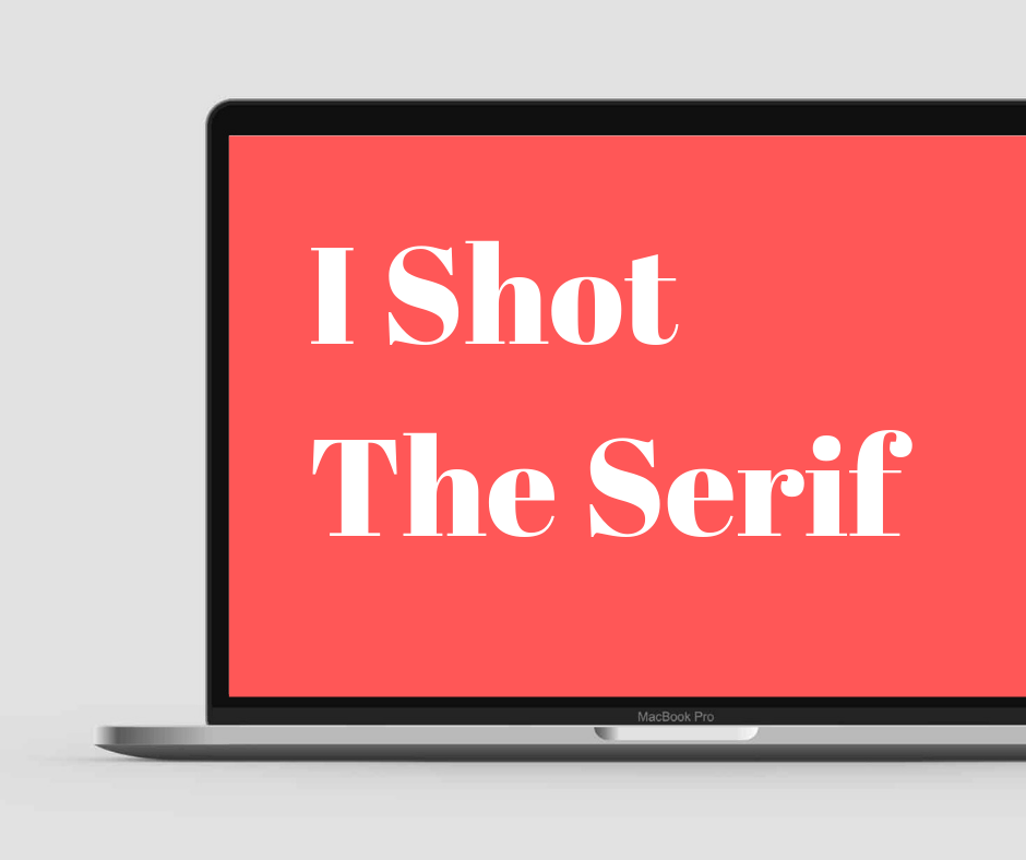
The serif is back in town
One major shift in the last year has been away from sans-serif fonts. The ubiquitous Helvetica-inspired typography which seemed in use on every major site has suffered from oversaturation, and now many more classic serif fonts are popping up. Indeed, many websites are making their choice of font front and center of their design philosophy, and quirky takes on traditional serif favorites are growing in popularity.
Colour blocks and monochrome
Another trend growing in popularity is the increase in monochrome images, offset by colored blocks. It gives the impression of a serious and nuanced approach to imagery and provides an easy way to maintain a consistent visual brand without too much effort. It allows any blocks of color to stand out more as well, giving the option to highlight particular sections which would otherwise be lost in a riot of color.
Flexible design
The ever-increasing use of mobile devices and tablets has been driving a radical change in web design philosophy for several years now, and that shows no signs of abating. While it first manifested as a necessity to have all elements of a site able to switch readily between portrait and landscape, touchscreen and monitor, more recent changes have incorporated elements that will work easily on any sort of device. This has meant a trend towards simple, bold elements in a design, which are both eye-catching when viewed on a large screen, and easy to navigate when held in the hand. Designers are now looking towards more asymmetric designs, breaking from the traditional grid-based approach to have more organically laid-out elements. It’s a careful balancing act, but when designers get it right it’s both spectacular and intuitive.
New media
An increase in the use of other forms of media, from micro-animations to video, has also become the norm. This is down in part to the increased bandwidth allowances that many mobile devices now have; and with the forthcoming introduction of 5G networking, and the vast upgrade in data that will allow, having media-rich design elements will become more and more common. Embedded video, interactive forms, chatbots, and even sound will all become commonplace as users are able to send and receive more data, more quickly. More powerful devices and browsers will also mean more interactivity with sites, from animated navigation to built-in applications.
Maximum minimalism. Finding a way to combine all these elements without overcrowding the screen is a challenge for any designer, and some designers are now reacting to that by hugely reducing the elements they wish to display. Minimalism will always have a certain chic, and that’s definitely a current trend, with many sites displaying copious white space and minimal content; a brave decision in many ways, necessitating trust that the content you display will keep your users interested. Certainly, the year ahead provides exciting and difficult challenges for designers and web development agencies alike to integrate new technologies and an ever more competitive fight for a share of the audience.
About the Author

Peter Makeshoff
Peter Makeshoff is the founder and main author of Designer Daily.