When you create a website for yourself or for your clients, you do so with an end goal in mind. You want your viewers to click onto your contact page. This makes it one of the most crucial pages on your site.
Many designers place a great deal of thought into site design in order to encourage viewers to convert.
At the same time, they often give little thought to the contact page, rushing to finish it quickly as it becomes time for the site to launch.
When creating a contact page, there are some pitfalls to avoid:
Including too few options
When it comes to making contact, some clients prefer to email while others prefer to fill out a form and have you get back to them. The split is more or less even.
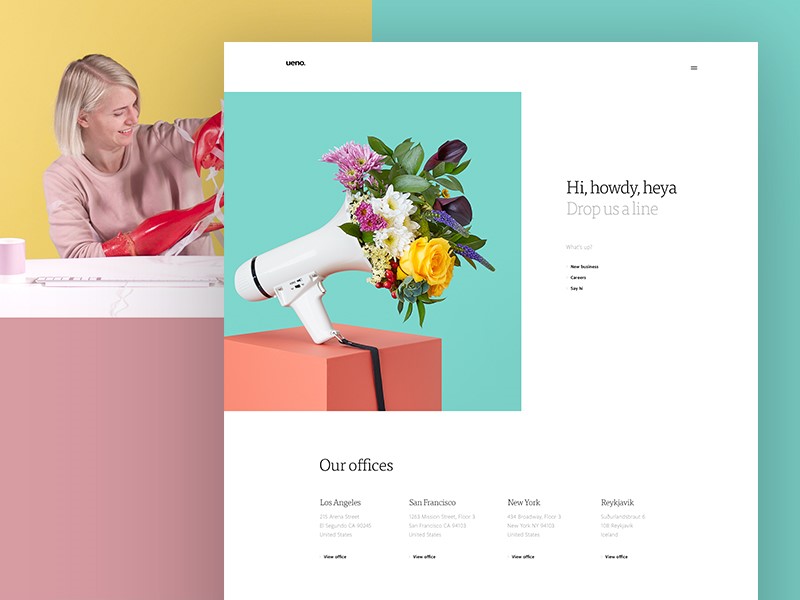
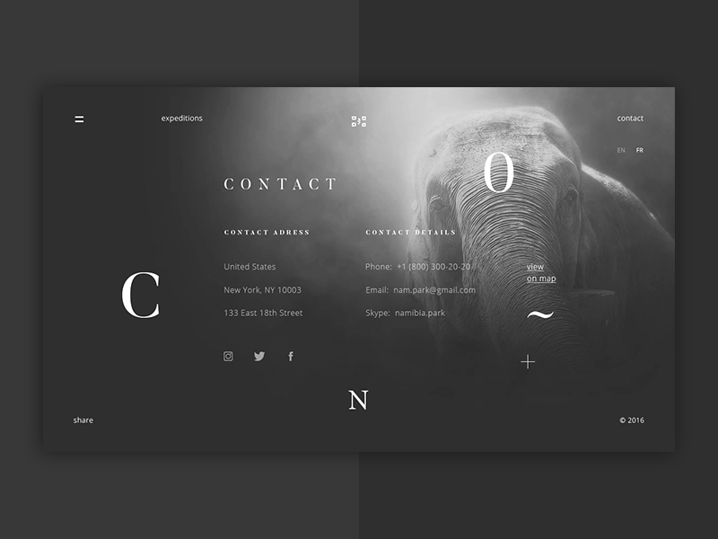
By including both options, you will meet the needs of the majority of your clients. You could also add social media links, a Skype contact number and a phone number.

Presenting multiple options assists clients to get in touch with you in whichever way they prefer.
Also, if you prefer planning your time well, and not going back and forth with emails, use a calendar scheduling app. The most at hand would be Calendly, although not the best. If you don’t like its downsides, you can look at the many Calendly alternatives out there.
Your forms are not engaging enough
If your form is very dull, your customers will not interact well. Use micro-animations to assist your clients to fill out your forms. You could also include your brand design so that your customers still identify with your contact page.
Some tips to make your form attractive
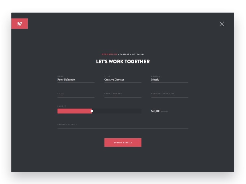
Keep it easy to read. Your readers should be able to understand what is required of them. They will also need to know which details they have filled in before they hit send.
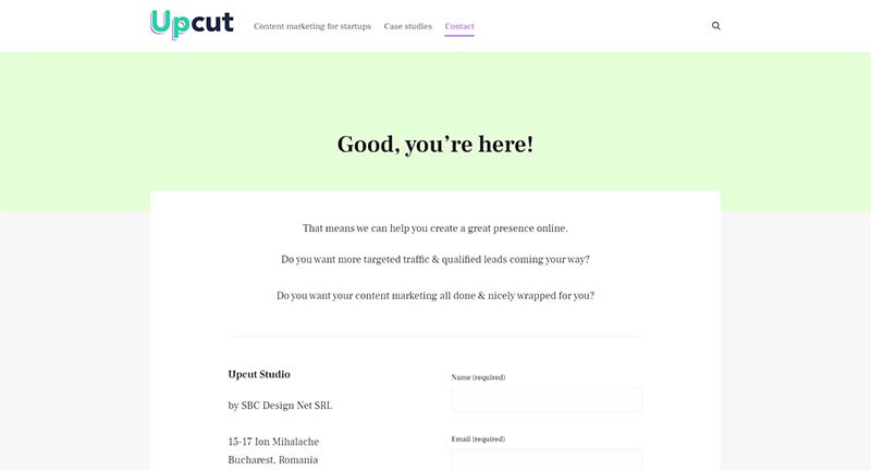
Keep your form fields large enough to fit any details your clients would like to submit. You should also place large gaps between your fields so that your forms are not cluttered. I always liked how fintech startups are handling this. They need lots of info, yet they manage to not make the contact forms a burden for the visitor.
When your readers have completed the form, they will need to press a button in order to send the form to you.
Try to keep the message on this button personal. “Contact us’ or ‘Request a quote’ are more helpful than ‘Submit’.
Your form is overwhelming
As stated earlier, not all clients want to fill in a contact form. Don’t limit your contact page to merely a form. However, even if a contact form is a preferred choice, a badly designed one may frustrate clients.
Here are some reasons why clients may find your form overwhelming.
Your form is lengthy
People often feel uncomfortable filling out long and complex forms. Some dislike providing large amounts of personal information.
Others don’t have time to fill out long forms. Keep your questions relevant. Your wording should be clear and precise too.
Your form isn’t responsive to mobile devices. Without a responsive design, many viewers will simply not attempt to contact you.
Your form links are broken. This will prevent your customers from accessing your page or submitting your form. Ensure that all your plugins are up to date.
Your contact page is not clearly marked
When you design your site, your labels need to be clearly designed so that clients understand how to reach you.
If you use vague terms or fancy labels, your clients might not know how to reach you and will need to search your site. Some might give up.
Add the term ‘contact’ to your menu at the top or bottom of your page. This way your clients will always know where to find you.
Add your contact page as a URL address so that your clients can easily find you. Create a clear link that is easily accessible through site navigation.
Although it is common to have your contact page in your header or footer, keep it above the fold if possible so that your clients do not have to scroll down to find it.
Your page is outdated
Like all other pages, your contact page needs to be well taken care of. Update it regularly. Your clients need to know who to speak to and where you are. If you move offices, update this information on your contact page.
Viewers need to know who they will be contacting. If you have a new sales rep, update your old information and add photographs to share a human touch.
Let Google know about any updated information at the same time. This will keep your search engine content relevant.
Allow space for people to make contact with you
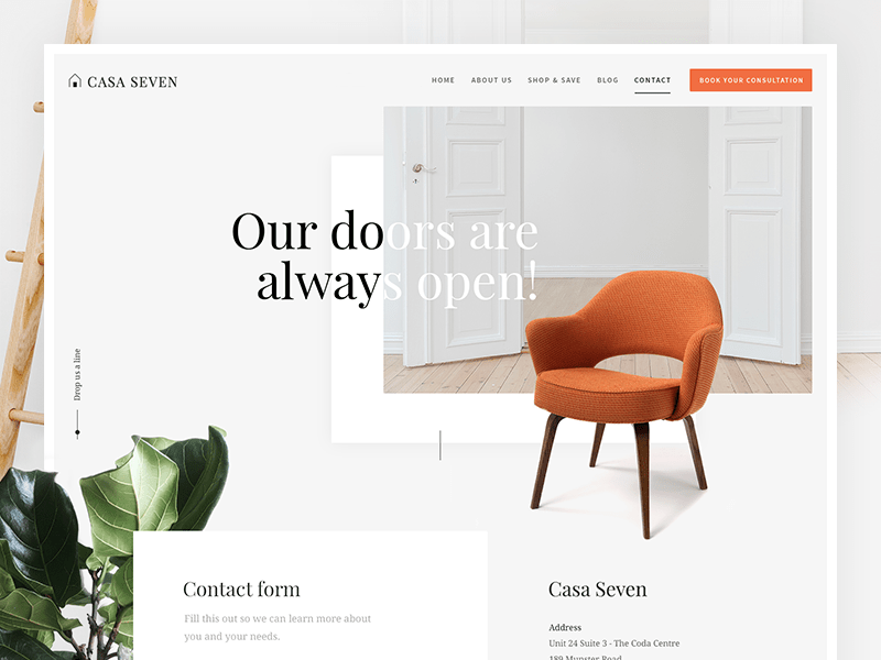
When you create a contact form, don’t assume this is the only way that your viewers would like to reach you. Many viewers would like to hold a private conversation with you! You can include a telephone number or email address for private consultations.
Including your social media profiles is a great way to encourage viewers to reach out. In order to do this though, you will need to monitor your social media accounts regularly.
The big one: your site doesn’t have a contact page
Once your clients have found your products or services desirable, they will want to get in touch with you. If your website lacks a contact page, they will not know how to achieve this.
If your client wishes to discuss your product further, make a sale or present you with an interesting opportunity, they will not know how to without a contact page.
Ensure your website has a contact page, and that your clients can find it with ease.
Your contact forms are the wrong length
As shared earlier in this article, viewers often find lengthy contact forms to be overwhelming. Many people are reluctant to submit too much information online. Viewers may also be reluctant to submit their phone numbers for fear of being hassled by sales reps.
At the same time, if you don’t ask for enough information, you may lose a possible contact. Give your clients information to share their concerns, ask questions or request a quote.
Ensure that you have enough information to give them a quick and helpful response.
The fix: create contact forms that are aimed at your target audience. Give reasons for the information you request and ensure that your forms meet your clients’ needs. Your form should be quick and easy to fill in, requesting some basic information and the reason for contact.
Not analyzing your reasons for contact
Your website will give clients access to company experts. Clients may have a number of reasons for making contact. Some may wish to ask for quotes, while others may have questions or queries.
Over time, you will get to know the type of questions people ask and why they might be contacting you.
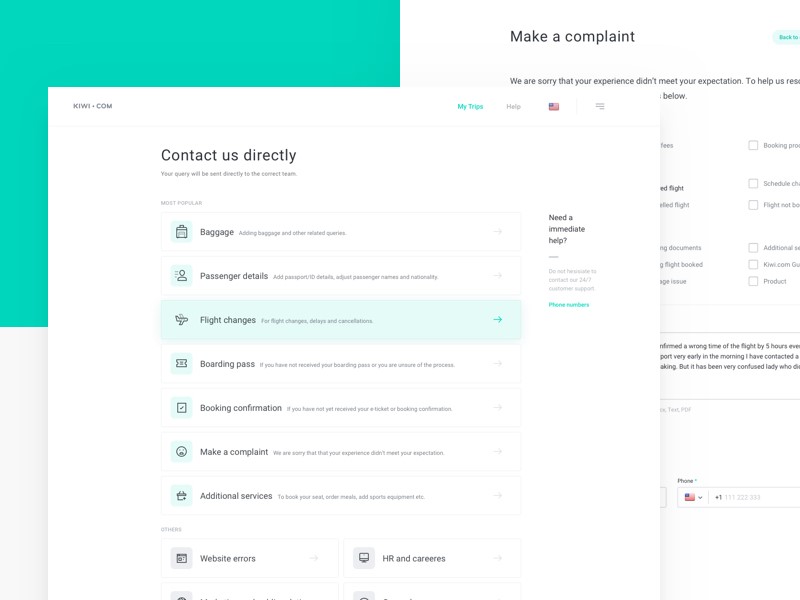
If your viewers contact you with similar questions or needs, you might consider creating a contact page which is tailor-made for these needs.
You could create a drop box of questions so that viewers could select one which is similar to their enquiry.
You could also create an FAQ section on your site if you realize that many viewers are contacting you with similar enquiries.
Tip: When you receive information from viewers, don’t simply reply. Instead, seek out the patterns which emerge and try to tailor your site to these questions or queries. This will assist you with improving your site
No acknowledgement that a form has been submitted
If your viewers send you a form, send an automatic receipt of their enquiry. This will reassure your viewers that their request has been acknowledged.

Without this, your viewers may send multiple contact requests simply to ensure that you have received their forms.
Captchas that are difficult to read
When you receive submissions to your site, you will want to know that you are receiving a request from a real person and not a robot. This may lead you to use captchas on your site.
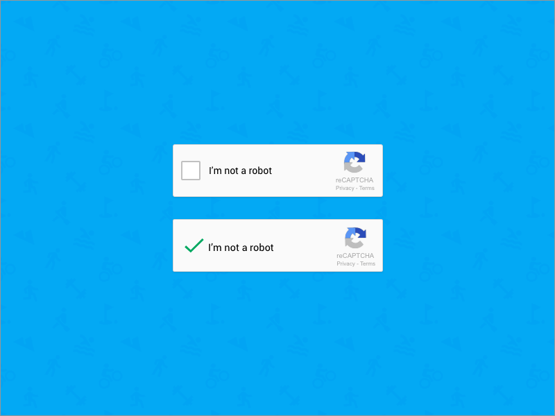
However, these captchas are often illegible and difficult to read. If you do use captchas, try to use those which are easy to follow or understand. Otherwise, you may deter your viewers from making contact.
Keep your contact page clear and easy to understand
If your viewer wants to make contact, this is their ultimate goal. If your page supplies all of the information they need without distractions it will be the most effective.
Summary
Your contact page is a very important means of transforming viewers into clients. It is, therefore, one of the most important pages on your site.
When you take your users into account while designing your page, you will have the most effective results.
Keep your page personal while sharing photos of your team. Increase trust by adding a map so that viewers know where to find you.
Provide multiple options for contact and keep your forms short.
This will assist you in increasing the conversion rates on your site. And if contact pages aren’t your thing, use a chat plugin. This might actually be a good alternative for large sites who spend a lot on customer support. A chat plugin with automated answers might lower the costs.
About the Author

Peter Makeshoff
Peter Makeshoff is the founder and main author of Designer Daily.