Everybody understands that there is no second opportunity to make a good first impression. This unchanging reality holds true in the world of digital products, where there is fierce rivalry and enormous diversity.
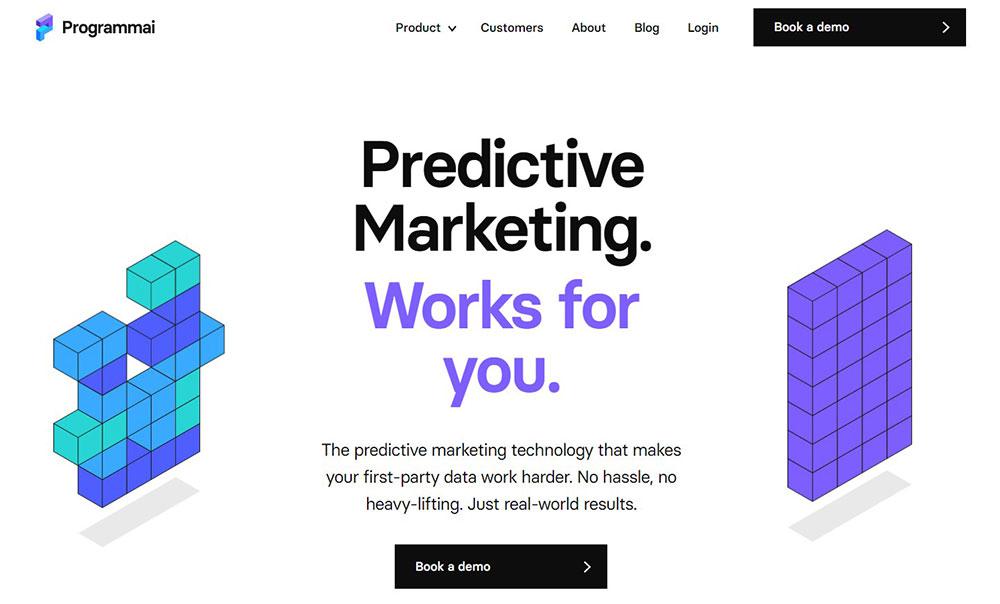
A website header is similar to a crown on someone’s head. The header is an important part of a website’s design since it sets the tone for the rest of the site. Especially now, in the era of victorious minimalism, when varied eye delights are frequently mercilessly commodified.
Creating the ideal header is a more personalized process than you would expect. When designing your website, bear in mind that the header is the first thing people will see when they arrive at your homepage.
A decent website header strikes a mix between clean design and straightforward access to the deeper pages of a website. As a result, it’s critical to focus on best practices while designing a website header for your company that allows their consumers to rapidly get the information they require.
A well-designed header may pique the interest of visitors and entice them to return. This post will go through some of the greatest website header design techniques.
Consider Navigation Beforehand
Consider whatever you want the most from the website visitor. Secondly, keep in mind that navigation and access to those things are at the top of the priority list. For example, if you own a high-end boutique store that specializes in tailoring, you would want to include a scheduling button to showcase this element of your business.
Visual Hierarchy
Visual Hierarchy is the arrangement of things in such a manner that users may easily grasp the content. Design the layout of elements such that they are visible, legible, and helpful to users.
Fixed (sticky) header
Continuous navigation bars, often known as “sticky headers,” indicate that the navigation follows you around the website as you scroll. This is currently considered a web design standard.
If it does not violate your general design idea, make the header fixed. It’s an excellent concept for desktop and mobile designs alike:
- E-commerce websites always have the cart in front of the user.
- The phone number or a call-to-action button is always visible on service websites.
- The navigation is always there for a quick tap or click. You can see this in sports WordPress themes and sports websites, implicitly.
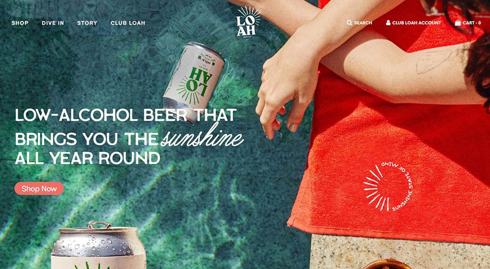
Choose an Efficient Menu Style
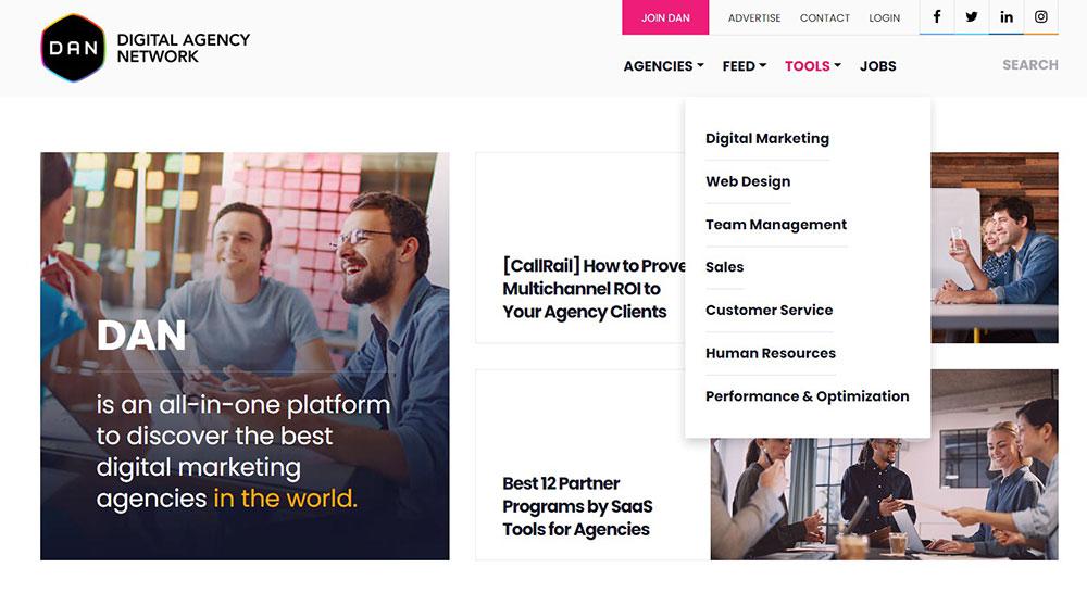
Businesses may utilize a variety of menu designs to make their headers more functional. Expandable and double menus, on the other hand, are two of the most efficient solutions. Expandable menus provide a lot of room for graphics, and double menus have two layers of navigation.
The hamburger menu is one of the most prevalent menu layouts seen on website headers nowadays. The name of this expanding menu comes from its appearance, which comprises horizontal lines that resemble a hamburger. The hamburger menu is easy to use and incorporates the main sections of the website.
Header size
The topic of what size a website header picture should be has no definitive answer. Some resources attempt to give accurate sets of data, but one of the most challenging components of website development nowadays is assuring the efficacy of every screen size. Even if two displays are the same size, the resolution may differ, thus consumers will not see the same thing.
So, instead of focusing on the precise pixel notion, stick to fundamental common sense guidelines. The height of the header should be such that it does not interfere with the perception of the content. A modest header would be ideal for informational resources, whilst a larger header would be appropriate for landing pages.
Consider Using a Shrinking Header
When your visitor scrolls, you have the option of making the header design shrink. This ensures that all important information is always at hand. You may boost visitor retention by using tactics like changing the color of the scroll and leaving the navigation visible wherever on the page.
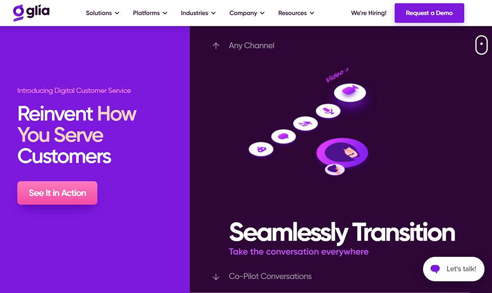
A well-designed call to action
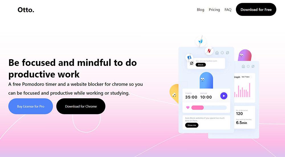
When creating a site header, the designer includes call to action components such as “log in,” “sign up,” “get in contact,” and so on. To draw the user’s attention and elicit the desired action, the button should have an inscription that is intelligible to the consumer and stands out among other materials.
A call to action placed in a strategically crucial area is an excellent chance to encourage consumers to take action straight away, increasing your conversion rate. Some CTAs can only be utilized for a limited time to promote special offers, while others have a long-term presence.
Search bar
Including a search bar in your header might be a terrific way to thank visitors. It allows customers to do a search on your site, showing a clear list of things related to the query. This is a very brilliant option to have on a blog since it assists readers in finding content relating to the themes in which they are most interested.
If you’re going to include something like this on your website, it should be in the header. Visitors will never miss it, and they will most likely appreciate having fast access to the search bar at the top of your website.
Use clear, readable fonts
Because the header sits at the top of your page and contains some of the most crucial and informative content, readability is essential. When designing your header, use a typeface that is symbolic of your company identity while still being easy to read.
Because your text’s objective is to instruct your audience, it would defeat its purpose if they had to expend too much effort interpreting it.
Hidden navigation (hamburger menu)
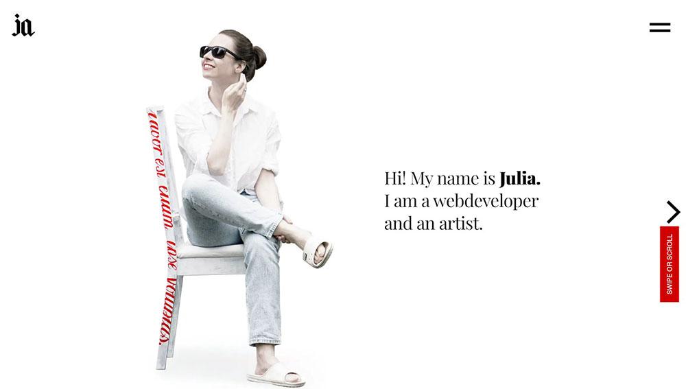
This is a solution that is increasingly being employed in website design. The hamburger menu is a tiny three-stripe symbol that, when clicked, exposes the whole menu. Designers utilize this strategy when they need to concentrate on the primary screen.
This is an excellent choice in terms of site usability. This type of menu originated in mobile design and is already recognizable to users. The hamburger is appropriate for promotional sites where the major emphasis is on high-quality product presentation via photographs or videos.
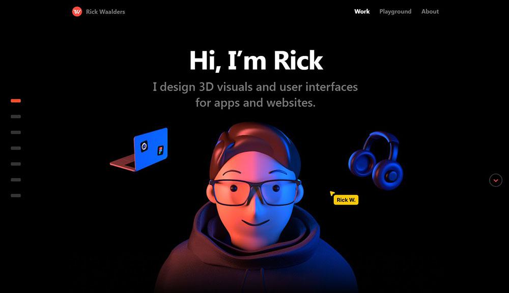
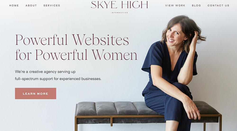
Headers with a message
It is OK to include a brief remark linked to the company’s activity in the header. You do not need to include the section in the title if it is not beneficial to visitors.
Adding text to your website’s header is a terrific way to send a personal or professional statement to your visitors right away. We’re not talking about page titles or your company name, but rather useful or inspiring content.
For example, you may utilize your header area to include an inspirational phrase related to your company or service. This works well if we’re talking about a yoga website or something similar. Alternatively, it might be a catchy area to post information about your company or to greet visitors as they arrive to your welcoming website.
Social media links

Is there really anyone who doesn’t desire more social media followers? It’s normal practice to include social media symbols on a website. By connecting them to your selected channels, you can easily convert website visits into followers and likes.
Typically, social links are incorporated into the design of a website’s header or footer. Placing these links at the top of your website ensures that people will notice them more quickly. However, if space is an issue in the design of your header, don’t worry about fitting things in here.
Keep a consistent design
Although there is no standard measurement, color, or even form for a website header, you want your header to strike a careful balance between being prominent and harmonious. In other words, it should never go undetected, but it may also be used as a design element to enhance the overall appeal of your site.
That is always up to interpretation, but there are some general guidelines to follow.
For example, ensure the size of your header does not interfere with how a user interacts with your content. Maintain consistency in aesthetic components such as color scheme and fonts with the rest of your website’s design.
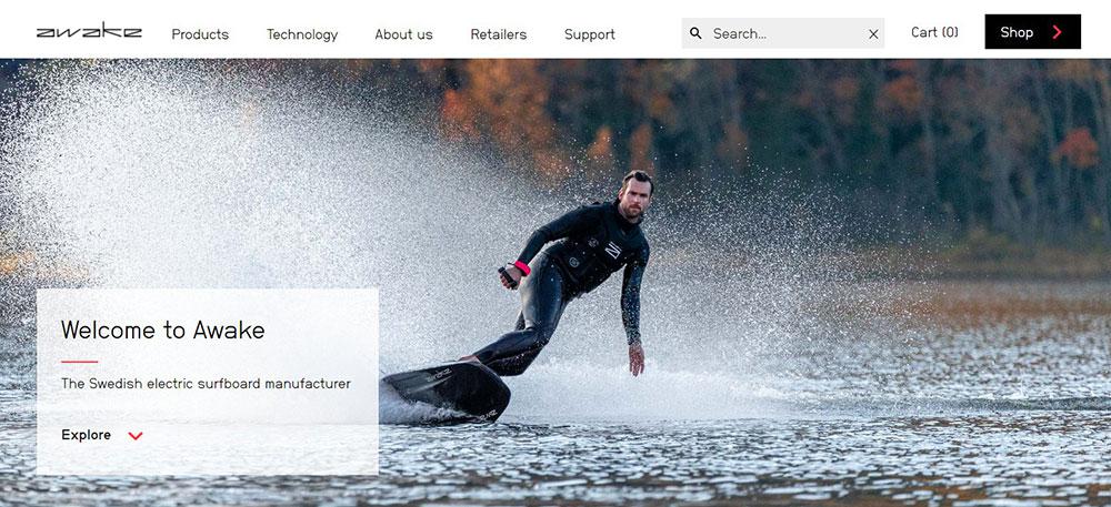
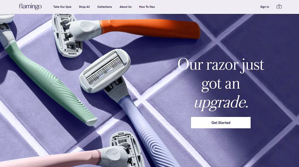
Make Your Website Header Minimal Over a Captivating Background Image
Typically, you’d want to include a header picture to enhance the graphics. However, in order to make room for a beautiful background picture, you may occasionally make your header simpler, smaller, and less apparent. This is one of those cases where the visuals outweigh the function. When you wish to shift the users’ attention to more crucial areas, you may want to apply this method.
Mobile header design
It is best if the header is appropriately shown not only on the desktop version of the website, but also on the mobile version. As a result, it must be responsive and capable of adapting to any mobile device.
The widespread usage of mobile devices has resulted in website designs that appear mobile-oriented even when viewed on a desktop computer. The use of huge hero pictures and hamburger menus, for example, has its beginnings in mobile design.
Add illustration or animation

There’s no reason why you can’t add some flair to your website’s header design if you have the room. Thanks to vector art’s outstanding technology, it’s simple to create high-quality website visuals – including drawings or animations – of any size. Incorporating artwork or animation will provide visitors with an unexpected experience by providing dynamic detail in an unexpected way.
Conclusion
You may anticipate your website header to be as impressive as possible if you follow the suggestions and best practices.
Because the header is an essential component of a website, businesses should take the time to design one that is both appealing and functional for their consumers. Consider keeping your header simple and clear when building a web page for corporate branding.
About the Author

Bogdan Sandu
Bogdan is a designer and editor at DesignYourWay. He's reading design books the same way a hamster eats carrots, and talks all the time about trends, best practices and design principles.