
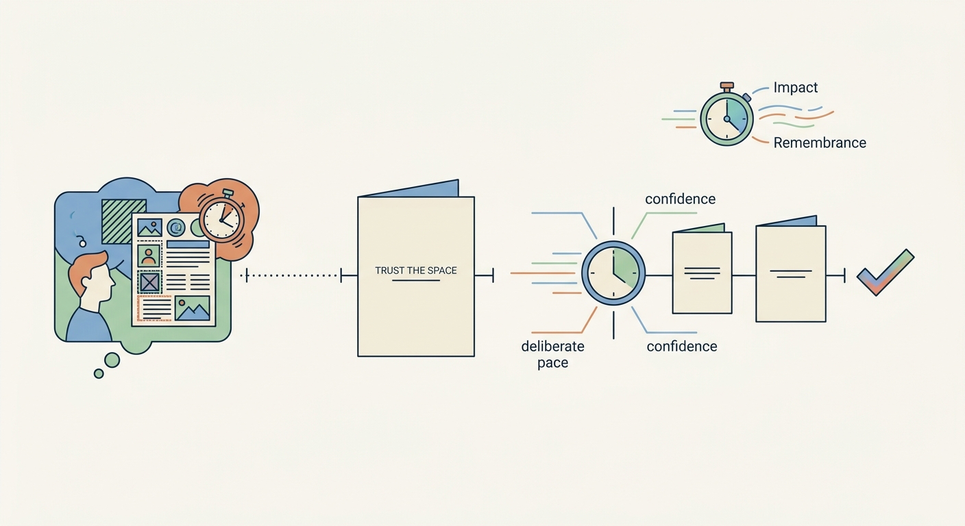
It was a simple card. A single line of text on the front, centered, with generous margins. The paper was thick, the ink was dark, and the empty space around the words was vast. The card did not try to fill every corner. It did not add a border, a pattern, or a secondary message. It trusted the emptiness.
The card worked. The message landed. The recipient felt the weight of the words. And the emptiness was the reason.
The Fear of Empty Space
Designers fear empty space. They see it as wasted opportunity, a blank canvas begging to be filled. The instinct is to add more: another element, a different color, an extra line of text. The fear is that the design is not finished, that something is missing.
The greeting card showed a different approach. The emptiness was not a lack of content. It was a deliberate choice. It was a statement of confidence. The card did not need to shout. It trusted the words to carry the meaning. The emptiness amplified the words.
The Role of Negative Space
Negative space is not an absence. It is a presence. It defines the shape of the positive elements. It creates breathing room for the eye. It gives the design a rhythm.
In the greeting card, the negative space was the message. The vast white field around the text forced the reader to focus. The space was not empty. It was purposeful. It was the medium that made the message visible.
The Lesson
The lesson is simple: fill less, say more. The design that has room to breathe is the design that is remembered. The design that is crammed with content is the design that is ignored. The space is not a liability. It is an asset. It is the thing that makes the content visible.
The next time you design something, leave more space. Trust the emptiness. The message will land harder. The recipient will remember longer. The space is not wasted. It is working.
About the Author

Peter Makeshoff
Peter Makeshoff is the founder and main author of Designer Daily.