A neon sign in a window is one of the few brand assets that continue to work after the shop closes. The lights inside are off. The door is locked. And the sign still tells the street who you are, and whether you’re worth stopping for. That’s a lot of pressure for something most people file under ‘decoration’ rather than ‘storefront branding’.
The gap between a sign that decorates and one that brands is wider than it looks. A decorative sign glows. A branding sign gets remembered, shows up in other people’s photos, and gets tied back to a name. One fills an empty wall. The other does the quiet work of recognition, the same job a logo does on a business card or a website header, only at street scale and usually in the dark.
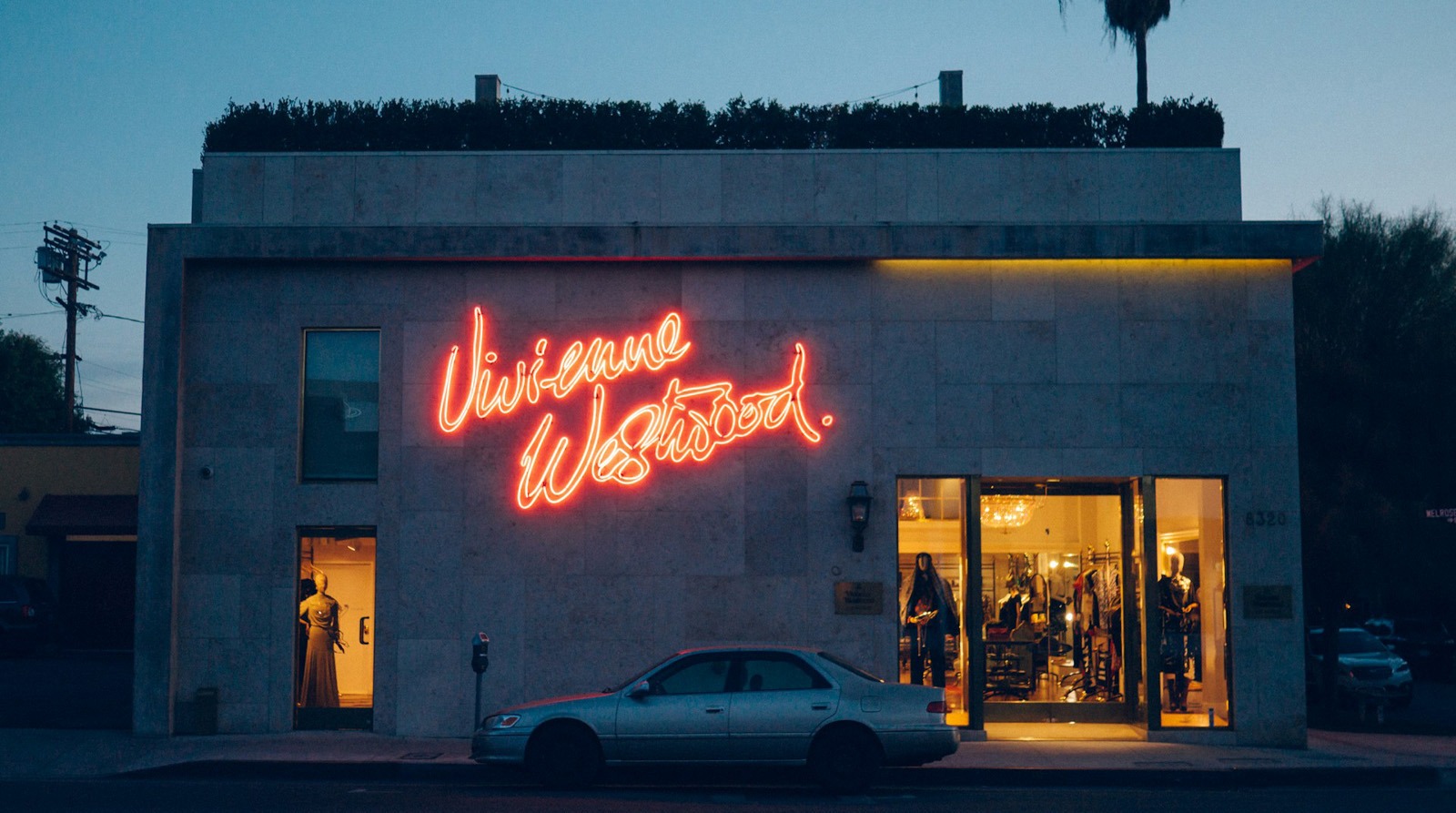
A good custom neon sign earns its place by carrying real identity, not just light. It uses the brand’s own letterforms, a color that holds up from across the road, and a message short enough to read in a second. Get those right, and the sign stops being an accessory. It becomes part of how people know you.
The Difference Between a Sign that Decorates and one that Brands
A custom neon sign can look perfectly nice and still fail at its actual job. It says nothing specific. A pink heart in a cafe window is pleasant, but it could belong to any of a hundred cafes. Swap the logo behind the counter for a competitor’s and nobody would notice. That’s decoration doing decoration’s job.
Branding is the opposite. It’s specific to one business and hard to mistake for another. When a sign carries the real name, the real typeface, and the colors people already associate with the brand, it builds recall every time someone walks past. Recall is the whole point of storefront branding. You want the person who saw your window on Tuesday to remember the name on Friday, when a friend asks where to go.
This is also where a lot of money gets wasted. A business pays a designer to nail the logo, the palette, the tone of voice, then orders a generic script sign that throws it all away. The storefront, the one brand touchpoint thousands of strangers see in person, ends up off-brand. (It happens more than designers like to admit.) A sign that matches the brand system isn’t a nice-to-have. It’s the system showing up where it counts most.
Why Typography Does Most of the Heavy Lifting
Type is where a neon sign lives or dies, and it’s the part most buyers think about least. A typeface that looks sharp on screen can fall apart once it’s bent into a tube or a strip of LED. Thin strokes get lost. Tight letter spacing turns into a glowing blur. Fine serifs can’t really be formed in the material without looking broken.
The fix isn’t to abandon your brand font. It’s to adapt to it. The designers who do this well pick a weight and width that survives the medium, open up the spacing, and drop any detail that won’t bend cleanly. A wordmark built for print often needs a slightly heavier, more even-stroked cousin for light. What you’re after is simple: someone reading it from across the street still recognizes the brand, not a vague version of it.
Legibility at a distance is the real test. A sign you can only read once you’re standing under it has already missed the people walking by. Keep the message short, the letters generous, the contrast against the wall behind it high. One clear word in the right type beats a clever phrase nobody can parse at a glance. Restraint reads as confidence.
Color Behaves Differently the Moment it Lights Up
Brand color on a screen and brand color in glowing glass aren’t the same thing, and treating them as identical is a common mistake. A warm pink that feels soft in a logo can read hot and loud once it’s lit. A cool blue that looks crisp on a website can feel clinical on a wall at night. Light adds its own temperature to everything it touches.
That temperature is a tool, not a problem. Warm tones (soft white, peach, amber) make a space feel inviting, which is why they suit food, beauty, and hospitality. Cooler tones (blue, green, bright white) feel modern and clean, a better match for tech, fitness, or anything clinical. Picking a color is really picking a mood. The mood should line up with what the brand already promises everywhere else.
Test before you commit. Color shifts between daylight and evening, and a shade that pops on a pale wall can vanish on a dark one. Any decent maker will show you how a color reads under lit versus unlit conditions. (If they won’t, that tells you something.) The one that matches your brand and survives the wall behind it is the one to buy.
The Light Itself is a Design Decision
The material behind the glow shapes how a sign looks, how long it lasts, and what it costs to run. Traditional glass neon is the real thing: hand-bent tubes filled with gas, with a warmth and depth that fans swear by. It’s also fragile, hot to the touch, power-hungry, and a headache to fix when one section goes dark.
LED neon flex is the more common choice now. It copies that look with flexible tubing lit by small LEDs, and it’s tougher, lighter, cooler to run, and more energy-efficient. Most versions ship with a dimmer so that you can match the brightness to the room. For a working storefront that has to look good every night for years, the practical case is strong.
Neither one is automatically right. A vintage bar might want the genuine glass glow and be happy to accept the upkeep. A new boutique probably wants the durable, low-maintenance version that withstands daily wear and tear. Just choose on purpose. The material shapes the brand impression as much as the letters do.
A Good Sign Earns Its Keep
Storefront branding isn’t only about looking like yourself. It’s about getting people through the door. A sign in the right spot, with the right message, does brand work and sales work in the same breath. There’s a real link between a strong storefront sign and how many people actually walk in, and the mechanics of how signage drives foot traffic are worth understanding before you commission a custom neon sign.
The logic is simple. People decide whether to step inside within seconds, mostly based on what they can see from the sidewalk. A clear, well-branded sign gives them a reason to slow down and a name to trust. In the evening, when the shops nearby blur into the dark, a lit sign is often the only thing pulling a glance your way. That visibility is worth more than most owners give it credit for.
This is the honest case for treating a sign as an investment, not a decoration. A well-made one keeps working night after night for years, at a fixed cost, while rented ad space bills you every month. Not many brand assets pay you back that quietly.
The Shift that Makes a Sign Worth It
The brands that get this right stop treating the sign as the last thing they buy and start treating it as the brand meeting the street. A custom neon sign built with the right type, the right color, and the right amount of light isn’t a decoration that happens to carry a name. It’s the identity itself, working in public, after hours, in front of everyone who walks by.
That shift in thinking is the whole difference. Decoration asks to be looked at. Branding asks to be remembered. A storefront sign can do either, and which one it becomes is decided long before anyone flips the switch. Make those calls like a designer, and the glow earns its place.
About the Author

Peter Makeshoff
Peter Makeshoff is the founder and main author of Designer Daily.