A staircase is the original user journey. Long before wireframes and user flows, architects were solving the same fundamental problem designers face today: how to move people from one place to another in a way that feels intuitive, meaningful, and even delightful. The best staircases don’t just connect floors. They choreograph experience, build anticipation, and reward the journey.
Here’s what UX designers can learn from three very different approaches to stair design.
The Spanish Steps: Designing for Meandering
The Spanish Steps in Rome are a masterclass in intentional indirection. You cannot descend them in a straight line. The staircase expands and contracts, creating landings, curves, and gathering spaces that have no functional purpose except to encourage people to stop.
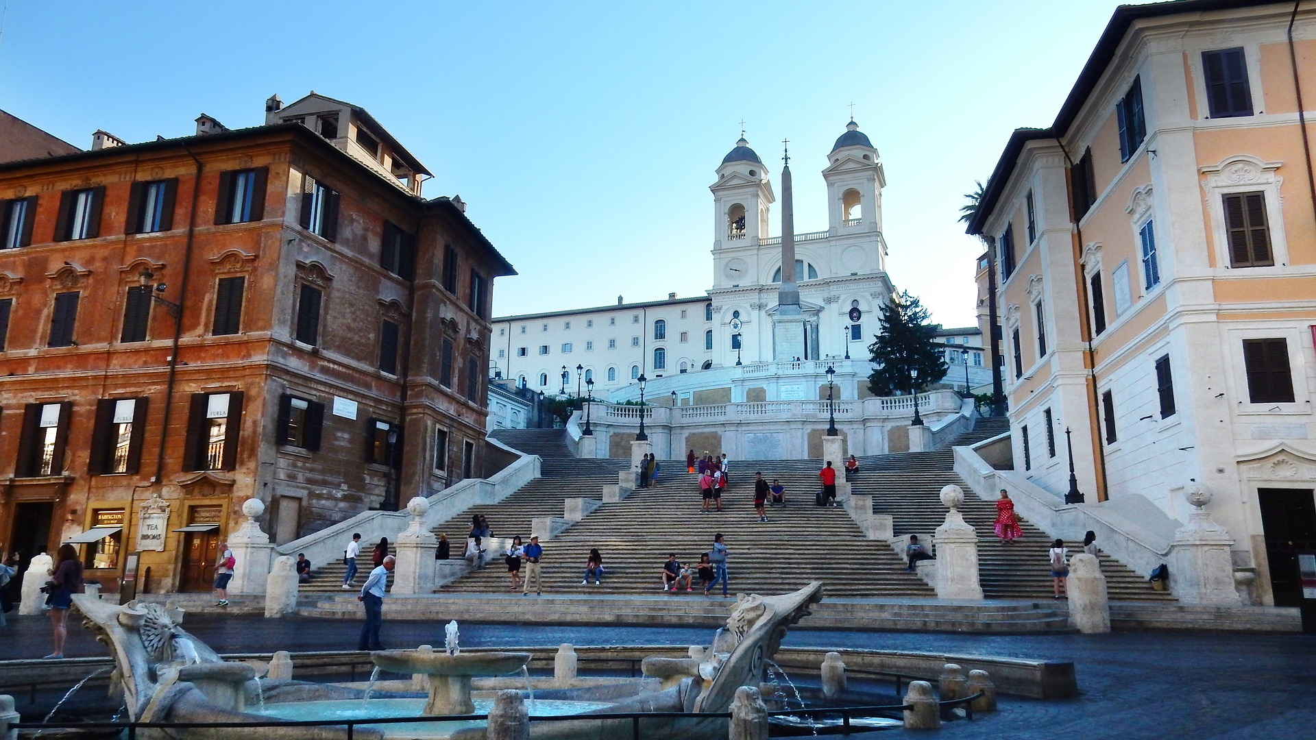
The effect is profound. A structure that could have been a simple utility becomes a destination. People sit. They talk. They watch. They live their lives on those steps. An architectural analysis notes that the Spanish Steps “encourage meandering,” inviting people to “step out of their busy lives and take time to sit, relax, and chat”.
UX lesson: Not every journey needs to be the shortest path. Sometimes the goal is engagement, not efficiency. In consumer apps, e-commerce sites, or content platforms, creating opportunities for exploration and serendipity can transform a transactional interaction into a meaningful experience. The question isn’t always “how do we get users to point B fastest?” Sometimes it’s “how do we make the journey itself enjoyable?”
The Vessel: Pacing and Anticipation
New York’s Vessel, the 16-story honeycomb of staircases at Hudson Yards, offers a different lesson. Designed by Heatherwick Studio, it contains 154 interconnecting flights of stairs, 80 landings, and nearly 2,500 steps. Visitors can climb to the top, but the real design intelligence is in what happens along the way.
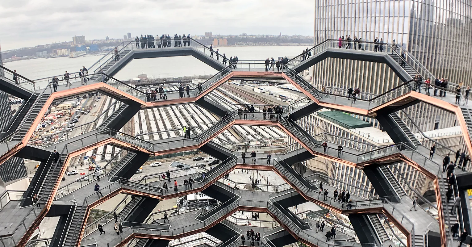
As you ascend, the structure reveals itself gradually. New perspectives open. The city appears through different frames. Other climbers become part of the visual landscape. One visitor described it as “the closest one can come to actually inhabiting an Escher drawing”. Another noted that the structure “provides an opportunity to do the opposite” of typical city experiences: instead of looking up and feeling small, you look down and feel elevated.
The designers intentionally created a journey with pacing. There are moments of anticipation, moments of revelation, and moments of rest on the landings. The elevator exists for accessibility, but “the real joy is found in the meandering journey to the top”.
UX lesson: Long user flows need pacing. Multi-step onboarding, checkout processes, or setup wizards should include moments of progress indication, variation in density, and visual rewards along the way. The landing pages of your user journey are as important as the destination.
Parisian Spiral Staircases: The Efficiency of Constraints
Parisian apartments, particularly in the Marais, offer a third model: the spiral staircase. These tight, vertical coils solve a brutal spatial problem. In a city where space is the ultimate luxury, a spiral staircase consumes far less floor area than a conventional straight run.
But the constraints create unexpected qualities. The spiral is inherently romantic. Its curves reveal and conceal. You glimpse the floor above through the center of the coil. You hear movement before you see it. The form forces intimacy and anticipation.
One Parisian apartment renovation by Fendi designer Daniel Rueda uses a spiral staircase inspired by Tina Chow’s legendary Sutton Place apartment. The stair connects basement to mezzanine, becoming the sculptural heart of a 431-square-foot home. Another project uses an exterior spiral to connect garden to terrace, transforming a purely functional fire escape into “a romantic aesthetic to the Shakespearean outdoor scene”.
UX lesson: Constraints can create character. When you’re forced to work within tight limits, screen size, development resources, technical requirements, the resulting design often has more personality than an unbounded canvas. The key is embracing the limitation rather than fighting it.
The Safety Problem: When Design Fails Users
The academic research on staircases contains a sobering statistic: stairs are responsible for more accidents than any structure except motor vehicles. This persists despite extensive building codes. Alexander Koutamanis, reviewing the literature in Architecture journal, argues that the problem stems from a fundamental misunderstanding of how users actually interact with stairs.
His proposed solution is to build on “affordance-based analyses” that establish “a clear connection between the form of a stair and the perception of both action possibilities and dangers by all kinds of users”. In plain language: designers need to understand how real people with real bodies and real cognitive loads perceive and navigate stairs.
A viral TikTok video illustrates the point perfectly. An interior designer booked a stunning Paris Airbnb, only to discover that the spiral staircase, while beautiful, was terrifying to descend in heels. “Me: I want the aesthetic Airbnb. Also me: can’t walk down the stairs without risking my life in my shoes,” her caption read. The stair, a classic Roger Tallon design, was safe. But it didn’t feel safe. The perception and the reality diverged.
UX lesson: Perceived safety matters as much as actual safety. In interfaces, this translates to error states, confirmation dialogs, and clear feedback. Users need to feel in control, even when they are.
Applying Stair Logic to UX Design
What would it mean to design user journeys with the intentionality of great staircase architecture?
Consider the entry point. The Spanish Steps don’t begin with a sign saying “climb here.” They begin with an expansive invitation, a widening of the path that signals this is a place to be, not just a route to traverse. Your app’s home screen or landing page should do the same: signal what kind of experience this is going to be.
Build in rest stops. The Vessel’s 80 landings aren’t design errors. They’re opportunities to pause, reorient, and appreciate progress. Multi-step user flows need equivalent moments: progress indicators, summary screens, or simply visual variation that signals a new phase has begun.
Embrace constraints creatively. The Parisian spiral staircase doesn’t apologize for its tight footprint. It celebrates it, becoming a sculptural feature. When you’re working within tight constraints, a small screen, limited navigation options, strict brand guidelines, ask what those constraints make possible rather than what they prevent.
Test with real users in real conditions. The academic research on stair safety reveals that designers systematically misunderstand how people actually use stairs. The same is true in UX. Users will find paths you never anticipated. They will hesitate where you expected confidence. Testing with real behavior, not just ideal scenarios, is the only remedy.
The Bottom Line
Staircases and user interfaces share a fundamental purpose: they move people through space toward a goal. The best examples of both understand that the journey is as important as the destination. They build anticipation, reward exploration, and make the functional feel meaningful.
As the analysis of the Spanish Steps puts it: “The three sites, although very different in form and function, each have specific, intentional designs which enable the designers to effectively achieve their goals, no matter what they may be”. That’s the standard to aim for. Intentionality in every step.
About the Author

Peter Makeshoff
Peter Makeshoff is the founder and main author of Designer Daily.