
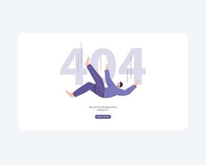
A 404 page is a moment of failure. The user has clicked a link or typed a URL and arrived at a dead end. The content they were expecting is not there. This is not a rare edge case; it is a routine part of the web experience. How you handle this failure communicates something about your brand. It is an opportunity to build trust or to erode it.
The Standard 404: A Missed Opportunity
The most common 404 page is a generic, system-generated error message. “404 Not Found.” A stark, technical phrase that offers no guidance, no comfort, and no reason to stay. This page is the digital equivalent of a locked door with no note and no apology.
This is a failure of empathy. A user who arrives at a 404 page is already frustrated. They have been redirected, disappointed, or confused. A generic error message compounds this frustration. It offers no explanation. It offers no path forward. It tells the user that the system has failed and that the system does not care.
The Empathetic 404
An effective 404 page turns a failure into an opportunity. It acknowledges the problem, explains it in plain language, and offers a clear path forward.
The language should be human. “Oops, we couldn’t find that page.” Not “404 Not Found.” The explanation should be simple. “It looks like the link you followed might be broken, or the page might have been moved.”
The design should be consistent with the brand. A playful brand can use humor. A serious brand should be serious. A minimalist brand should be minimal. The 404 page is not an exception to the brand guidelines. It is an extension of them.
The Functional 404
The most effective 404 pages offer a clear path forward. The best thing you can do is provide a search bar so they can find what they were looking for. A sitemap or a set of popular links can also help users find their way.
The functional 404 page is not just a landing. It is a navigation tool. It helps the user recover from the dead end and continue their journey. A simple search bar, a link to the homepage, and a few popular pages are usually enough.
The Branded 404
Some brands use the 404 page as an opportunity for creative expression. A clever illustration, a witty message, or a playful animation can turn a moment of frustration into a moment of delight.
The tone of the 404 page should be consistent with the brand’s personality. Mailchimp uses a playful illustration. Dropbox uses a simple, friendly message. The design should feel like a natural part of the brand’s visual language.
The risk is that a humorous 404 page will feel dismissive. If the user is genuinely frustrated, a joke can feel like mockery. The humor should be gentle, not condescending.
The SEO Impact
A well-designed 404 page can also have a positive impact on SEO. By providing clear navigation and helping users find relevant content, you reduce bounce rates and signal to search engines that your site is well-maintained. Conversely, a poor 404 page can harm your search rankings by creating a poor user experience.
The Bottom Line
A 404 page is a moment of failure. It is also a moment of opportunity. The user is lost. They are frustrated. They are looking for a way forward. What they find is a reflection of your brand. A generic error message says you do not care. A helpful, empathetic, branded page says you do.
Design your 404 page as carefully as you design your homepage. It is not an edge case. It is an essential part of the user experience. The user who lands on your 404 page is the user who needs your help the most. Give it to them.
About the Author

Peter Makeshoff
Peter Makeshoff is the founder and main author of Designer Daily.