
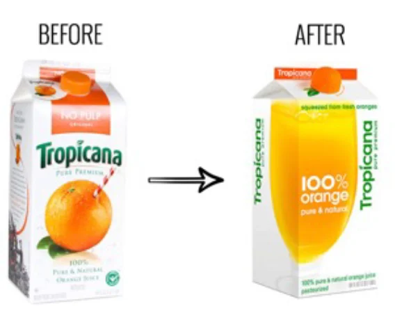
It is one of the most expensive and instructive failures in the history of brand design. A juice packaging that consumers knew by heart was completely redesigned in the name of “modernization.” The result: sales plummeted by 20%, and the company was forced to scrap the new design and revert to the old one within two months.
The Backstory: The Straw in the Orange
In January 2009, Tropicana launched a new packaging design that cost $35 million, part of a “modernization” strategy under its parent company, PepsiCo. The old packaging featured a highly recognizable visual asset: a red straw stuck directly into a fresh orange. This image was simple, intuitive, and full of life. For decades, it helped consumers instantly identify Tropicana on the supermarket shelf.
What did the new packaging replace it with? A glass of pale orange juice, with the caps uniformly designed in orange. The old packaging had a clear color-coding system: blue caps meant added calcium, green caps meant pulp, and orange caps meant original. The new packaging made all caps orange, blurring the distinctions between product lines.
The design team’s intention was “more modern, more natural.” But consumers felt the opposite.
The Disastrous Two Months
After the new packaging hit shelves, problems surfaced quickly. Consumers could no longer find Tropicana in the supermarket because they were used to looking for the straw stuck in the orange. Without that visual anchor, Tropicana became just another “generic juice brand” in their eyes.
Social media was flooded with negative reactions: “It looks like a store brand,” “It looks cheap,” “It doesn’t stand out.” More critically, consumers could no longer quickly distinguish between Tropicana’s different product lines (calcium, pulp, original) because all the caps had become orange.
The data was cold. From late December 2008 to February 2009, sales of Tropicana Pure Premium plummeted by 20% year-over-year. For a brand that held a leading position in the highly competitive juice category, this drop was catastrophic. By the end of February, Tropicana announced it was abandoning the new packaging and returning to the old design. The entire lifespan of the new packaging was less than two months.
A study published in an academic journal estimated that the packaging redesign cost Tropicana up to $27 million. And that does not include the $35 million spent on design and promotion, which was essentially wasted.
What Went Wrong?
Scholars and brand experts analyzed the failure after the fact, identifying multiple causes:
Misjudging a Visual Asset. Tropicana treated the “straw in orange” as an outdated decorative element, but consumers treated it as the brand itself. This image was not “decoration” on the packaging; it was a “navigation tool” that helped consumers complete the task of identification on the shelf. Removing it was like tearing down the signpost that helped consumers find you.
Collapse of the Information Architecture. The old packaging’s color-coding system (blue/green/orange) was a carefully designed functional tool that allowed consumers to grab the product they needed within three seconds. The new packaging made all caps orange, which looked “simpler” but actually destroyed functional clarity.
Misunderstanding “Modernity.” The design team believed the old packaging was “too traditional” and needed “modernization.” But they failed to realize that Tropicana’s old packaging was effective precisely because it had built strong brand equity. What was called “modernization” became “de-branding” in the eyes of consumers.
The Real Lesson
Tropicana’s failure is not an isolated case. Gap changed its logo in 2010 and was forced to revert within a week after a social media storm. Cracker Barrel attempted to “modernize” its logo in 2025 by removing the iconic “Uncle Herschel” figure, triggering a fierce backlash from consumers, investors, and even politicians. The company lost approximately $100 million in market value within days and restored the old logo within a week.
These cases reveal a common pattern: The most valuable asset a brand owns is often precisely the visual element that consumers are most familiar with and most dependent on. Designers may find them “outdated” or “not modern enough,” but for consumers, they are carriers of trust and shortcuts for recognition.
When Tropicana’s designers replaced the straw-in-orange with a glass of juice, they thought they were “updating” the brand. But what consumers saw was: the Tropicana I knew is gone. Standing on the shelf was something I did not recognize, something that looked like any other bottle of juice.
Tropicana never truly recovered. The straw that was pulled out took away not just a graphic, but a visual contract that had been built between the brand and its consumers over decades.
About the Author

Peter Makeshoff
Peter Makeshoff is the founder and main author of Designer Daily.