Customers prefer to buy online for a variety of reasons, including the fact that it is faster, simpler, and less stressful, provides a broader selection, and is frequently less priced due to a range of special discounts.
However, exceptional client experience can only be accomplished with smart e-commerce design.
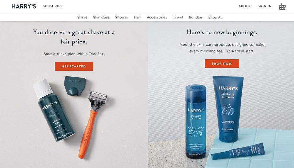
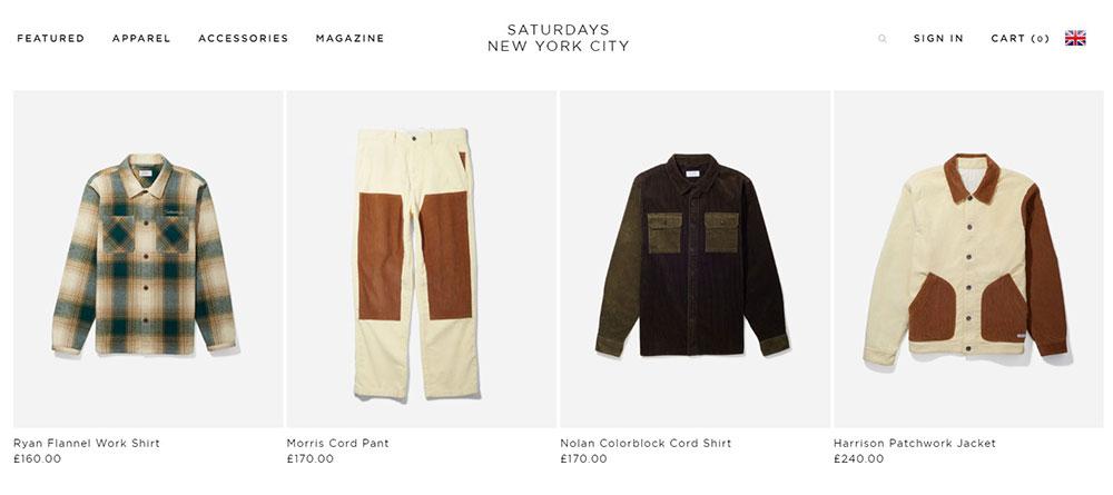
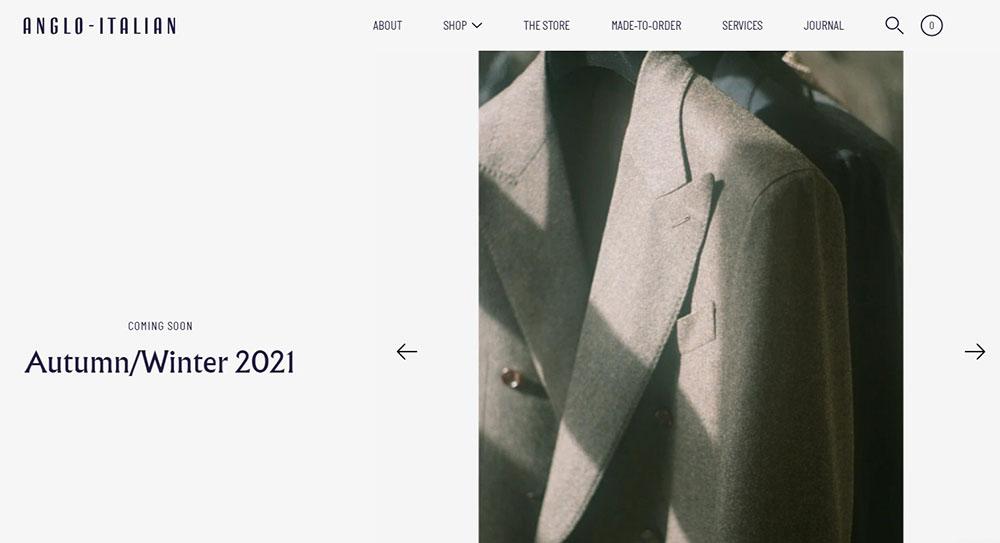
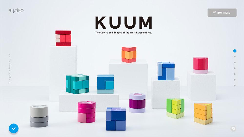
Minimalist digital design reduces the layout and appearance of a website to its bare bones.
Companies all around the world have used the Minimalist approach to brand marketing and promotion for the better part of a millennium. Conversion rates may rise as a result of directing users’ attention to the most crucial element of the content.
Visitors will be able to spend more time on your website as a result. Aside from design, the architecture of your website should be capable of educating, acquiring, activating, and growing your consumers.
The following are some of the reasons why e-commerce stores choose a minimalist design.
Simple design is timeless
One of the most serious issues with websites is that they get out of date very fast. It appears that just as you are ready to complete one update, another appears. But this does not have to be the case.
Busy designs soon lose their appeal and become ancient.
You can endure the changing tides of website trends by adopting a basic design for your website. You’ll require fewer revisions and can save money by upgrading less frequently. Even more crucial, you will keep your attractive appearance for many years to come. You can do this easily with a minimalist WooCommerce theme, for the whole online shop, or a minimalist website template, if you just want to create a few static pages.
Ease of Interactions
Simplifying your website involves reducing the number of calls to action. Calls to action that are simplified result in an evident boost in engagement. A minimalist vision exudes elegance and self-assurance.
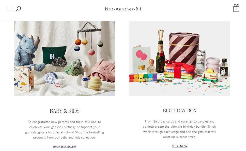
The use of white space and clean components provide your brand with a well-established, self-assured, and bold appearance. There are no bells and whistles required to showcase your essence. This design emphasizes the most crucial features, such as your items, pricing, and calls to action.
Visual Information Processing
And the greatest approach to make your site more cognitive is to make it visually easy to digest. A Harvard research published in 2013 discovered substantial mathematical connections between what various populations considered to be “aesthetically pleasing.” While various people appear to have wildly disparate tastes in web design, one common notion was discovered: the more aesthetically complicated a site is, the lower its visual appeal. By streamlining your site, you can appeal to the greatest number of individuals.
The following is how it works:
- Your retina transforms visual information into electrical impulses, which it then delivers to your brain. These impulses provide information about color and light.
- The more color and brightness changes there are on the page (visual complexity), the more effort your eye has to do to convey impulses to your brain. The information must then be translated and stored by your brain, which requires more effort.
Drive Focus
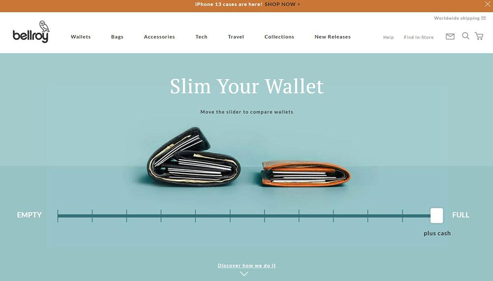
Negative space is a method most frequently associated with this school of design, and it is very probably the defining aspect of minimal design. The fundamental role of negative space is to influence the user’s visual flow and divert his or her focus.
When creating a flat website design, you commit to clarity and user experience. Typography, grids, space, scale, colors, and imagery all work together to establish hierarchy, meaning, and attention. As for extras, custom icons and patterns are utilized to pull the user’s eye through the website.
The use of motion and properly timed animations reinforce the user as the primary doer, establishing continuity as things alter and rearrange. Google advises employing depth, visual hierarchy, and drop shadows to build designs that replicate real-world behavior.
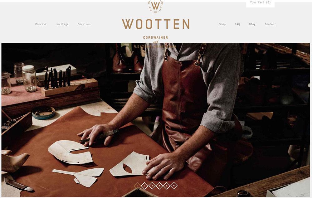
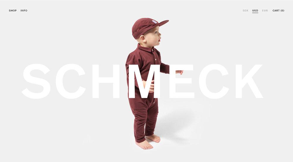
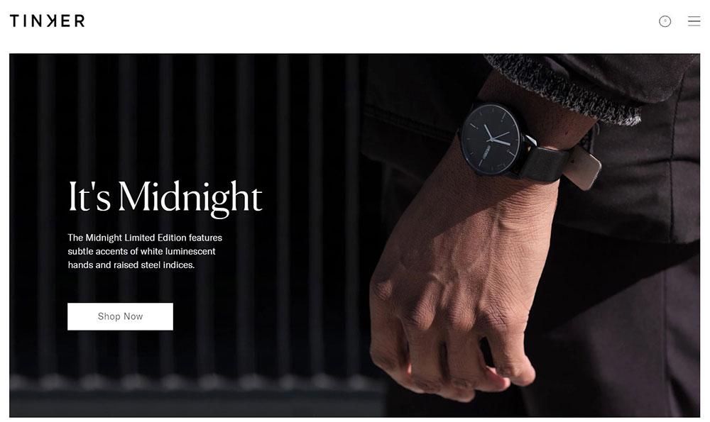
Large And Vivid Photography
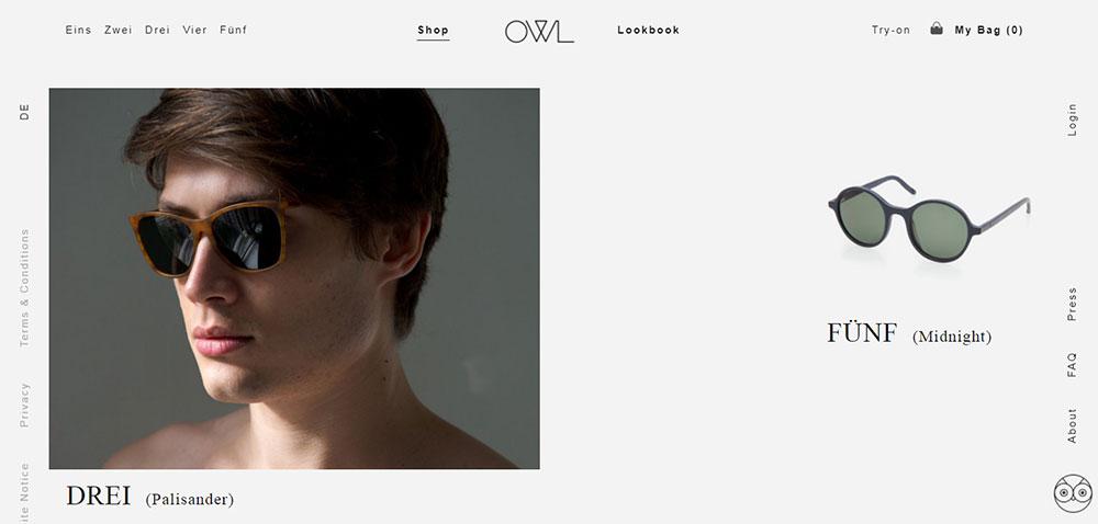
When overdone, minimalist website design and minimalist graphic design might come across as emotionally detached. This is why a bit of contrast, such as larger images, adds some much-needed balance.
The most popular instances of vibrant graphics in minimal digital design are hero pictures and headers. They establish an emotional and contextual link and set the tone for the media in which they appear. The contrasting nature of these components — in respect to minimalism – complements the website’s interface’s simplicity.
Simple design strips away the sales feel
One of the most serious issues with fancy websites is that they look overly “salesly.” Complex websites can drive away potential consumers in an attempt to improve income and conversions. Minimalistic design, on the other hand, allows users to study without making them feel as if the site is trying to sell them something.
Every Element Communicates Info
You’re probably wondering that while simple is a fantastic concept, how can you express all of your messages without making your site too cluttered? The solution is to convey as much as possible with as little as possible.
Every aspect (typography, logo, color scheme, layout, and so on) conveys subtly about your brand. This is related to fundamental psychology, which influences how individuals react to various colors and typographic faces.
The goal of optimizing your site is to communicate as much brand information as feasible with as few components as possible.
Unique theme
A simple design provides an excellent chance to create your drawings and icons. Illustrations that complement the tone of your brand speak about the personality of your firm in a strong way. Tailored drawings may help your company stand out and increase brand identification. Sketches may also provide a playful touch to your site and help your notion stand out.
Consistency with Typography
The sharp, clear, and legible font may add significantly to the uniformity of a minimalistic digital design. In this case, the typography should consist of no more than two font families and as many color schemes. The most stunning typographic examples are those that are most readable.
Simple design loads faster
The time it takes for a website to load is an important element for SEO and user experience. Complex graphics, features, and options are often the things that slow down a site.
By removing them, a minimalistic website will load with lightning speed, attracting new readers and increasing search engine traffic.
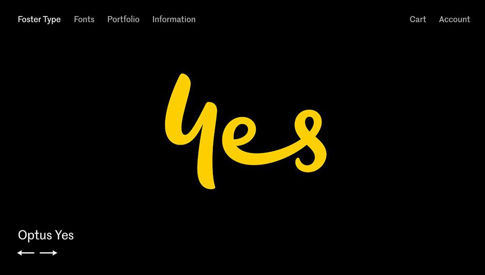
Effective Color & Contrast
Colour should always help the typography and pictures on the screen, according to the concept and practice of simple digital design. White is the hue of choice for minimalist designers.
What? You were expecting a pink color palette to be the most used one? No. White.
It offers a blank canvas for them to add color and other contrasting aspects.
The color white may be used as a backdrop, a foreground element, or even as an accent. Colour, but also size, shape, position, and scale, may be used to create contrast. This draws attention to certain design components and contributes to the creation of a recognized visual hierarchy.
The simple design builds trust
If you want to sell anything through your website, you must first win the confidence of your visitors. However, if your website is cluttered and crowded, this might be tough.
According to research performed on online e-commerce sites, presentation is directly connected to the confidence users have in the site. Include a lot of white space in your website design to establish trust. Keep the website simple by having a basic layout and each page focused on one subject at a time.
SEO Friendliness
Minimalist design is SEO-friendly because it makes it easier for search engines to crawl and interpret the website’s content. As a consequence, your website will appear higher in search results.
Google has explicitly said that they reward websites with clean coding and that is mobile-optimized. This SEO element of minimalism implies that a successful website must be minimalistic in its backend code as well.
Conclusion
In most situations, if appearance is important, simplicity takes precedence. The same is true for e-commerce design, which should not only be basic but also assist you in growing your business. A crowded website can confuse customers, raise your website’s bounce rate, and, most significantly, lower your revenues.
Therefore, if visitors can’t locate what they’re searching for, they won’t be thinking about how creative and remarkable your site is. They’re simply perplexed as to why things aren’t “where they’re meant to be.” And it is not the greatest state of mind to be in if you want them to convert.
To adopt the minimalist mindset and engineer simplicity, companies must focus on the issues they solve rather than the services they provide. According to current trends, the future will include simpler designs and more minimalist interfaces. It will also place a stronger emphasis on the user experience, with flat/material design serving as the visual language for each project.
About the Author

Bogdan Sandu
Bogdan is a designer and editor at DesignYourWay. He's reading design books the same way a hamster eats carrots, and talks all the time about trends, best practices and design principles.