
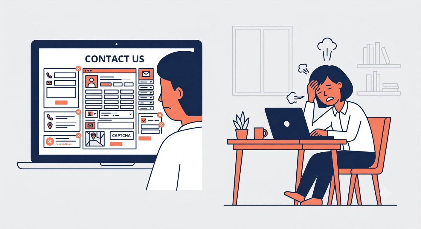
Your contact page is not a form. It is a promise. It tells the customer that you are available, that you care, and that you will respond. If it fails to deliver on these promises, the customer will leave and they will not return.
Here is why contact pages fail and how to fix them.
The Problem: A Form Is Not a Solution
The most common contact page is a form. The user fills it out. They click submit. They wait. This is fine for a mailing list. It is terrible for a customer with a problem.
A customer who needs help is not a lead. They are not a subscriber. They are someone who is already frustrated. They do not want to fill out a form. They want a solution. The form is an obstacle, not a service.
The contact page that converts is not the page with the cleanest form. It is the page that gives the customer an answer before they ask.
The First Mistake: No Answer
The customer has a question. They go to the contact page expecting to find it. They find a form. They do not find their question.
A contact page is the customer’s last resort. They have already searched the FAQ, looked at the help center, and tried to solve the problem themselves. If the contact page does not help them, they will leave.
The contact page should address the most common questions directly. Not with a link to the FAQ. With the answer itself. If the question is “How do I reset my password?” the contact page should say “Here is how to reset your password.” If the question is “What is your return policy?” the contact page should say “Here is our return policy.”
The customer does not want to contact you. They want to solve their problem. Help them solve it without contacting you.
The Second Mistake: No Response Time
The customer fills out the form. They submit it. They wait. They do not know how long they will wait.
A contact form with no response time is a void. The customer does not know if their message was received. They do not know if it will be read. They do not know if they should follow up.
The contact page should state a clear response time. “We respond within 24 hours.” “We respond within 4 business hours.” “We respond within 1 hour.” The response time sets expectations. It reduces anxiety. It builds trust.
The customer will wait if they know how long they will wait. They will not wait if they do not know.
The Third Mistake: No Alternative
The customer cannot find their question. They fill out the form. They wait. They get no response. They leave.
The contact page should offer alternatives. A phone number for urgent issues. A live chat for immediate help. A support email for non-urgent issues. The alternatives give the customer options. The options give them control.
The customer will not stay on a page that has only one path. They will leave and find another way.
The Fourth Mistake: No Human Touch
The contact page is a page. It has a form. It has text. It does not have a person.
The contact page should feel human. A photo of the support team. A name and title for the person who will respond. A personal note from the founder. The human touch builds trust.
The customer is not contacting a company. They are contacting a person. They want to know who that person is.
The Fifth Mistake: No Follow-Up
The customer submits the form. They receive an automated acknowledgment. They never hear back.
The contact page is the beginning of a conversation, not the end. The follow-up is where trust is built or broken. A thoughtful response builds trust. A generic response breaks it. No response destroys it.
The contact page should set the expectation for follow-up. It should also set the standard. The follow-up should be timely, personal, and helpful.
What Actually Works
The contact pages that convert are not the ones with the best forms. They are the ones that solve problems:
- Answers to common questions. The contact page should anticipate the customer’s needs and answer them.
- A clear response time. The customer should know when to expect a reply.
- Alternatives to the form. The customer should have options for urgent issues.
- A human touch. The customer should know who they are contacting.
- A follow-up that builds trust. The response should be timely, personal, and helpful.
The Test
Before you design your contact page, ask yourself these questions:
- Does this page answer the most common questions? If it does not, redesign it.
- Does it state a response time? If it does not, add one.
- Does it offer alternatives? If it does not, add them.
- Does it feel human? If it does not, add a photo or a personal note.
- Does it set the expectation for follow-up? If it does not, add a clear statement.
The Bottom Line
A contact page is not a form. It is a promise. The customer is not looking for a form. They are looking for a solution. The contact page that solves their problem is the contact page that keeps them.
Design your contact page to be helpful, not just functional. The customer will thank you. And they will return.
About the Author

Peter Makeshoff
Peter Makeshoff is the founder and main author of Designer Daily.