There are an estimated 261,600 graphic designers in the United States. While not all of these designers will do website work, many do. In addition, there will be strong competition through 2024 for web design work.
If you want to stand out and grab some of the web design work available, it’s important to understand the elements of good web design.
Here are 12 key features you should never overlook as a designer:
1. Design That Matches Industry
A generic design might sound like a good idea on the surface, but if site visitors can’t immediately recognize the industry of the business, then the entire design falls flat. Even if you’re using a cookie cutter design, it can be made industry specific with unique photos and other special elements. For example, if the website is for a local golf course, don’t use a design that would be better suited to a cooking site. That is an extreme example, of course, but you get the idea.
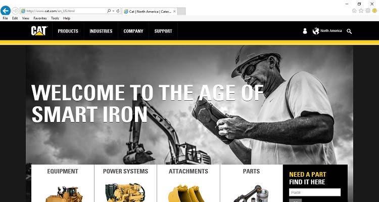
One example of a website that has a very industry specific design is Caterpillar. Note how there is a backhoe in the background of the main image at the top, and the colors of the overall design match the company’s product colors. The design itself is simple and could be used for any number of websites, but these specific images tie it strongly to the correct industry.
2. Call to Action Buttons
Making your call to actions (CTAs) look like buttons can increase conversion rates as much as 45%. A CTA grabs the visitor’s attention and encourages them to take the action you most want the visitor to take. So, if your desire is to create mailing list subscribers, your CTA can increase that conversion rate.
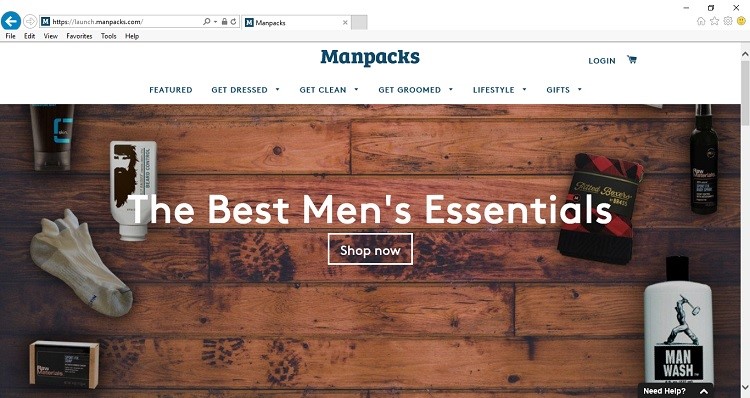
Manpacks does an excellent job of using multiple call to action buttons. They even use CTAs within their navigation. The middle of the page features a call to “Shop Now,” while the navigation uses buttons with CTAs such as “Get Dressed,” “Get Clean” and “Get Groomed.”
3. Device Compatibility
About 80% of Internet users own a smart phone, which means more people access your site from mobile devices than ever before. If your website isn’t compatible with different screen sizes, you risk losing those site visitors.
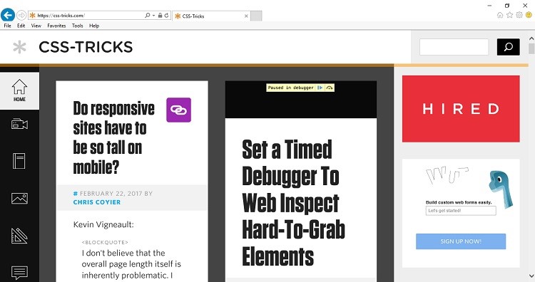
CSS-Tricks has a site that adapts very well to a smaller screen size. In a personal computer size browser, the site has three columns across. However, if you access the same site with a smart phone, it is a single column stacked one box on top of the other. This adaptation is very intuitive for smaller screens.
4. Links
How you present the links on your website can have an impact on the overall user experience. Are links easy to find? What is your structure like? If you have a large number of pages on your site, you may want to place main categories in your navigation, and then use sub categories under those main categories.
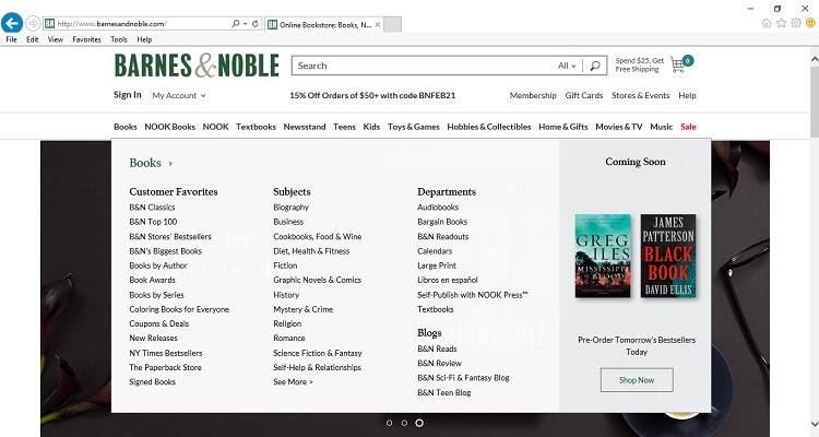
One example of a large site that provides sub categories in this way is Barnes and Noble. If you hover over the top navigation bar, the sub categories will appear. This is a good way to show all the links you need without overwhelming the customer.
5. Testimonials
Seventy-eight percent of online consumers in the United States indicate that online reviews help them decide to buy a product or service. Adding testimonials to your website is an excellent way to show your site visitors how much others love what you have to offer.
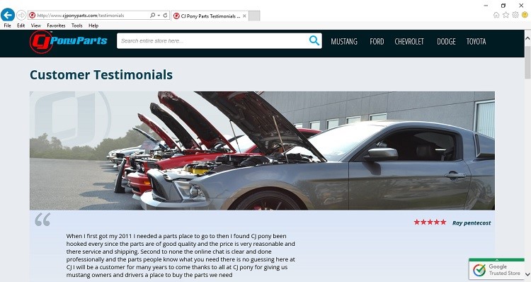
One example of a good use of customer testimonials is at CJ Pony Parts. The page features a five star review from one of their customers at the top of the page. Under that is a call to action (CTA) button, offering to let visitors write their own testimonial. The page then offers many additional reviews — 261 to be exact — with star ratings and specific details.
6. Well Formatted Content
Content should be formatted in a way that is easy to read and absorb. This includes the font style you use as well as the font size. For example, if a website uses a tiny little font, it may be too difficult for older readers to scan. However, a huge font can be distracting and particularly bothersome on a small screen. Using a font that is a standard size, such as 12-point, works best.
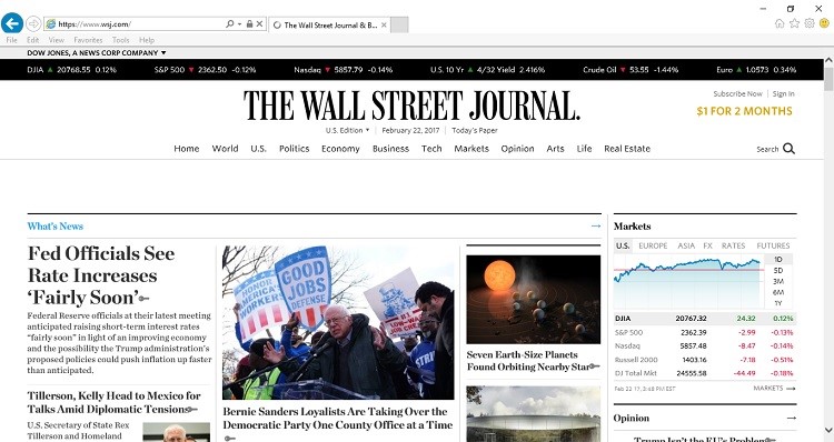
The Wall Street Journal’s website features a font size that is easy to scan and read, but it’s not too large for small screens. Note how the headlines are much larger, but there is also small text, such as the stock info across the top of the page. The overall balance draws the eye to the headlines, which works well for a newspaper style site.
7. Contrast & Complement
Pay careful attention to your color palette. It isn’t enough just to choose colors that work well together — or that complement one another. In addition to being in the same color family, make sure your colors provide enough contrast so users can see different elements clearly. For example, if you have a pale blue background, you don’t want to add a medium blue text. It isn’t enough contrast for the reader to see the text clearly.
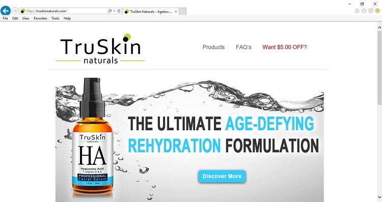
One site that has a beautiful color palette, but plenty of contrast is TruSkin Naturals. Their use of color adds vibrancy, but they also chose white text for dark backgrounds and dark text for light backgrounds. This dark vs. light balance makes for a palette that is easy to read and striking at the same time.
8. Load Speed
One of the things you should pay attention to as a designer is how fast your site loads. Site load time can impact abandonment rates. The average mobile device web user will wait six to 10 seconds, and then abandon the page. That isn’t a lot of time, so you need to make sure your site loads in under six seconds and grabs the reader. Optimize images, ensure the server is fast and be careful of plugins that can create a drag on site resources.
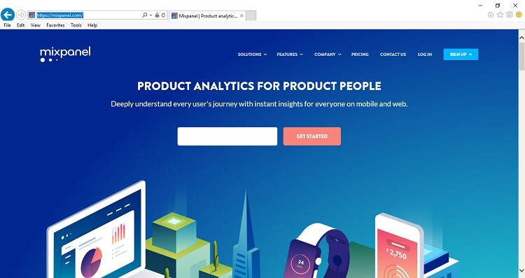
Mixpanel, an analytics solution, loads at lightning fast speeds. Even though there are bright colors and some visual elements on the page, it loads almost immediately.
9. Status Messages and Confirmations
If your site visitor submits a form or takes some other action, the visitor should get a message that confirms or denies that the action has been completed. Otherwise, you are just leaving your visitors hanging.
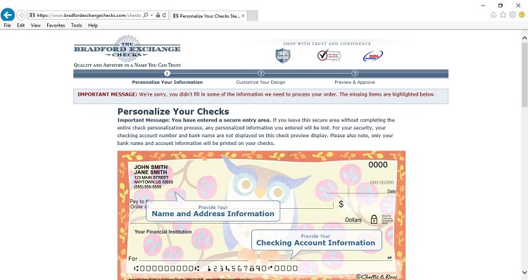
One site that does a good job with status messages is Bradford Exchange Checks. When you add a check design, make changes, etc., you are updated every step of the way. This lets you know that changes have been successful. If changes are unsuccessful, you will be notified of that as well. Note the text in red in the screenshot below to show that some information is missing.
10. Navigation
Navigation is a key feature of your website that shouldn’t be overlooked. Visitors expect to be able to move around to different pages easily and intuitively. However, that doesn’t mean your navigation has to be boring. While you should stick to some basic rules of thumb, such as having the navigation near the top of the page, you can also get creative with other elements.
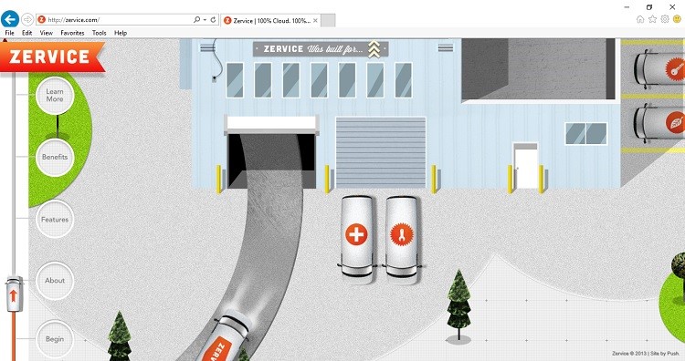
A good example of excellent, but creative navigation can be found at Zervice. You can click on the Zervice automobile on the page and then click “Go.” The service van will drive up to the main navigation features. Alternately, there are round navigation buttons along the left sidebar for “Benefits,” “About,” “Learn More,” etc.
11. Use Rotating Sliders With Caution
One of the trends that seems to be popping up on websites lately is that of rotating sliders — but these sliders are bulky and rather ineffective. As few as 1% of site visitors bothered to click on the slider, and those who did clicked on the first image in the slide.
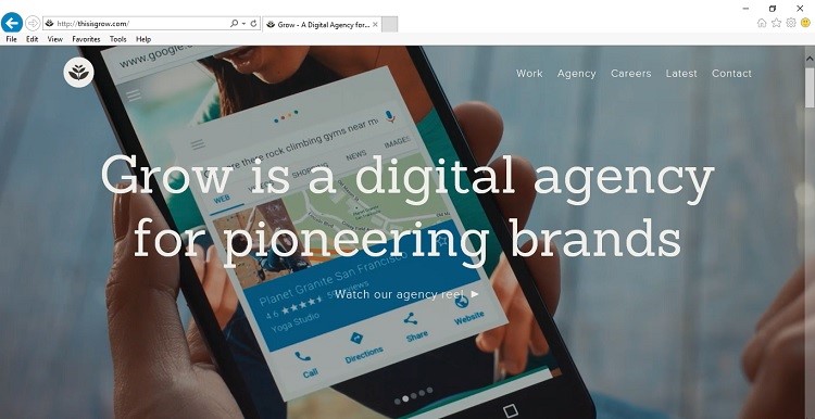
If you must use a slider, take note and make that first image the one that really counts. One example of a site that has an interesting slider feature is This Is Grow. This website has a long pause on the first slide as well as navigation that is easy to find and easy to skirt around the slider if one wants.
12. Functionality
After looking at colors, fonts, content and all the other elements that make up a website, it can be easy to forget to test everything out and make sure it is as user friendly as possible. Ask a few other people to check out the site and offer feedback on how easy the site is to use and if they run into any issues.
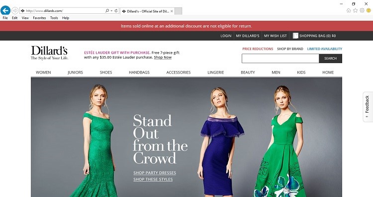
One site that offers a great user experience is Dillard’s. They offer suggestions for items near the top of the home page. Navigation is simple, but it’s detailed enough to help the consumer find anything they might need. Additionally, the site loads quickly, even though it’s image heavy.
Ultimately, the design features that shouldn’t be overlooked are all of them. Take your time with planning the design for your website and then invest some more into testing functionality. The end result will be a site that stands out from the competition.
Lexie Lu is a freelance web designer and blogger. She keeps up with the latest web design news and always has some coffee nearby. She owns Design Roast and can be followed on Twitter @lexieludesigner.
About the Author

Peter Makeshoff
Peter Makeshoff is the founder and main author of Designer Daily.