![]()
In a recent article on its blog, Mozilla announced a rebranding that brings the company to its roots. The non-profit company changed from a plain text, sans-serif logo, to a more thoughtful design that uses a slab serif logo and twists a few letters to make you think of your browser instantly.
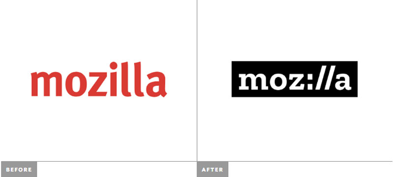
A before/after view of the logo, image created by BrandNew. It gained in recognizability, but in my opinion took it a bit too far by turning the “i” into the columns you insert before the slashes in your browser’s address bar. This makes the new logo lose in readability.
![]()
About the Author

Peter Makeshoff
Peter Makeshoff is the founder and main author of Designer Daily.