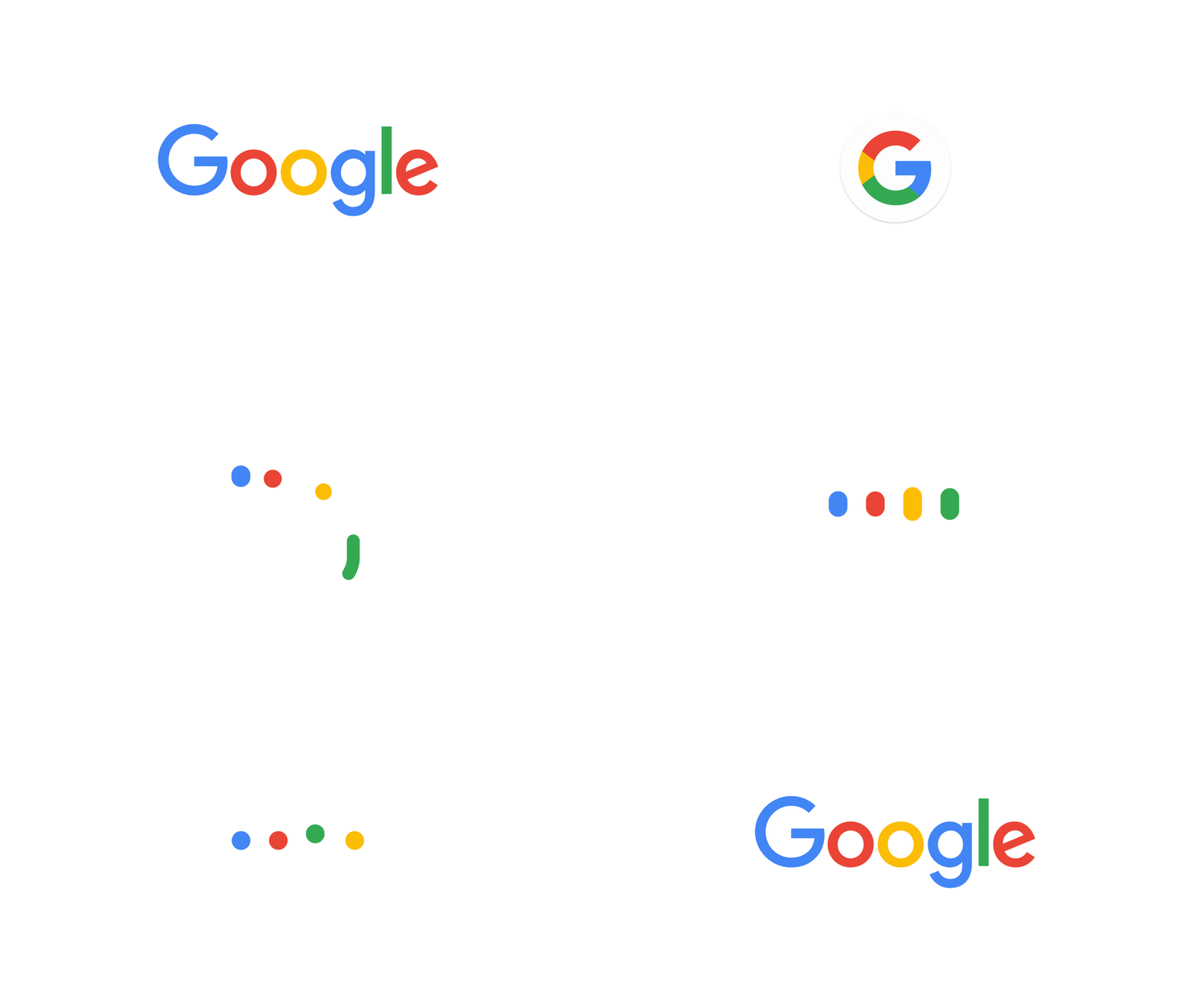
Google just released a new logo for the company, shortly after making it a branch of Alphabet, the scary giant that will control too many things. Unsurprisingly, the search giant goes for a more minimalist approach, which is what happen to most logos of big brands.
The new logo dropped the serifs and went for a geometric font that seems quite hard to kern. If you look at the Alphabet website, you can actually see that Google’s new logo seems to be a step towards harmonizing the brand with the other entities to come. The colors show that Chrome is becoming a more central element in Google’s strategy, a hint you can also perceive in the multicolor G.

On this animated GIF, you can see some elements of the design. Google also published a pretty cool Youtube video that walks you through the new logo with a bit of history of the brand. Overall I’d say that the design team who worked on the rebranding did a good and coherent job, but part of me resists to change and miss the more friendly look-and-feel of the old logo. The Google design website has a pretty extensive page about the new logo if you want to learn more.
OK Google, congrats on the new logo.

