Your website is an online representation of who you are. If it keeps the user’s experience in mind and appropriately represents your brand, you’ll be able to create a strong connection with your audience. However, if it is sloppy, difficult to navigate and doesn’t consider the needs of your user, you probably won’t see much success from your page — especially when it comes to getting phone calls or emails.
The contact page on your website acts as a communication tool between you and your audience. After a visitor to your website has had an opportunity to browse your site, understand what you can offer and make a decision on whether or not you provide the service they need, they will be looking for a quick and easy way to get in touch. This is where your contact page should come in.
Unfortunately, many companies don’t consider the importance of their website contact page. If it isn’t meeting their audience’s standards, it could mean a missed opportunity. Here are a few of the mistakes you may be making on your contact page and what you can do to improve them.
You Don’t Even Have a Contact Page
The biggest mistake you can make on your contact page is not having one at all. While you may have your phone number and an email address in the footer of your website, each visitor may not know to look there. If they see you don’t have a contact page, they may assume you don’t want to be reached.
Having a clearly defined page just for making connections can give visitors a clear path to getting in touch. Don’t try to get away with squeezing your contact information in the sidebar or on your About Us page. Make a special page just for your contact information.
You’re Not Making It Easy to Find
Website visitors may make the decision to contact you at different stages of the thought process. While some will want to get in touch with a customer service representative right away, others may wait until they’ve made a decision to purchase to try and contact a sales rep. If you hide your contact information in a hard-to-locate area of your website, you could be missing out.

Make sure your contact page is a part of your main navigation, like Marketo. Include a call-to-action on appropriate pages of your site encouraging visitors to get in touch. Providing your audience with ample opportunities for connecting will ensure no one leaves your site wishing they could get more information from you.
Your Email Form Doesn’t Work
Websites can break. Links stop working, code can be broken and mistakes can happen. If your email form is broken and you don’t know, your audience may be trying to contact you and the messages aren’t going through. Not only does this hurt your business, but it can look extremely unprofessional.
Make a point to check for functionality every couple of weeks. Submit a trial form to ensure it safely makes it to your mailbox, click links to ensure they send you to the right places and double check that everything is working properly. If you ever find a problem, be sure to get it fixed as quickly as possible or provide an alternative contact route until it is solved.
You Only Provide One Contact Option
Every user may have a different preference for how they want to get in touch. Some love the ease of sending an email while others enjoy the simplicity of picking up the phone. Still more will expect to have their problem solved or questions answered over social media. If you don’t provide your audience with options, they may choose to avoid connecting altogether.
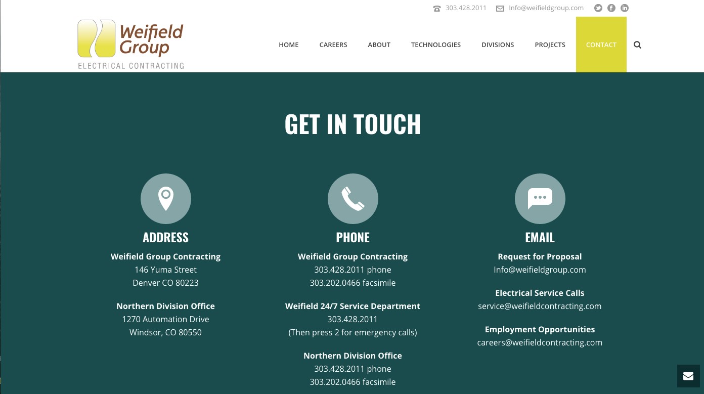
Be sure you’re giving your audience different ways to connect with you or your team, like Weifield Group does. Whether they have a problem, want to make a purchase or just have questions they want answered, you should be able to accommodate their needs in various ways. At the very least, include an email address, phone number and social links they can use to contact you. For additional support, a chat service may be helpful.
Your Contact Information Is Wrong
If you’ve recently moved, changed email addresses or gotten a new phone number, be sure you’re updating this information on your contact page. Many small businesses may change their point of contact from time to time, meaning emails could be ignored or forgotten about if they’re not going to the right inbox. If phone calls are going to a disconnected number, you could be missing out on a serious number of leads.
Every so often, double check that the contact information is still accurate. If you haven’t changed email addresses, phone numbers or physical addresses, this shouldn’t be a problem. However, be sure to change the information as quickly as possible if a change is ever necessary.
You’re Not Fitting the User’s Schedule
Your customers and clients are busy people. It isn’t fair to expect them to wait around for you to return their phone call. If they happen to be busy when you reach out, it can turn into a game of phone tag that is frustrating for both of you.
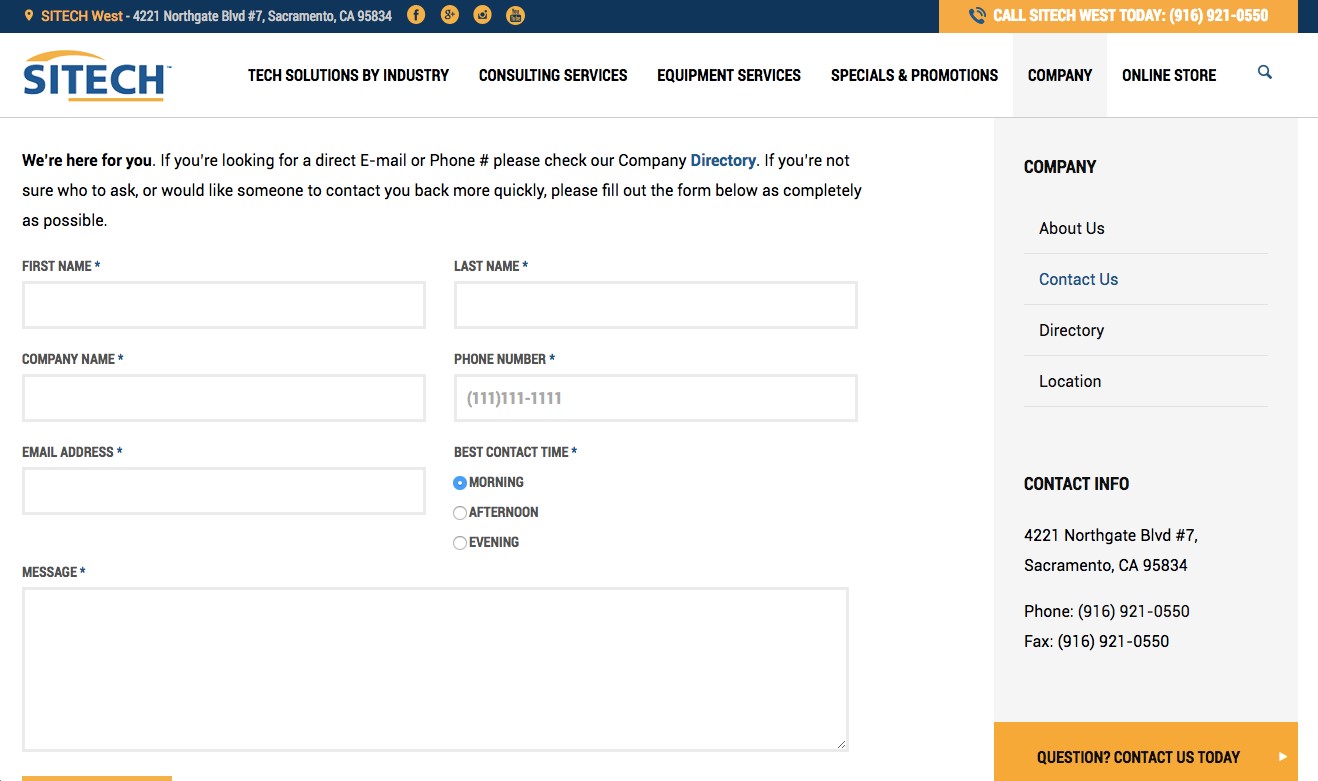
Sitech allows users to select time of day to receive their call. By asking for their best contact time, both the Sitech employee and the interested visitor can prepare for the call. While you may not be able to set a specific time, just letting them choose if morning, evening or night works best for them can save everyone a headache.
Your Website Isn’t Mobile Friendly
More and more visitors are turning to mobile devices to do their browsing. This means websites need to be fully responsive to adjust to the various screen sizes of smartphones and tablets. If your website isn’t mobile friendly, you could be missing out on a lot of business.
A mobile friendly contact page is extremely important for capturing leads on the go. Be sure your contact page automatically adjusts so visitors can easily enter their contact information or fill out your contact form.
Your Form Is Complicated or Long
Sure, you want to get as much information from your visitor as possible before you return their message, but contact forms that are long or complicated may actually push them away. If an audience member is reaching out to you for more information, they probably want the process to be as quick as possible. They don’t want to feel like they’re submitting a job application just to get you on the phone.
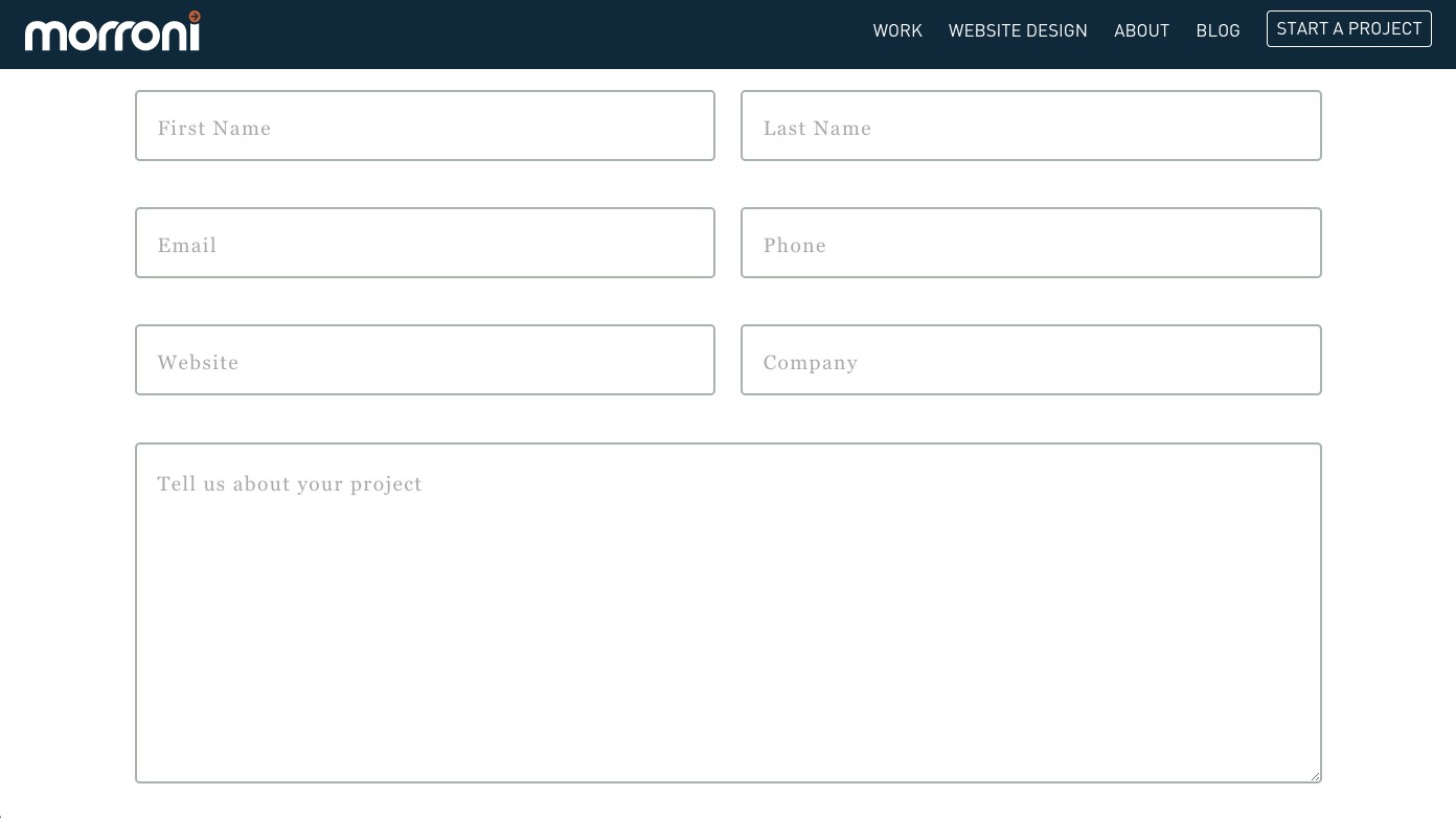
Like Morroni, keep your contact form to the bare basics. Ask for a first name, a way to contact them and a brief overview of their problem or situation. While you will want to collect more information from them eventually, that can be done through email correspondence or while you’re on the phone.
Your contact page is one of the most important pages of your website. If you aren’t attracting your audience’s attention and encouraging them to send you a message, you could be losing a number of potential clients.
Check your contact page to ensure you’re not guilty of these eight mistakes. Use our awesome examples of ways you can improve your contact page to get more clients and make better connections.
Lexie Lu is a freelance web designer and blogger. She keeps up with the latest web design news and always has some coffee nearby. She owns Design Roast and can be followed on Twitter @lexieludesigner.
About the Author

Peter Makeshoff
Peter Makeshoff is the founder and main author of Designer Daily.