Today, entrepreneurs and small business owners have a lot of do-it-yourself tools available to create brand identities for themselves. Budget-minded businesses can get by without spending lots of money on graphic designers and advertising experts.
Designhill is a graphic design marketplace, who have created a logo maker tool that can help you design a logo in less than five minutes. It uses complex artificial intelligence alongside sound fundamentals to create great logos. They have helped more than 100,000 clients till date. With so much vast experience, they have come up with some great tips for designing great
When you create your own brand icon, it’s important to account for the basics of logo design. These are fundamental principles on which all experienced designers agree. Keep these simple principles in mind and you stand a better chance of hitting the right notes with your new logo.
1. Use one or two colors – never more than three.
A rainbow of colors renders a logo cluttered and hard to read. There’s also an economic factor; multi-color logos are more expensive to print.
2. Use one or at most two fonts.
Assembling multiple fonts degrades the unity of your logo. You want it to look like a single entity, not a collection of different ideas.
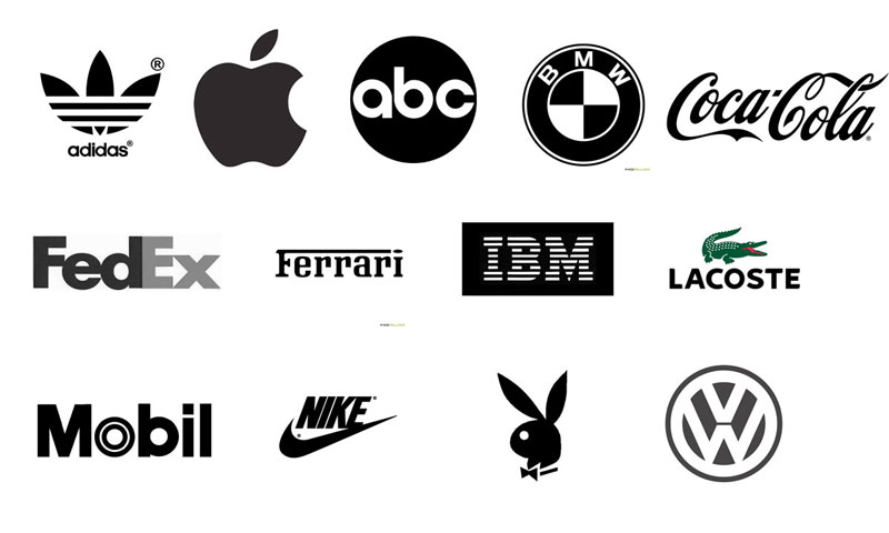
3. Check your logo’s black and white appearance.
The clarity and strength you’re looking for in a logo should be discernible in black and white. Weaknesses in your design may be more obvious when you convert it to black and white.
4. Check how your logo looks on both light and dark backgrounds.
Context matters with your logo. Apply it to light and dark backgrounds and make sure it stands out on both.
5. Aim for a logo that works at every size.
In a robust brand lifecycle, your logo will be appearing at many different sizes. Aim for the sort of simplicity that scales up or down. Whether your logo is on a billboard or a business card, it should still be legible.
6. Steer clear of the third dimension.
Three-dimensional logos are trendy at the moment. Adding a third dimension to your iconography multiplies the challenge of designing it well. Stick to two-dimensional icons and maintain your focus.
7. Format your logo as a vector file.
Your finished logo needs to be put into a vector image format. This defines the image as geometric shapes rather than a collection of pixels. Vector images scale perfectly and don’t lose quality when you resize them.
8. Stay away from shadows, bevelling, embossing, and gradients.
Some of the creative tools at your disposal are more trouble than they’re worth. The techniques listed here are problematic because they can be hard to reproduce. Gradients, for instance, don’t work well when applied to merchandise (e.g. pens, mugs) via hot stamp printing. Gradients are also difficult to emboss on fabric items like hats and clothes.
9. Don’t use photographs.
Photos have a range of potential downsides that make them more trouble than they’re worth. Photos can age poorly, making your logo look outdated. They are also hard to reproduce in many media from the web to print.
10. Check your design’s negative space.
Bear in mind that the shapes you put into your logo leave empty spaces that can be read as shapes themselves. This can be done intentionally. The FedEx logo famously has a negative space arrow nestled between the “E” and the “x,” for example. Examine the negative space in your logo design to see if there’s anything unexpected or undesirable lurking there.
About the Author

Peter Makeshoff
Peter Makeshoff is the founder and main author of Designer Daily.