Brands are built to reflect companies’ identity and to be memorized as quickly as possible. Why is it so? A big reason is that we look very quickly at brands and don’t take the time to enjoy the designers’ work (it would be impossible to take that time anyway). In this post I take a look at some of the hidden messages that designers did sneak into some of the world’s most popular logo design.
1. Toblerone
The famous Swiss chocolate brand features Matterhorn, Switzerland’s most famous mountain. What fewer people know, is that you can see a bear inside the white space of the mountain. The bear is the animal that represents the “canton” of Bern, where Toblerone comes from.
![]()
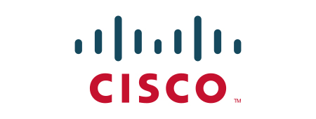
2. Cisco
The high-tech company that powers the great firewall of China was founded in San Francisco and features a minimalist version of the Golden Gate bridge in its logo.
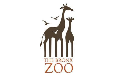
3. The Bronx Zoo
A clever one, using the white space in the giraffe’s legs to display some buildings in the Bronx zoo logo.
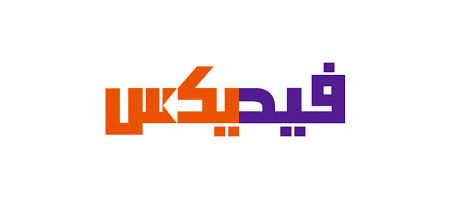
4. FedEx
The arrow in the FedEx logo (between the “E” and “x”) is already quite well-known, the reason why I feature it in this post anyway is the great adaptation of the logo in Arabic. You can still see the arrow, but going in the other direction since Arabic is read from right to left.
![]()
5. Northwestern Airlines (old logo)
This logo is no longer active, but it was a piece of genius. It combines an “N” for North, a “W” for West, and the small triangle is pointing Northwest.
![]()
6. Amazon
Another famous one, the Amazon logo. The arrow under the logo goes from the “a” to the “z”, suggesting that Amazon sells everything from A to Z.
![]()
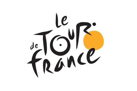
7. Tour de France
The Tour de France logo looks quite average with a script font and a hint of color, but if you look closer you can see a little guy cycling in the word “Tour”.
8. Baskin Robbins
Baskin Robbins sells 31 flavors of ice-creams, and they give you a little hint of this in their logo with the “31” that appears in pink.
![]()
9. Wendy’s
Wendy’s tries to bring back childhood memories by adding the word mom in the collar of the little girl in their logo.
![]()
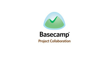
10. Basecamp
The popular collaboration software is all about getting things done and adding checkmarks in your to-do list, thus the little checkmark they have hidden in their logo.
About the Author

Mirko Humbert
Mirko Humbert is the editor-in-chief and main author of Designer Daily and Typography Daily. He is also a graphic designer and the founder of WP Expert.