Logo with a hidden meaning are everywhere, although you may not have noticed it so far. Most of the time, the hidden meaning bring a new layer of sense to the logo or a humorous touch to it. On top of that, it can add an extra connexion between the customers or brand users and the brand, as the hidden meaning of the logo might be seen only by the most regular and loyal customers.
This post aims to serve as a tribute to the designers who managed to get so much meaning condensed into one image, but also to help younger designers to understand how they can improve their own logo designs by following the examples show here. Enough with the introduction, let’s get into the logo designs with a hidden meaning. For designers who want to experiment with similar visual tricks before moving to advanced software, tools like Adobe Express for free can be useful for testing simple logo concepts, layouts, and negative-space ideas quickly
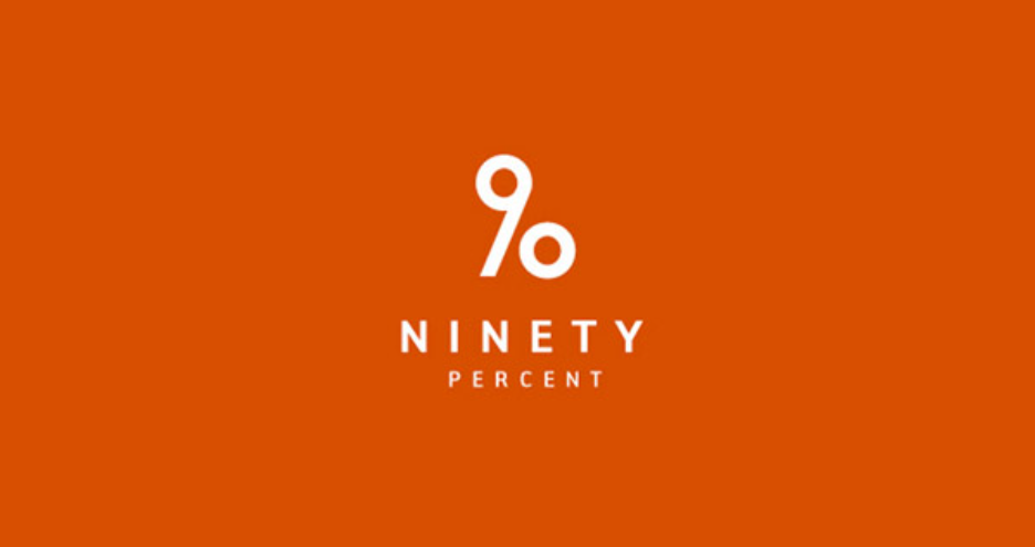
1. 90 Percent
At first, you just see the number 90, which perfectly fits with the name of the brand: Ninety Percent. However, the number 90 is designed in a way to turns it into a percentage symbol as well. Brilliant!
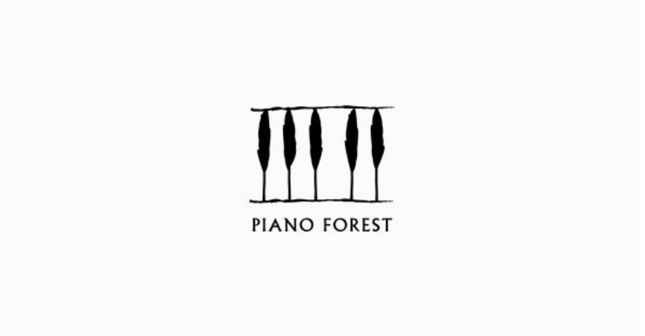
2. Piano Forest
See a piano keyboard? Look again, there are trees to remind you that you are looking at the “Piano Forest” logo.
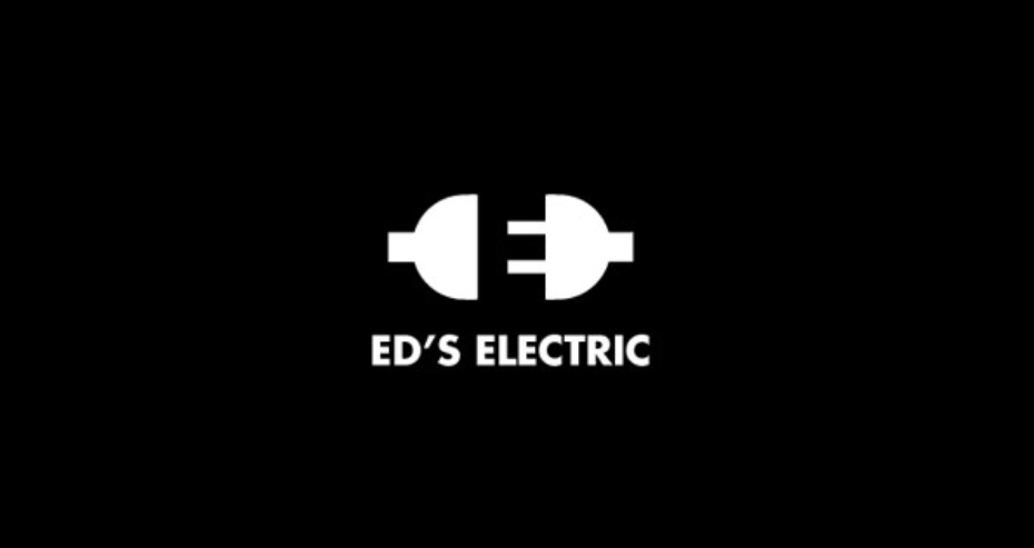
3. ED’s Electric
An electric plug about to be connected, how could you make a logo for an electrical company more relevant? The answer is simple, by displaying the initial letter of the company in the white space of the said plug.
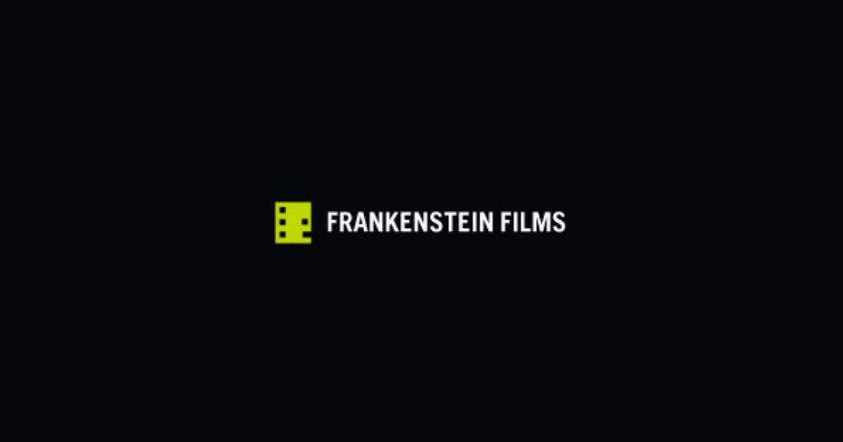
4. Frankenstein Films
A creative twist on the film icon turns it into a totally different beast (litterally). Very minimalist and clever!
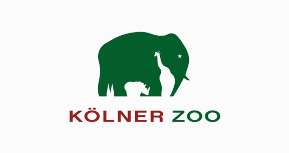
5. Kölner Zoo
Another great example of white space use, with several animals blended into one, thanks to smart use of white space.
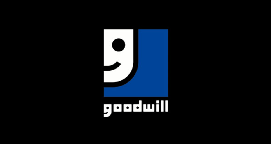
6. Goodwill Industries
Half the face of a smiling little dude, but it’s actually the first letter of the brand’s name. Well played!
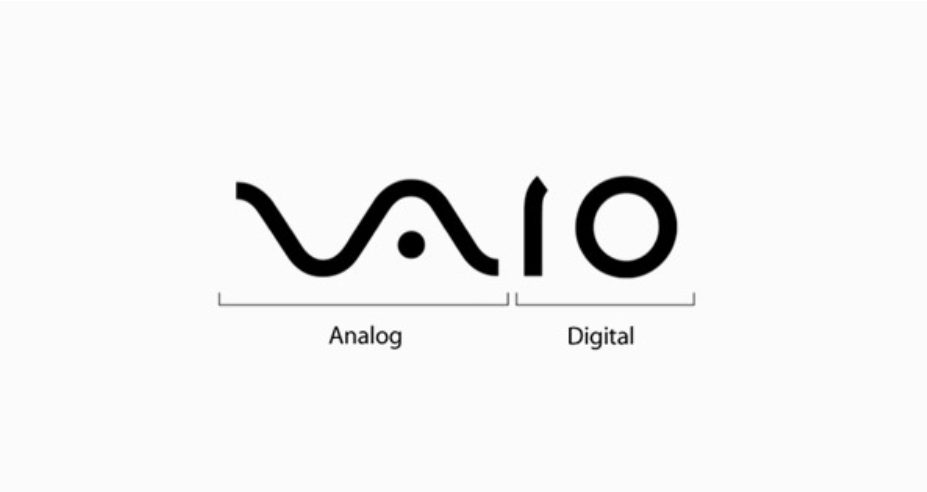
7. Sony Vaio
This one is a bit more tricky and requires some technical knowledge, but the Sony Vaio logo includes the “analog” and “digital” symbols.
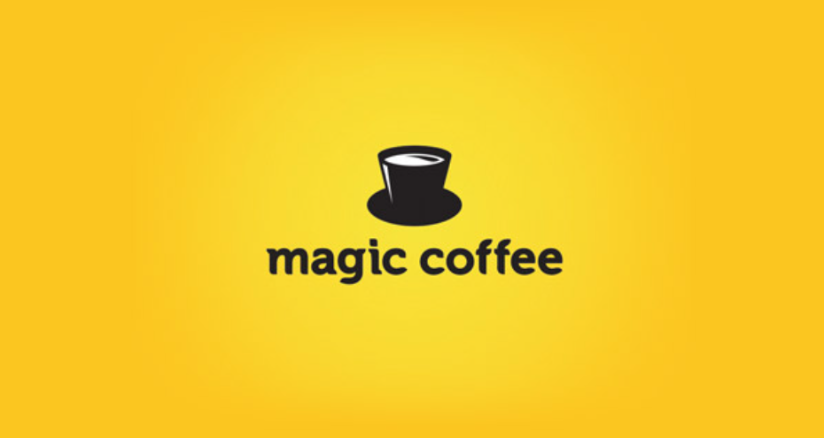
8. Magic Coffee
Yep! It’s a hat AND it’s also a coffee cup!
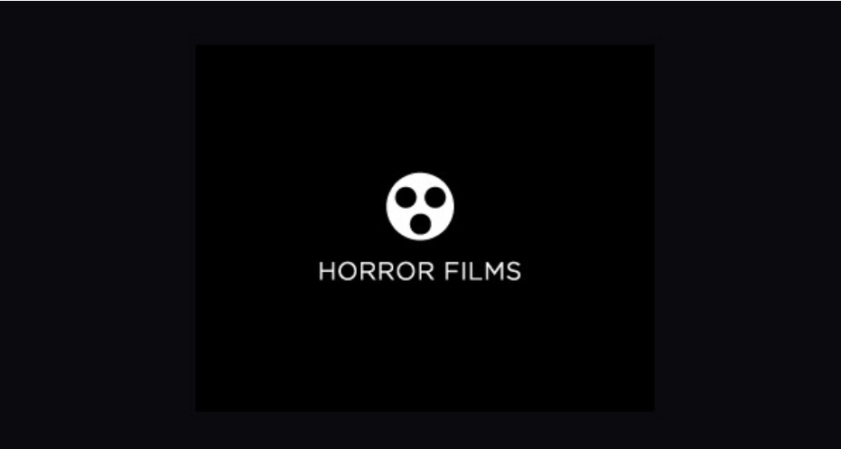
9. Horror Films
A film band turned into a simple figure with a shocked expression. Logo with a hidden meaning done right.
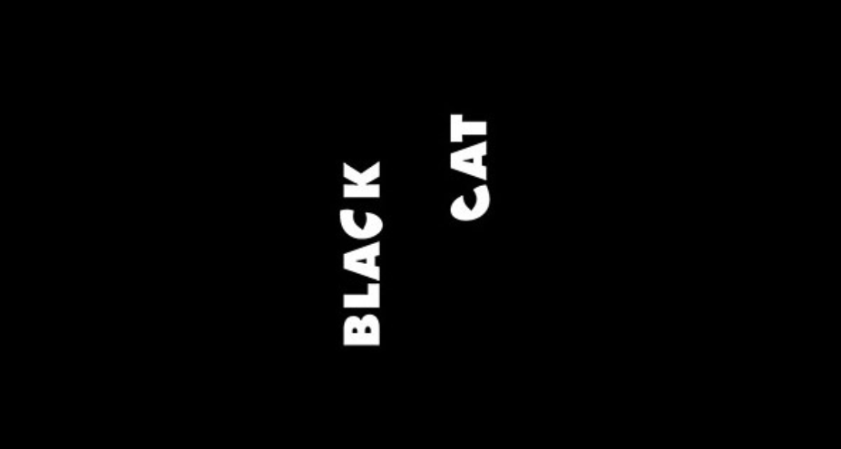
10. Black Cat
To be critical, this logo design lacks a bit in readability, but it does make up for it in technical mastery.
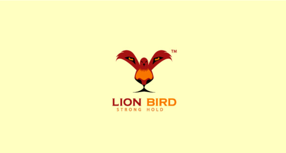
11. Lion Bird
Not the easiest animals to blend into one, but the designer did a pretty good job here.
12. Tour de France
The “Tour the France”, world’s most famous bicycle race, has a logo that includes a cleverly hidden cyclist.
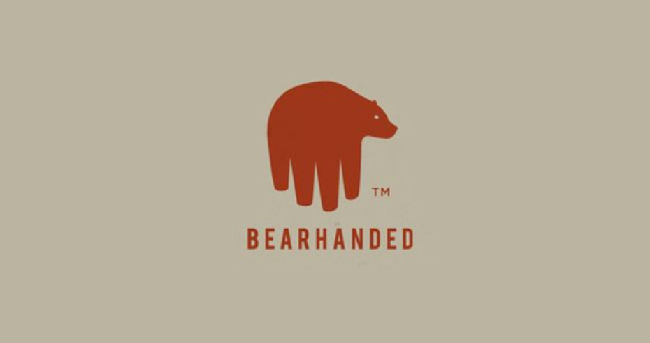
13. Bearhanded
A very litteral take on the name of the brand “Bearhanded”, with a hidden bear in the hand, or a hidden hand in the bear, depending on how you look at it.
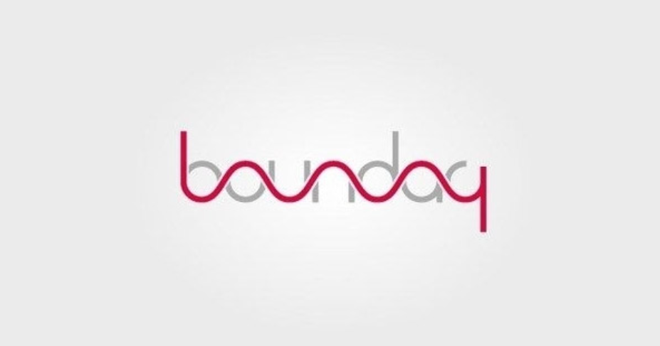
14. Boundary
Another logo that kind of lacks in readability, but is worth mentioning here for its creativity.
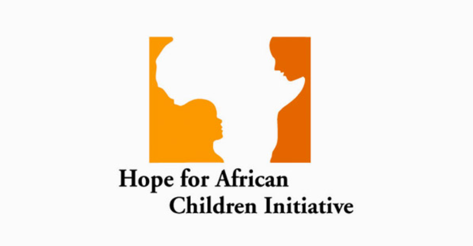
15. Hope for African Children Initiative
Another great use of white space in a design. It shows an adult and a child, with the African continent in the white space.
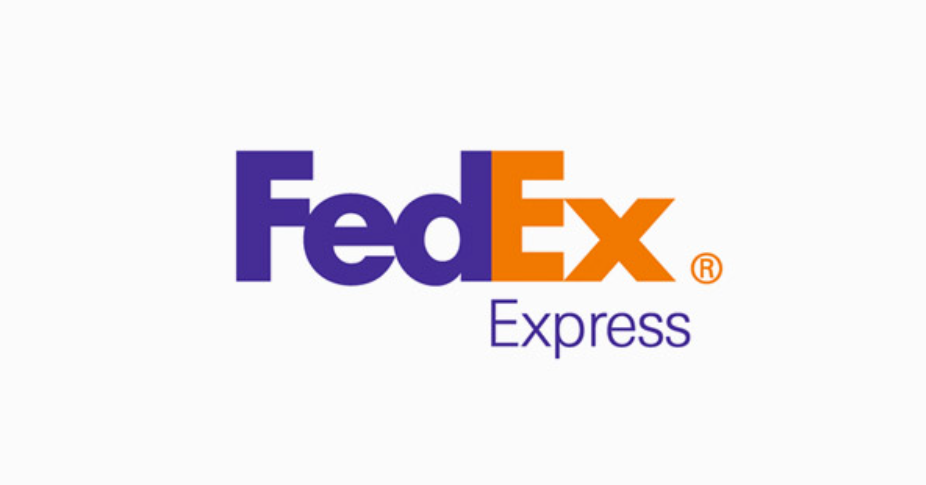
16. FedEx
A more famous logo, as FedEx is a global brand recognized by most, but with a hidden feature unseen by so many, a little arrow in the “Ex” part of the logo design.
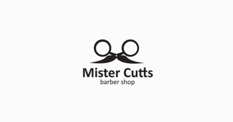
17. Mister Cutts
A cute logo that blends scissors with a moustache into one cool icon.
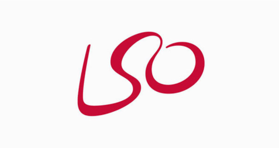
18. London Symphony Orchestra
A more difficult one to see, but definitly a brilliant one. Using the initials of the name “London Symphony Orchestra” (LSO), the designer managed to draw a moving orchestra director.
19. NBC
It may not be obvious, but there is a peacock hidden in the colorful logo of NBC. The peacock is very subtly suggested by the small white space in the center of the icon.
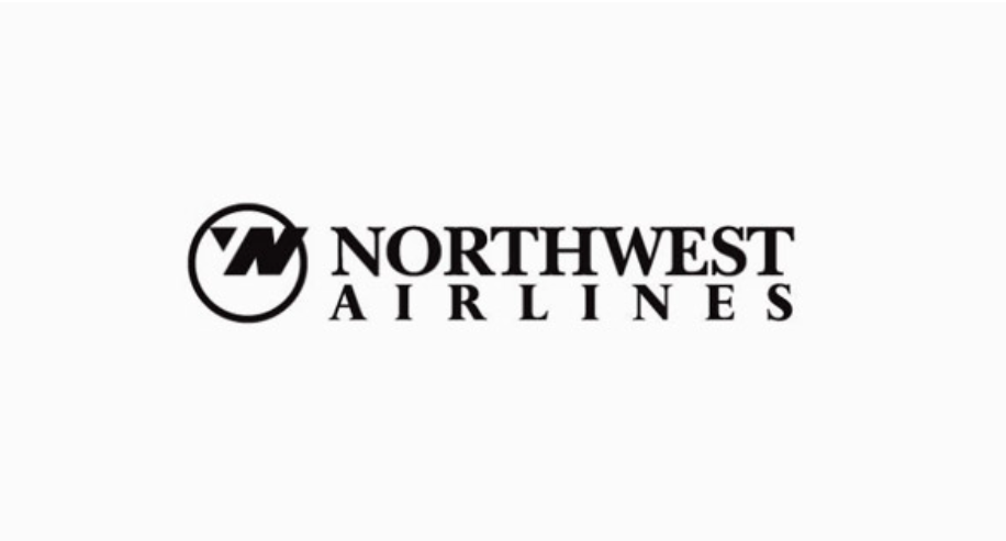
20. Northwest Airlines
The Northwest Airlines logo includes a very subtle hidden meaning in it logo design. In the circle, you can see a “N” that is formed from a “W” cutted by white space. However, the cutted little part forms an arrow that is pointing to… the NORTHWEST! Pure genius in this logo design.
How did you like this list of logos with a hidden meaning? Feel inspired by it? Let us know on X by tagging us @designerdaily.
About the Author

Peter Makeshoff
Peter Makeshoff is the founder and main author of Designer Daily.