Have you ever come across a website that you couldn’t use at all?
Either for an “all over the place” kind of navigation menu. Or for a slow loading page. Or for images that won’t load or text that couldn’t be read?
Well, these are just the starters. Talk of poor UI design and the world wide web has seen a big bunch of disappointments for us to learn from.
And that’s what we’re going to do today.
So, buckle up, here are 6 UI design mistakes that cost companies millions.
1. UK Government Wasting £12 Billion Trying to Skip User Research
It was in the year 2002 when the UK government came up with the idea of centralizing the patient records of citizens throughout the country.
The project went on for nine years and had to be scrapped later in 2011. One top reason for this failure as the then health secretary Andrew Lansley said was the UK government trying to impose an unnecessary IT system on the local NHS. It didn’t fit their needs.
Instead, they could have chosen to come up with a service/solution concluding to user research.
This little fiasco cost the UK government £12 Billion.
Clearly, companies indulging in user research before development save themselves a good deal of money and time.
2. A Minimalist Design Change Cost Icons8 Almost Half of Their Users
Icons8 is one of the largest websites that offers its users access to free icons for all niches. Sounds great, right? Well, it indeed is a good idea.
However, they’ve had their fair share of mistakes. Mistakes that cost them nearly half of their users.
What they did was redesign their “icon request” service page.
This is the page where users can request icons to be made by their designers and the icon getting the most number of votes (from users) is made the following day.
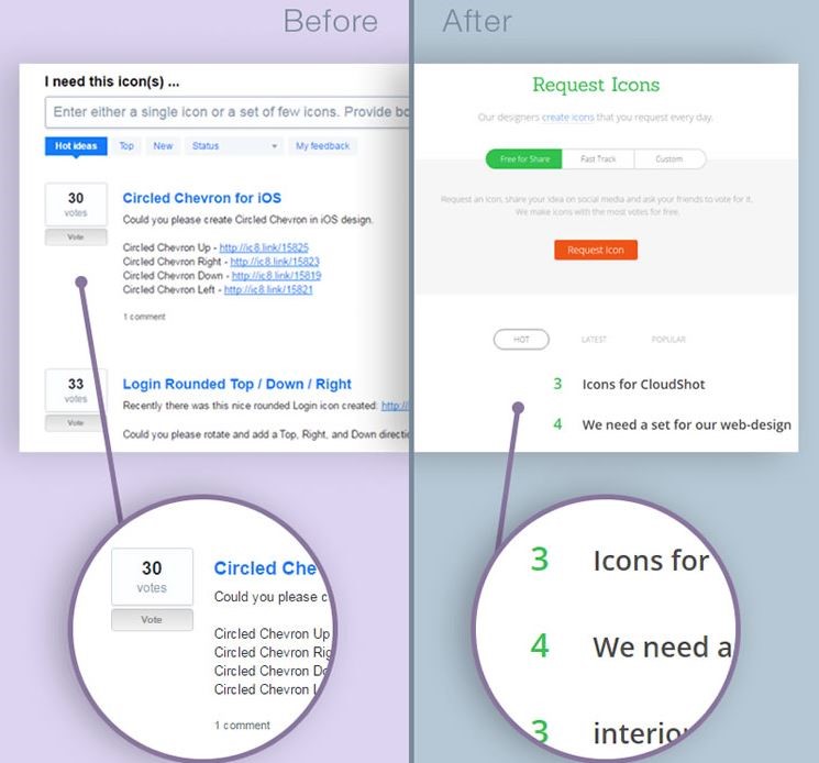
Do you see the difference? Undoubtedly, the new page looked better, but did it perform that way?
This new, modern and clean web design came off as less intuitive than the older one.
While the older model clearly showed a voting system, talking about the number of votes for different icons and instructing users on how they can place their votes, the new one was strange and a little confusing.
As a result of this, Icons8 lost around 47% of their users, giving us all a lesson — never sacrifice user experience for modern design. Instead, hire a qualified service for web design in Dublin and you’ll never have to worry about such fails.
3. Spotify Having 30% Less Users Because of the Hamburger Menu?

Do you remember the hamburger menu? It became quite a thing over the last decade. Even Facebook introduced it on its mobile website and app. But did it really work?
Well, not really! As the world of web designers started thinking beyond it, more apps and websites started getting rid of it. And so, it paid off.
In fact, Spotify got a 30% increase in users after they decided to drop the hamburger menu.
Lesson learnt – not all trends are worth your buck.
4. Walmart Lost $1.85 Million For ‘Just’ Listening to What Its Users Said
In a regular Walmart survey, it asked users whether they wanted less clutter in the stores.
To this, most of them agreed. Anyone would want to get rid of clutter, wouldn’t they? (but at what cost?)
Walmart acted upon the votes and went on to spend its $$$$ and hours trying to reduce the amount of inventory so the stores could be more spacious.
Results?
These changes hit Walmart with a $1.85 million downfall in sales. Plus, they had to fire the team that worked on this project. And the money that they invested in this project, well, we can’t even talk about it.
This gives us all a reason to examine user behaviour before blindly trusting what users say.
5. Google X Having to Pull Back a Design Blunder Within 24 Hours
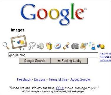
Yes. Not even Google could keep safe from UI blunders.
Coming up with the idea of Google X in 2005, Google changed the design of the home page and the world on the web broke down.
This new design consisting of an Apple’s OS X style dock above the search bar fell with its chin to the ground and had to be reversed.
As users reported, the icons in this design were ugly (even though Google, sort of, tried matching up with Apple). Plus, they didn’t make much sense. As a result, Google had to pull this update down within less than 24 hours. Wow!
6. Hospital Patient Record System’s Bad UI Fails to Display Required Information
This is a case where a little girl suffering from cancer was admitted to a hospital.
The hospital underwent intense chemotherapy which had to be followed by an adequate dosage of I.V. Fluid. Hospital appointed three nurses for the task granting them access to the charting software.
Now, as the software wasn’t easy to use and had a lot of redundant information, nurses missed important information about the IV dosage. As a result of this, the patient died of toxicity and dehydration.
This is one of the biggest UX fails of all time, which led to a patient’s death.
Lesson to take — information overload in U.I. Design can be more dangerous than one can imagine.
Final words
Often taken as granted, user experience is one integral element that must be prioritised while designing an interface.
If the users aren’t able to get the hang of the interface, the purpose of that particular design is clearly defeated.
Plus, even though the examples in this article are blunderous enough to wake us up, they aren’t all. There have been cases where situations have gotten worse — another reason why the world must take UI design more seriously than ever.
About the Author

Peter Makeshoff
Peter Makeshoff is the founder and main author of Designer Daily.