The Tokyo 2020 Olympics logo is a disaster. It’s not a matter of design, the official logo doesn’t look too bad. The problem comes from all the controversy that came with the creation of the logo. The first logo proposal was abandonned because of plagiarism accusations, so there is a lot of bad PR around the branding already.
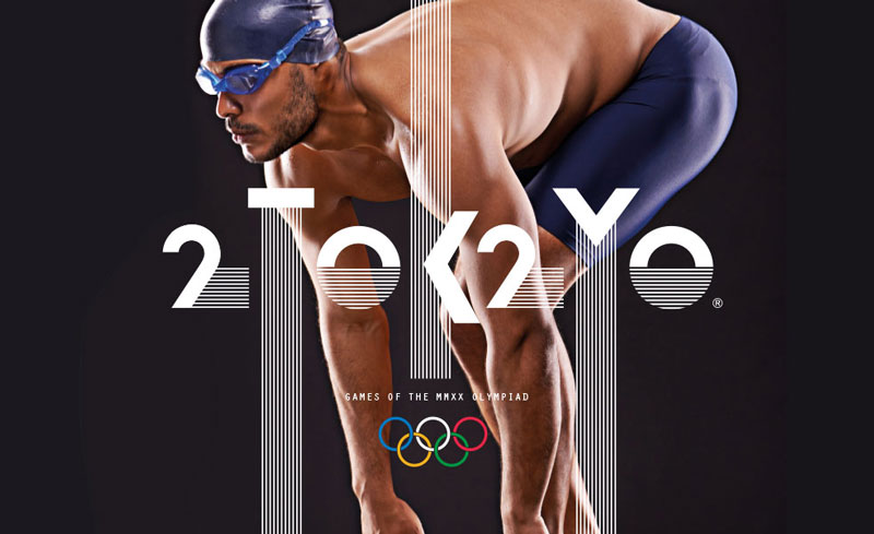
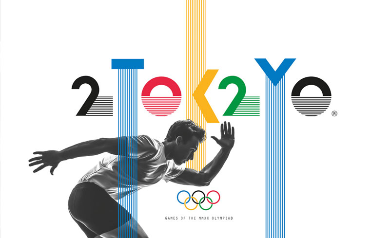
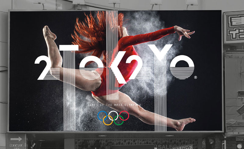
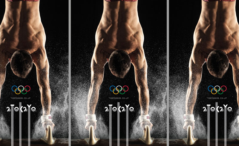
Australian design firm Creative Order decided to give it a go just for fun and designed an interesting alternative to the logo. Their branding is a bit more experimental, but is perfect to create powerful visuals.


