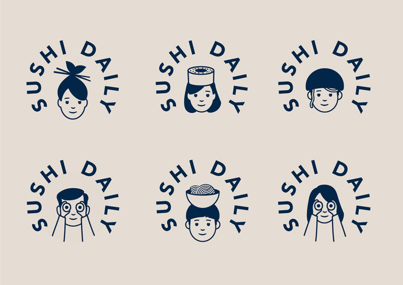
When choosing Without for its branding, Sushi Daily made an excellent decision. The London-based design studio did a great job with the branding, using simple illustrations and typography to create a friendly logo that can easily be declined in many variations.
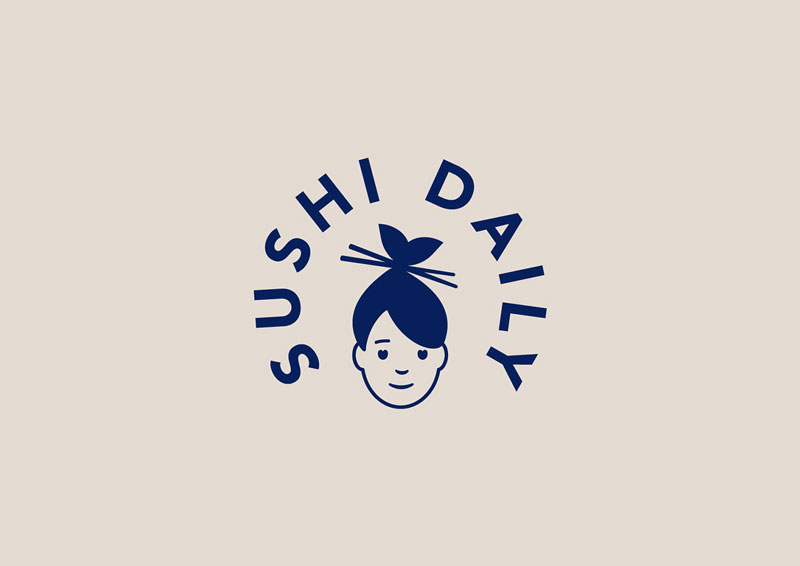
The basic logo is very subtle, the hair of the woman illustrated look like a fish with its mouth wide open, while the sticks in the hair look just like chopsticks. The brand being European, it was important to give it a Japanese touch while still making it attractive for European customers, which is the case in my opinion.
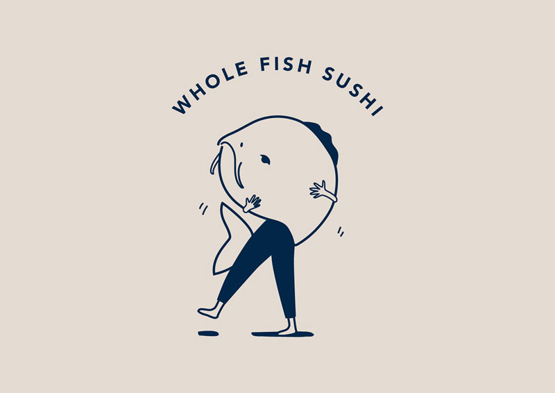
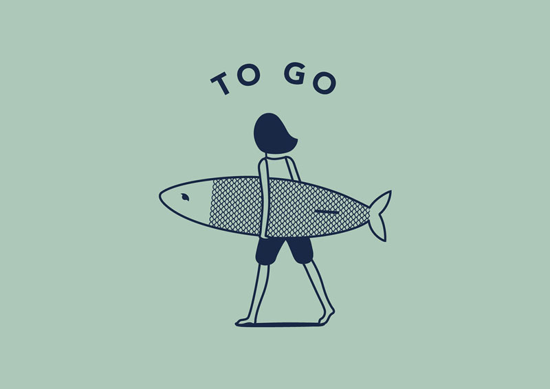
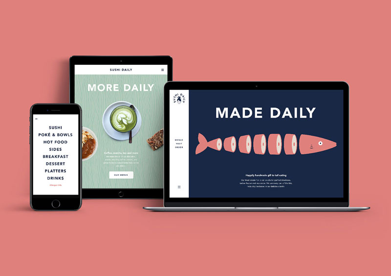
Below: some illustrations that go along with the logo, the playful style of drawing and topics make it very attractive.

About the Author

Peter Makeshoff
Peter Makeshoff is the founder and main author of Designer Daily.