When it comes to the design of a website, or in this case an online casino, you’d be surprised to find out how much it matters. While there are web designers that feel that it’s okay to throw together a simple design and call it a day, there are few brands that will be able to get away with that. There’s one particular element that’s used to quickly establish trust and that’s familiarity. While new designs are great and bring in a waft of fresh air, the novelty of the design will quickly expire and will therefore fall to the wayside.
By adding a familiar element, the site will immediately be associated with the chosen element. This is the case with Jackpot City Casino, one of the most popular online casino brands that are not only known for its incredible gaming offering but also its stellar design.
About the Homepage Design
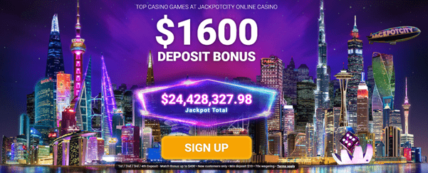
When landing on the homepage of JackpotCity Casino, you’ll be greeted with an indigo and lilac color scheme that’s highlighted with a few neon accents which bring the page to life. However, the background is what stands out the most, as you’ll see various famous skyscrapers that look to be a part of one city. It’s easy to assume that the mash of various architectures would clash, but it doesn’t. Some of the famous buildings include the Burj Khalifa, Willis Tower, the Transamerica Pyramid, the Marina Bay Sands Hotel, and many more.
The background is highlighted with a purple gradient and what makes everything “pop” is the reflection of the towers in the water. The most important part of this image is that the lights of the buildings are on, try and imagine what it would look like if they weren’t. This creates a familiar Las Vegas-Esque atmosphere that almost everyone is familiar with. No matter whom you are, if you’re a fan of spending time at a casino, then the bright lights of the Vegas Strip would be something that you’d add to your bucket list.
However, not everyone has the luxury to travel, which is why the design of JackpotCity is so appealing as it generates a glamorous atmosphere that you’ll be familiar with.
The Logo
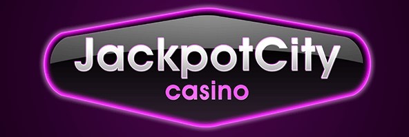
As you can tell the JackpotCity Casino logo is simple, yet effective at achieving a glamorous look without the addition of a flamboyant font. This makes it easy for people to identify and for new clients to read. The logo consists of the name of the casino, written in a standard font, with the background finished in a glossy black surrounded by purple neon light.
If you were to access this site with a desktop computer, the logo that’s used in the tab of your browser will consist of a neon-lit “JC”, which is simple and quite classy while being able to maintain the color scheme.
The Overall Aesthetic
A major component regarding the success of JackpotCity Casino is its design as it provides users with something that they’re familiar with. Las Vegas is a trusted gambling location and this is why it makes sense for JackpotCity Casino to loosely base its design on the Neon Capital. While gambling safety is something that most people rarely tend to care about until something happens, the reliability factor of using a site that reminds them of a place that’s known for being the gambling capital is quite high.
The rest of the site is what keeps users around as it’s easy to navigate and the general aesthetic makes it an online casino that’s pleasant to use. From the homepage to the logo that’s used, JackpotCity oozes aesthetic appeal. With so much time and effort put into the design of this online casino, users will immediately gravitate towards it as the general rule of thumb regarding any type of design is that if it’s pretty, people will love it, and this is evident with JackpotCity Casino.
About the Author

Mirko Humbert
Mirko Humbert is the editor-in-chief and main author of Designer Daily and Typography Daily. He is also a graphic designer and the founder of WP Expert.