When it comes to creating a web or mobile experience, the content should always take center stage. Apart from excellent web design, a good website has liable usability. Designers worldwide use a vast amount of tools to create and improve the overall user experience. With the rise of many new technologies, data couldn’t be presented any easier.
Maps are an excellent way to attract viewers and make them spend more time on your website. If you offer them the location of your services, they’re more likely to trust you. It is a tool that makes the whole website interactive and engaging.
Ever since the beginning of time, people have been using maps to get from one place to another. With the rise of the internet and online locations, maps are a proven way for a web page to be more interactive and reliable.
This is why it is crucial to incorporate a map in your overall website design.
Why maps are used in web/UI design
Maps are an excellent piece of information a website should have. You may not have noticed, but every app you download an open asks for location. This is not true for apps only. The presence of maps and location services is increasing on desktop screens as well.
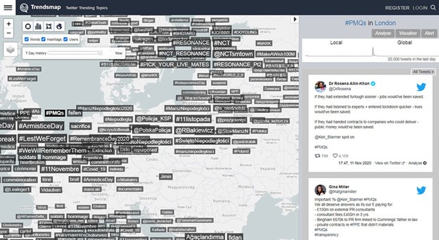
Maps are becoming more and more popular. Said they are taking the spotlight in web design. Many people use maps to see a place, find directions from site to place, and even explore different content. Many apps, especially Snapchat and Uber, use geolocation as their primary driving point of their app. Even big platforms such as National Geographic’s Geostories use maps to tell stories about culture and wildlife and simultaneously explore them.
Maps are an interactive way to engage one user with your brand. Maps make visitors spend hours and hours on a website. Many technologies are designed to get information about your site smoothly and to provide a better user experience based on that same location.
How to use a map in UI/web design
So how do you use maps in web design? Let’s say that the key to an excellent user experience is an excellent map user interface. A great map UI (user Interface) is based on a lot of design and data management. When you create a website, you want to make your information stand out while simultaneously visually appealing. You want your future users and visitors to find their way on the map, use it with ease, and enjoy looking at it.
To begin with, Google is a great starting point. It comes with simple mapping tools. You can use it to design a map without making any effort.
It gives you a friendly UI. The UI comes with many controls users can use to communicate with the map.
Understand the anatomy of the digital map
Before you or your web development company will begin with creating your map, you need to do some research first. That is because when you start mapping, it might be a little confusing, overwhelming even.
If you know how a map is made and structured, it will make your designing process much more comfortable. Not only that, but it will give you more precision to customizing.
Here is how you can use maps to improve your user experience on your website.
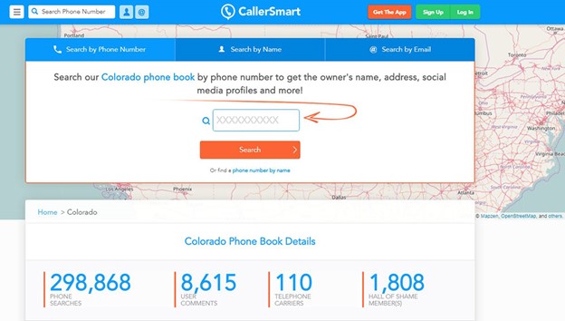
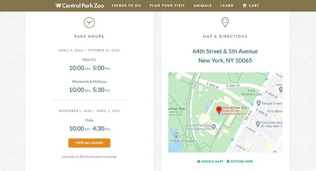
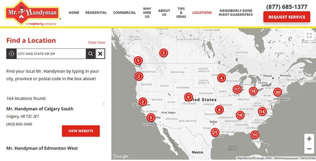
Contact page maps on the website
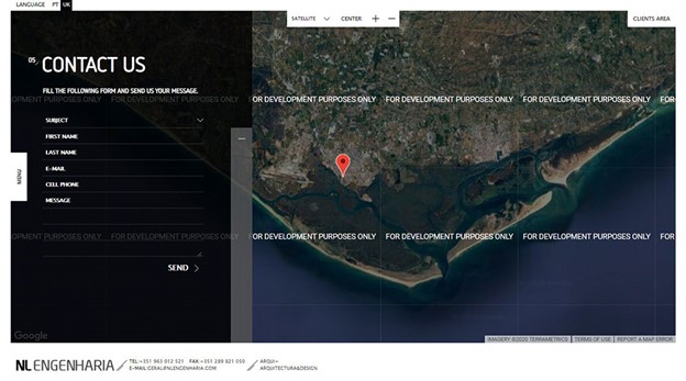
Even if you have the coolest portfolio website possible, you still need to create a separate page for contact information. There is your contact number, email address, and location of your business. This is how visitors can find you and contact you. Not only that, but a map also is proof that your business exists, and you’re not some fraud.
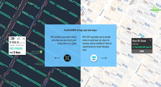
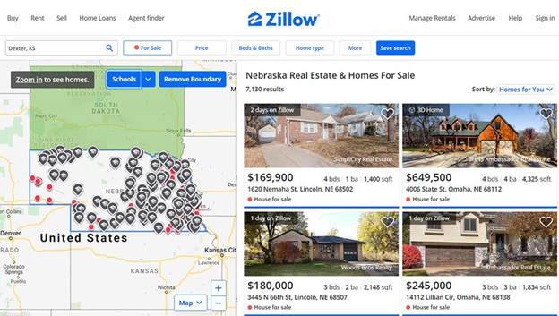
To Explain Data or Information
Maps are used for ages, especially by print designers. They use them to explain all kinds of information and data. Then, they apply it to the web. Maps are great because they have a variety of uses.
You can use maps to design and create infographics, elaborate concepts, and plot various information. Because of this, it is customary to see plans incorporated into web design. To use maps means to maximize one’s attention and to have a positive impact on how they interact with your brand.
Game or Method of Comparison
Another considerable element that is crucial to an excellent web and app design is gamification. In simple terms, gamification is the use of game elements into a non-game context.
You can create a location-based game for users to interact with and drive traffic to products.
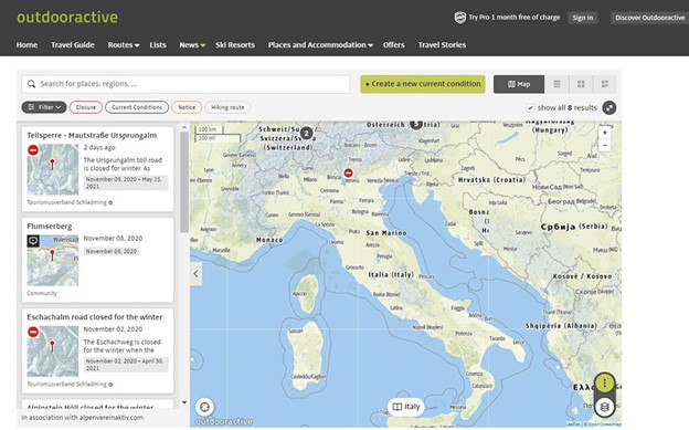
Tourist maps
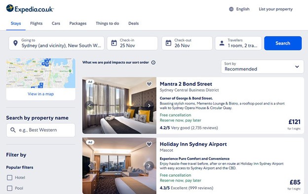
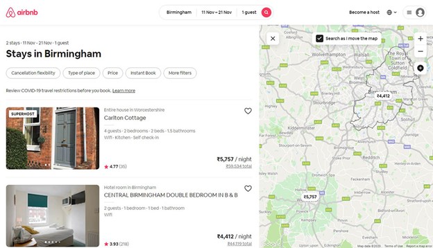
Many tourism websites use maps to make a city more tourist-friendly. You can now add destinations, entertainment places, various options for transport, and even hotels and hospitals on many maps. This is to make the city more home-like to many tourists that’d like to move there.
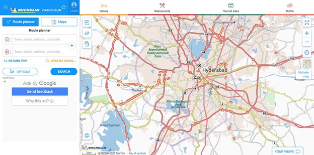
As a Search Tool
When it comes to mapping and adding search options into maps, Google is the best. First, you type in the location.
Then, Google shows you the precise location and offers many options to get to that place. It will show you an opportunity to get there by car, a bus, or even walking. It will also tell you how much time it will take you.
Follow their steps and make your app/website map-able. You want to serve your location to your visitors right away. Also, remember to use location data when they’re searching your website.
Tips for good map UI/web design
We already said that it is essential to have a good UI design. The design should be an amalgamation of both creativity and information. To create excellent content, you have to have a great appearance on your website and visually appealing data yet informative.
Positioning
First, think of the position of the UI elements. Where they are placed is the ultimate key to an excellent design.
Use layouts to add structure to your system and make the whole experience more familiar to users. Make them feel welcomed as if they already know and have experience with your brand.
Hierarchy
When creating a website, make sure to add scale to your elements. Your ultimate goal is to help customers focus on the most critical parts. Not only that but also to identify familiar patterns. For example, if you want to accentuate a metropolitan city, you’d use a bigger font with a bold format. You can add hierarchy to color too. You can manipulate scales as well. Add different zoom levels.
Typography
Typography is essential, as well. How you label text is going to have a positive or a negative impact on viewers. Make the text readable and easy to comprehend. You can’t ignore this element when thinking about UI design.
Number of colors
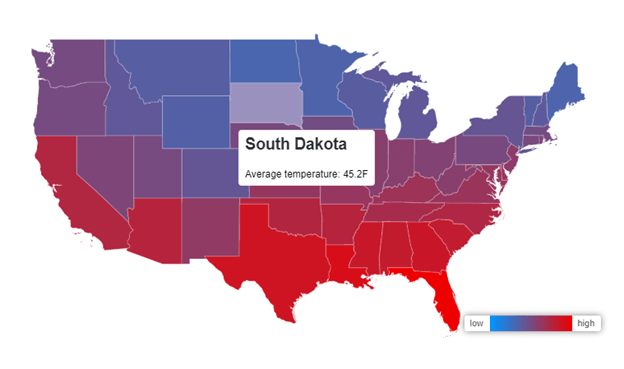
We’ve mentioned several times how color has an impact on users. Color is crucial, no matter what. You can use it to draw attention to important details and elements. You can highlight group projects and highlight the appearance of the map.
As color has many shades and hues, it would be best if you have a limited palette. If the map you’re creating is elaborate and more detailed, a color scheme of ten to twelve colors would be the best.
But if you want a simple one like a choropleth map, use fewer colors to create harmony. Then, put it to use and ask for reviews from your friends and strangers.
Contrast
Contrast is a significant element to help users communicate better with your website. Add contrasting details to guide your users’ attention to the most critical parts. When you use contrast, you emphasize the key points.
Try using contrasting colors to make content stand out from the rest of the background.
Information density
It is also essential to know when and how much text you should use. You don’t want to stuff unnecessary information into your website. You want to add subtle text that will concisely deliver the message of the work. You don’t want to overwhelm future visitors with too much text.
Icons
When it comes to visual language, another essential thing is icons. This is how designers communicate with their users. Many icons for maps are made to improve how one map is read. These icons also serve to recognize and associate a brand.
You can add modern icon styles to give a fresh touch to your site. You can use various contour graphics and drawings to make your page seem as if it was hand-drawn.
When it comes to how one page is designed and developed, it is crucial to add maps and location services. You want to give a precise direction of where your business is located. Your plan, like many things, should be interactive and serve well. But that is not all. The UI should tell the brand’s story and make it a wholesome experience for everyone.
About the Author

Bogdan Sandu
Bogdan is a designer and editor at DesignYourWay. He's reading design books the same way a hamster eats carrots, and talks all the time about trends, best practices and design principles.