Visual design entails taking several different aspects of design and combining them in order to create a site that is both easy to use and enjoyable for the visitor.
The World Wide Web is comprised of several million websites, all competing for the attention of their viewers. Because of this, many website designers want their websites to be unique in order to stand apart from the rest.
The problem with this is that designers give in to their creative sides and often design sites that are too complex for visitors to navigate quickly and efficiently.
When designing for website usability it is important to stick to the fundamentals and create a website that is easy for anyone to use. In this article, we will talk about what clean website design is and how to achieve it.
What makes a design clean
Everyone wants a website that will attract lots of visitors. What makes a website attract a lot of traffic is how easy the site is to use. If you look at some of the more successful sites, they all seem to have certain elements in common.
All of these sites are clean and professional. When designing a website it is important to remember that designing a clean website is a process of constant refinement.
No matter how much content you may have, the purpose is to streamline that content into a manageable format that the visitor can access quickly and efficiently.
All of the individual components of design: graphics, word spacing, color and so on must come together seamlessly in order to create a site that flows smoothly and is simple to navigate. This can be done by giving your site a professional look and feel.
Combining powerful content with a micromanaged layout will help your visitors to trust your site as they navigate it to get the information they need. Your visual elements have to be organized in a way that will make sense to the visitor. This applies to both the larger visual elements and the smaller ones as well.
Do not be afraid to scrutinize over the smaller details like shadows and borders. Doing so will help to refine your site and could shed some light on flaws that would be missed otherwise.
Making your site usable
The site should be usable and the content engaging and easy to find. Modern-day web surfers do not like to spend large amounts of time figuring out how to use a website.
They want to complete tasks quickly and easily, so make sure that it is easy for visitors to find what they want on your site quickly. The fewer steps that visitors have to take to get to what they want the better.
They’ll need a clean navigation, so make one that they can use to reach any part of your site in a few clicks. They’ll also need to see that you are reliable, so use a clean design and add social proof, either in the form of client logos, or Google reviews directly, if it’s applicable.
They will also need to get to fast the end result of your website, to send a form, start using your product or anything else.
In an ideal world, we would have real visitors test out the site. Since that is not practical, here are some important things to consider when designing a website.
If you do have people to test it with, use a Kanban app among your team members and set up tasks to assign to testers. In this way, you’ll have feedback faster. It surely beats the alternative of manually discussing with everyone and overseeing the testing phase by asking each and every one what’s the status.
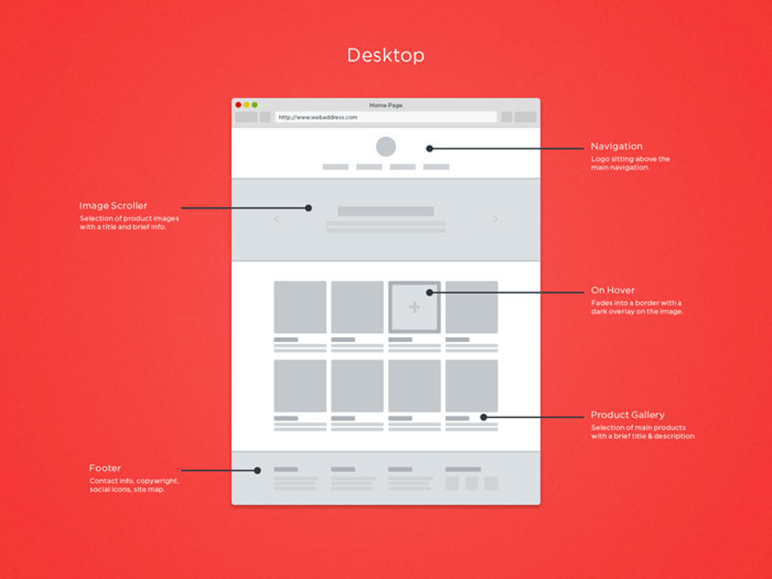
Site navigation and links
Your site should be easy to navigate. Visitors should not have to guess how to get around. Keeping with the established conventions for website design will help create an easier user experience. There is a reason that most sites have a navigation bar at the top or a list of links on the left side of the page.
Give your links clear and meaningful names so that your visitors do not click the wrong link by mistake. Make sure that any descriptive text is limited to the link itself.
Use the same style and format for links. Combining color and underlining is the common convention for indicating linked content. If the link changes colors once it is selected, then make sure that all your links do the same thing. Follow this same rule with groups of links as well.
Make sure your links have different states when you are designing them. Visitors should know whether a link has been selected or not by its color and style. The same applies to when visitors are hovering over a link.
Don’t forget about the search form
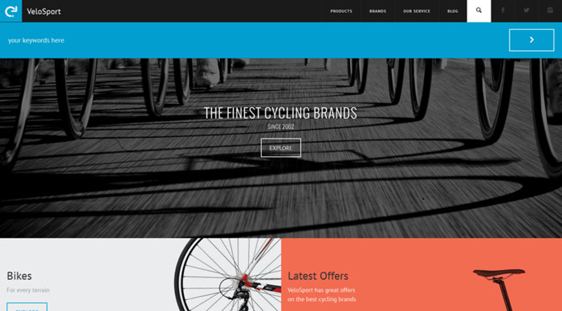
The search form can be the quickest way of finding content on a site, so make sure you have one that is clear and visible. Often people who visit a site already know what they want, and including a search form will make it easier for them to find it.
A search field is invaluable for any website. Whether it is e-commerce or blog, the search field is how you look for content, so never design a website that does not have one.
Make the content easy to scan
A clean website design does not just have a good visual design. It also has a good copy. The copy is the text that accompanies the visual aspects of your site. Make sure the copy on your site is clear and easy for the visitor to read and understand. For example, if you are working on a wedding website, make sure the welcome message is clear and informative.
Spelling and grammar are very important. Nobody thinks highly of a website where all the text is misspelled. Keep your words simple so your visitors will not have to grab a dictionary to navigate your site.
It is also a good idea to understand how visitors are going to read that copy. Some may read from top to bottom while others may just scan the titles in bold to decide if they would like to continue.
There is a lot of information out there and most people want to get as much as they can as quickly as they can. Be sure to keep this in mind when writing copy for your site.
Use Whitespace
Whitespace is the space between copy and visual elements on your site. When used properly, whitespace can be a very effective way to promote website usability.
Whitespace can be used to separate groups of items and provide a sense of visual hierarchy to your site. The visual hierarchy will make your site easier to perceive, so you may want to consider grouping related items together for the same purpose.
Whitespace also manages space on your site. By grouping items on a page, you can provide the appearance of space when you have a lot of information that you need to display. Let’s take two examples from the booking apps niche, Calendly and Acuity, where the user isn’t necessarily tech savvy.
If you don’t use whitespace to organize the elements better, the user might get lost in details and won’t manage to set up an appointment.
Sign up forms should be simple
Nobody likes completing forms and the fewer time people have to spend doing, the more popular you will be. Filling out forms on your site should be simple and intuitive. People should not have to search for information to fill out your form.
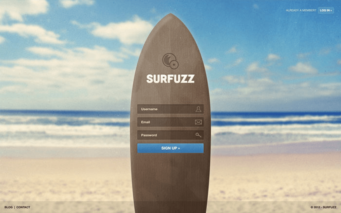
In addition, some people may be using a mouse to click in the field so make sure it is large enough for them to select it. Avoid putting example text in the field unless it automatically disappears when they click on the field. Having to erase example text can be viewed as a waste of time.
Keep the number of fields to a minimum. A single column for inputting information is better because two can be confusing. Make sure to add a visible call to action like a big sign up button. Use the username, email, and password fields. With password fields make sure there are two so that the visitor can verify the password they type.
404 error pages are important
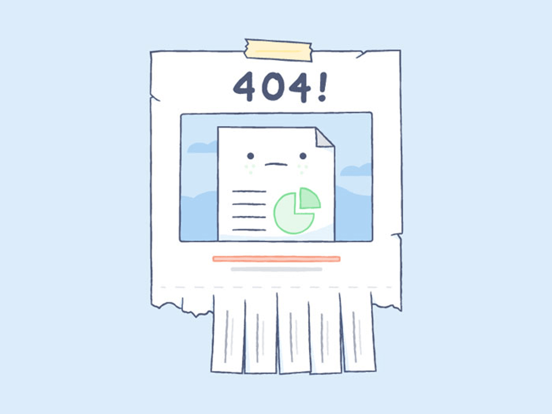
Many designers often overlook the 404 error page. If a visitor clicks on a site that is inaccessible, they are in danger of leaving. Use this page to get them back on track by adding a home button to it. You can also add links to other pages on your site
Do not ignore the user expectations
It is understandable to want a website that is unique, but it is often a better idea to stick to conventions because they reduce the learning curve. Remember most visitors do not like to take the time to figure out how to use a site.
Sticking to the established conventions will allow visitors to use your site with confidence. Visitors will come to trust your site as a reliable source of information. That kind of credibility can be worth its weight in gold. Always keep in mind that the site exists for the visitors and should be designed with them in mind.
Test your design
Now that you have gotten your site up and running, it is time to test it. Testing your site should be something you do constantly. Test it at first to see if it works, then find the bugs and fix them.
You may overlook testing, but in large companies there are tests even for using a table background color or another in a comparison or pricing page to see what impact it has on the conversion rate. There are some neat A/B testing examples out there that you can read to realize how important this is.
After you have fixed any bugs, test it again to see how the site performs. If they are fixed, have some friends or colleagues test the site and document their feedback. If you have a bigger project and the budget allows it, look for agencies who do online consulting. They’ll have someone specialized to nitpick your site.
Testing points out problems and flaws so always test and refine your site. A good way to think about it is to have others test the site until they tell you that it has great content and is easy to use.
Ending Thoughts
Many people want to design a site that is colorful and pretty, but it is a better idea to design a site that is practical and easy to use. Anyone who visits your site needs to see the benefits of it. It is a good idea to offer visitors an easy way to explore your site so they can see what it has to offer for themselves.
Making sure that visitors can navigate your site easily without thinking will reduce user frustration and make the experience more enjoyable for the user. Use presentation, feel and attention to detail to provide visitors with all of the benefits while doing none of the work. Doing all of these things will help to create a good experience that visitors will remember.
About the Author

Bogdan Sandu
Bogdan is a designer and editor at DesignYourWay. He's reading design books the same way a hamster eats carrots, and talks all the time about trends, best practices and design principles.