When you are creating a website, it’s no secret that you want it to stand out. An outstanding site gains points over the competition and is impressive to potential customers, this is why it’s better to build your own website.
A unique and attractive website gives designers a competitive edge. Developers add original and successful websites to their portfolios in order to attract new clients.
The following tips will assist you to make your website stand out:
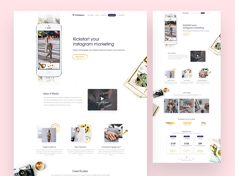
Layout and structure
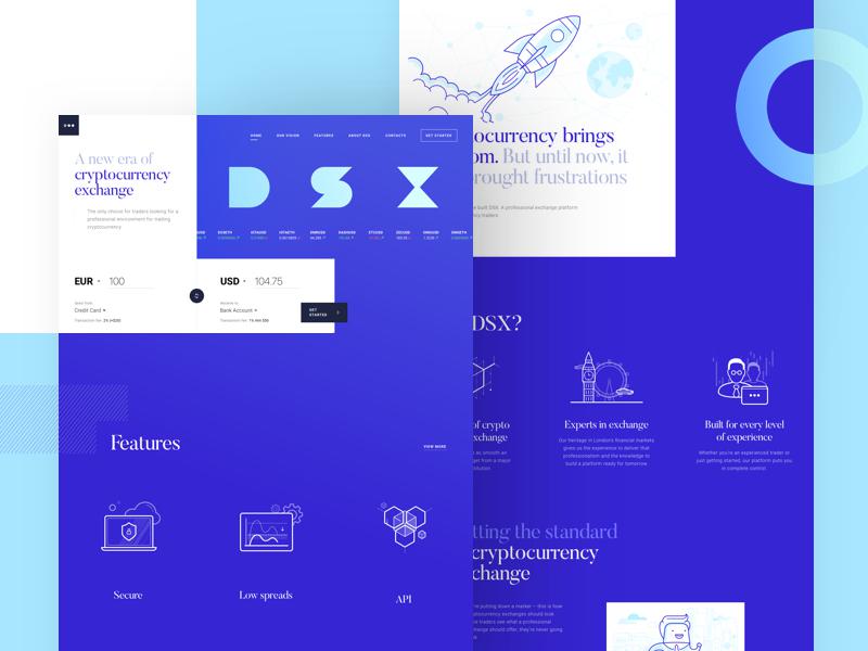
A unique site structure or impressive layout will make your site memorable. However, this is no easy feat. Creating a unique website provides a visual challenge and the opportunity to stretch your developmental skills.
Remember to keep information well organized and accessible while working on a unique site. When offering a unique site, development time may be increased as you encounter new problems.
When designing a new site, use programs which are easily accessible to users. Many complex sites rely heavily on JavaScript, but this is not always accessible to users.
Branding
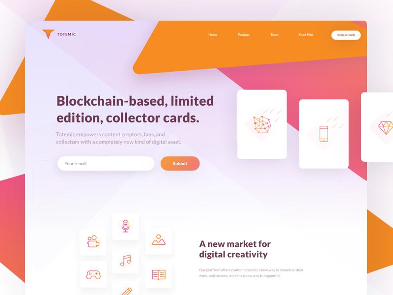
If your client has an excellent brand, this will assist your site to stand out. Branding aims to transcend a product, creating an emotional resonance with the user. Stick with your client’s branding guidelines, embrace them, and use the client’s logo on your site.
If your client does not have original branding or logos and only has a choice of font, this makes it harder. Work with the message, color and font you would like your client to create.
Use text effectively
Using text to set your site apart is both complex and very effective. The content of a site reflects the client’s personality or corporate culture. Use text, video, subheadings and easy reading or legibility to set the site apart.
Ask your client for copy that is well written and effective, showing a sense of warmth which connects with the reader. You want any copy which reaches your site to go beyond the obvious sell tactics and to engage the reader. This can sometimes be tricky.
Work with your audience
When you construct your website around user needs, you create a site which is both engaging and easy to navigate.
Many designers don’t do this. Take time to research who your users are, what interests them, and how you can incorporate their needs to create a niche site which is easy to navigate.
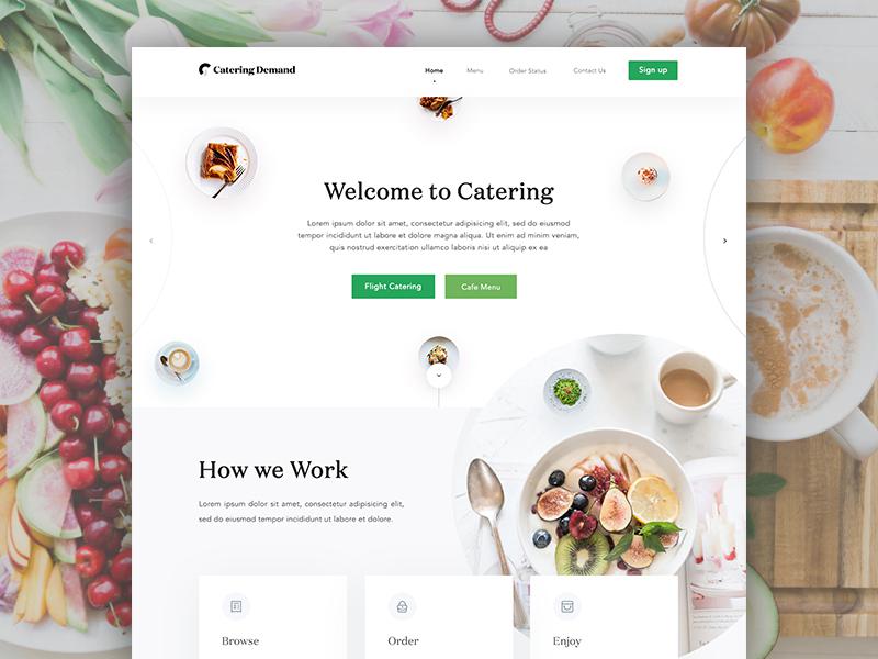
Keep it simple
Although branding and logo set the stage, assuring users they have come to the right place, it is the site’s design which will keep the reader engaged. A well laid out site is clear and easy to read, has plenty of white space, and uses color effectively. Navigation is simple and easy to use. Keep content arranged according to hierarchy.
When creating your site, keep it simple. Arrange content so that you don’t overwhelm your audience, but they are easily able to find the information they need.
Use white space effectively
Background space keeps your design clear and simple. Website organization is an important aspect of your design.
Design each area of your page so that it is aesthetic and adds value. Use white space to keep your design looking clean and fresh.
Typography
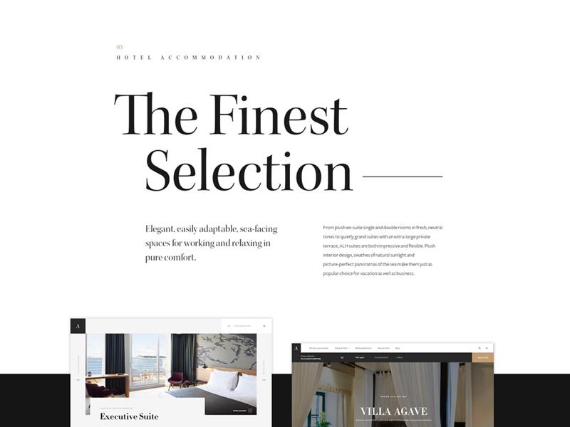
When you browse the web and come across some of your favourite brands or designs, how often do you recognize the font or typeface immediately? A brand is often immediately recognizable by the font chosen. Using a clearly defined font will link viewers to your brand.
When creating a header font, use a font which will stand out, and tie your viewers back to your brand. Google Fonts has plenty of options which are free to use.
Play with text
Great websites use large font sizes to keep text legible. This helps to create an easy flow. It also assists the designer with narrowing down language so that it is clear and precise. A large text has no space to become superfluous, confusing readers.
Clear, legible text which is easy to read will make your message easier for viewers. Along with headings and subheadings, large fonts will also enable you to scan articles or web pages to find the information they need.
Dramatic Headlines
Headlines make a statement, showing users what your site is about. They are often the most important aspect of a site and grab user attention because of their information content.
As a result, large, attractive headlines are used amongst many modern designers.
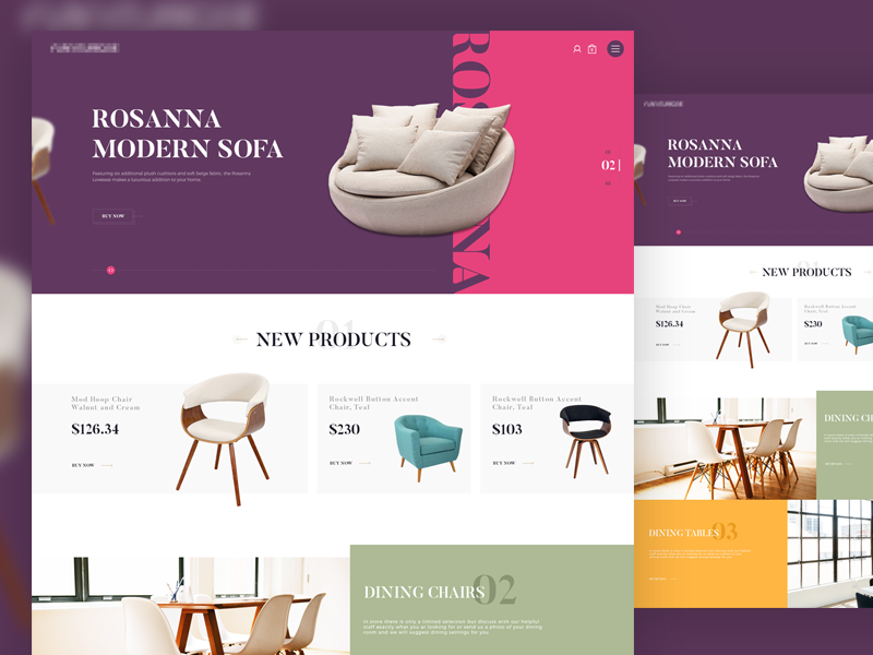
Color
The goal of a website is not just to create site visitors, but to encourage those visitors to buy a product, commit to a service or access new knowledge. In other words, the success of a website is determined by its ability to convert viewers into clients or customers.
In order for a website to have a high conversion rate, there is a need to make it accessible, efficient, and to use prompts which encourage users to take action. Color is often used as a means of highlighting aspects such as ‘sign up’ or ‘get started’ buttons.
Instead of looking at which single color is most effective, focus on how color stands out against the background of your website. This way, you can use color to create a hierarchy, drawing user attention to the most important buttons on a site.
Use contrast
Web designers rely on color to give an emotional or intuitive message to viewers. This helps to portray the atmosphere or culture of a company.
Color does not only create a mood, however. By contrasting colors, a designer is able to highlight different areas of a page. This assists viewers with establishing a hierarchy.
Be willing to experiment
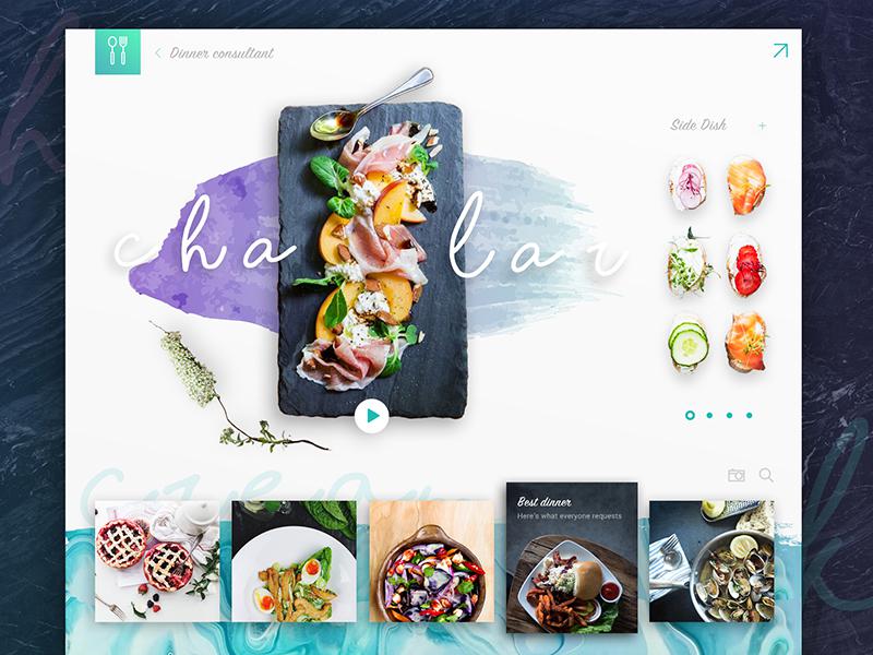
Have you ever thought about designing using a watercolor theme? There are many approaches to watercolor.
It was a popular trend not too long ago, and it’s making a comeback. You can use various watercolor elements in your header, sidebar or footer, depending on the site you’re designing.
Even if you don’t already have watercolor illustrations, you can create them yourself with watercolor brushes for Photoshop.
Whatever you do when using watercolor, have fun!
Using a grid
Using a grid is a popular website design method for modern websites. This effective way of designing enables you to add effective imagery to your site while presenting options to site visitors.
When using a grid, keep it simple. Too many options can be overwhelming for visitors. Keep your imagery simple and your navigation panel concise and easy to use.
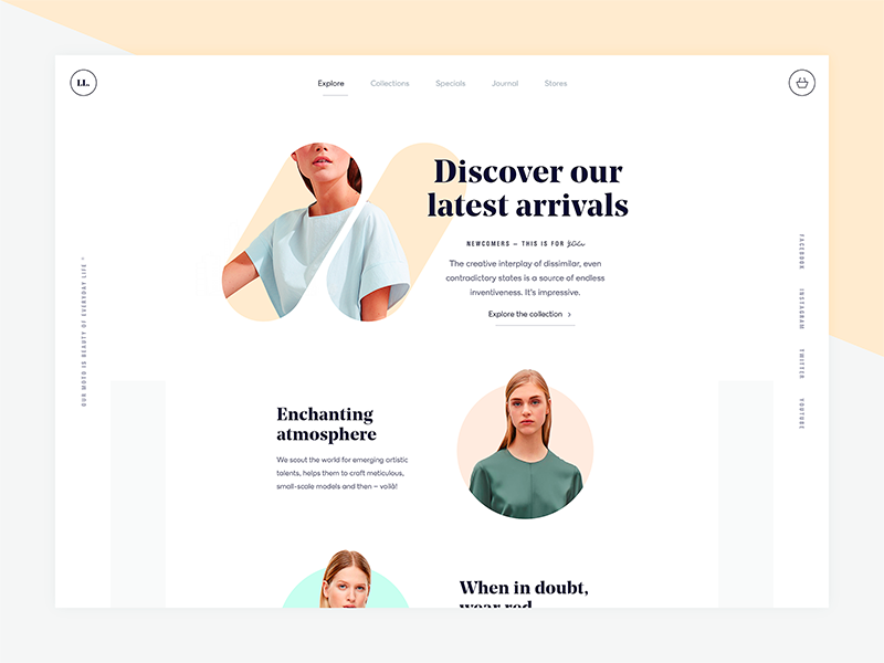
Minimalism
Minimalism sounds simple, with its use of white space, attractive imagery, and sleek typography, and believes that less is more. However, there is a lot going on beneath the clean surface.
In minimalism, negative space is used to draw attention to specific elements, so that the viewer does not get overwhelmed by too much information. The focus is on content, and the bare background is a means of achieving this goal.
When creating minimalist designs, focus on large images which give a sense of drama to your page, providing an emotional connection for viewers. Image quality is vital, as it will provide the emotional or atmospheric element to your page.
Social proof
When you have an expert review a product, make a statement on a service or carry out research, you create a sense of trust or reliability for your readers. Likewise, customer reviews or testimonials show how clients have experienced a product or service.
When using reviews, do so after you’ve made an argument for how your product will fit, providing a similar service or content. This will enable the review to offer a persuasive element to your site.
Go fast
Users are quick to abandon slow websites. Therefore, if you want to ensure that viewers turn into clients, it is important that your site downloads quickly.
Online viewers are impatient, and if your site takes more than a few seconds to download, they will often abandon the page.
Search engines give a higher ranking to pages which load quickly. In order to ensure rapid download, use only essential elements in your design, and go for premium hosting to ensure your downloading speed gives you what you need.
Summary
Developing a stellar website is all about embracing customer need, thinking through your design so that it works intuitively while being aesthetically appealing.
If you are able to work with client needs, your site will set you apart from the competition. Follow these tips and get started, and remember, never settle for second best!
About the Author

Bogdan Sandu
Bogdan is a designer and editor at DesignYourWay. He's reading design books the same way a hamster eats carrots, and talks all the time about trends, best practices and design principles.