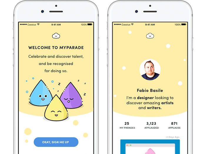
Mobile user experience somehow ‘imposed itself’ with all the development and improvement of mobile communication devices.
In fact, it is the quality of user experience that divides outstanding apps from their less outstanding counterparts.
The same factor enables startups to learn from big brands and to improve their products.
User experience for mobile applications – the key to success
UX seems to fit perfectly the development of mobile interaction. Customers cannot deny the fact that digital disruption is knocking out their loyalty, and mobile brands are gaining success. Instead, they are looking for a customized and stable experience that can always be upgraded.
Only a small part of them agree that channel interactions offered by companies are seamless. Established brands are working hard on triggering loyalty and improving their UX experiences to the level of impeccability.
It is a challenging task-they need to ensure their sites comply with traditional standards and that they load faster with no need for zooming or pinching.
The success of a website, however, depends on continuous streaming, and customers are becoming more and more frustrated that companies struggle to do business via mobile communication.
Tips for ‘mobilizing’ and personalizing the user experience
The focus is always on the user
We cannot talk about a universal UX simply because we are all different form each other.
Great apps should really consider their users’ personalities. They should research and gather data and they should customize the experience according to their users’ needs.
Take travel apps as an example – they ought to present attractive information even before we adjust searching settings because they know who we are, where we are, and how empowering our budget is.
Menus should have search options
Searching is a core element of good user experience. Therefore, such an option should be available everywhere. Your users need to be able to switch pages, to add or deduct content from the current page. Designers should pay attention to this because their main purpose is to make interaction easy and comfortable, which necessarily involves proper content division. From now on, it counts also for mobile systems.
Additionally, make sure the search field is visible. Put it in the menu or in a very striking position on the pages.
Remember – introducing search is not enough. It is just the beginning. You have to make sure it actually provides results. The results, on the other hand, should be logically ordered and accessible from desktops and mobile phones.
Finally, make sure your results are easily distinguished. One more thing about mobile UX related to search: having the option is just step one. Make sure your internal search result pages look great and are functional as well.
Apply the 80/20 rule
Most generally, 80% of your app’s users are about to use only 20% of its functionality. If not sure this is a valid rule, launch the service online, and observe how customers interact with it (in the case of mobile analytics difficulties, pay special attention to your mobile users). You will conclude which functionality is mostly applied so that you can cut the rest out and get as close to intuitive design as possible.
Keep forms short and simple
The same as with your desktop sites, mobile replications should not aspire for too much conversation, especially when we’re talking about forms. You need an app that summarizes information, buys or sells products or makes subscriptions through simple contact forms.
Think about it – what will your mobile UX look like if you introduce an 8-page long questionnaire? It will be ruined! “I’ll do that tomorrow on coffee time” – that’s exactly what users will say. And they won’t do it.
An optimal user experience takes care of size. Therefore, remove everything you wanted to know, but it wasn’t really necessary. Do they want a newsletter? Ask only for their electronic mails. Do they want to shop? Ask for the delivery and input address (and give them the chance to copy-paste the same information).
Start from scratch
Excellent apps start from the basics. The designer finds out what customers want and he adjusts the work to their requirements. Improvement comes second, whenever there is an affordable chance for improving your digital existence. Then, if it is a mobile idea, let it be a mobile idea! There is nothing that can make ideas so unique.
An app without content will simply not work
Additionally, too much content will be just as dysfunctional.
And we are not talking about not having content at all. We are talking about content that has not been exposed in a clear way. You may not have a searching tool or it may not work properly. You have to consider every option and to put content as close to your users’ view as possible. Again – filtering that provides low-quality results is equally bad as not having a filter at all.
Therefore, the same efforts apply to the search option-incredibly customized apps need incredibly customized searching features.
Consider interruption
One of the biggest drawbacks when designing for mobile systems is the unavoidable possibility for users to be distracted. They are almost all the time on their phones and there is naturally no chance that something will not interrupt their experience (either from the outside or within the phone itself).
You have to consider this option-maintain the app straightforward and the interface simple because it is the only way to keep users focused and engaged. Make sure that if they leave, they will come back and pick up from where they stopped. Therefore, divide content in small chunks and break larger tasks in no-time operations.
Introduce yourself properly
Appear friendly and really grateful for the fact that new customers visited you.
Assuming you’ve gotten to know your target users, the next thing to do is to let them know you. Charm them at first sight and convince them that it is a good decision to start using your site. You have to create a positive impression from the very first moment, instead of waiting for them to start searching. In fact, most clients base their entire experience on the first run they had on the site.
Presenting poor and empty screens to potential users is like signing a death sentence. Their first impression will be terrible and it will likely stay like that forever.
Don’t stop working on speed

Speed is among most important factors for creating excellent user experience. Speed is what users mostly complain about, so every website is trying to improve it. The improvement goes mostly in two directions: optimization of images (even if everybody tries to hide instant images); and reduction of size.
However, remember that the loading speed on your website/app doesn’t depend only on your efforts. It is highly dependent on mobile connections too. We don’t always have WiFi or 4G and we have to be patient.
Most users adjust their browsing habits to the speed of their internet connection-if traveling on the subway, it’s not really recommendable to try and stream a three-hour movie. Instead, you can read a Wikipedia article or your daily horoscope. This is how it works-users decide!
Design will never be perfect enough
Even if you made it to the top of all lists and your users seem to adore you, there is a big chance you’ll discover flaws you weren’t really aware of. In fact, it is very probable those will be things you missed when developing the app or results of failing to adjust it to real-time needs.
There are also certain options that make sense when you don’t have a great budget for the app and no revenue, like using free fonts instead of premium ones.
However, it is not a justification for throwing out ideas that seem technically unfeasible at the moment – write them down and work out whether there is an alternative that can replace them, or save them for better days. The mobile world is constantly innovating, so the same way as inundated settings fail to work, futuristic ones may become real. The key is to adjust to the time being.
Remember – your app is a developing entity. It will draw analytical data, users’ feedback, and it will follow trends and breakthroughs. You have to make sure it is ready to provide better and better experience. Don’t think that you will only work hard on it around the launching date when you have all your checklists and plan with what needs to be done.
Conclusion
Try and create excellent mobile user interface which can respond to every need and it can act informatively in every phase of the purchase cycle. Don’t rely on trends which impose the ‘must go mobile’ mindset and think how your users want you to enhance their journey. This is the right approach for keeping customers on board, encouraging purchases, and breaking records.
The quality of your app depends on the quality of its UX design – it will either make it or break it. We think you know what you should do.
About the Author

Bogdan Sandu
Bogdan is a designer and editor at DesignYourWay. He's reading design books the same way a hamster eats carrots, and talks all the time about trends, best practices and design principles.